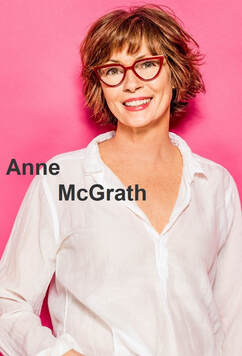
 I became familiar with Anne McGrath's works when I ran Working On Gallery's Instagram account. During the pandemic, she posted a piece every day -- some were black & white paintings, some were naturistic adaptations -- it became my morning routine to observe her art with a cup of coffee.
Today's process essay especially encourages me because I have been thinking of how much I have yet to achieve in creative writing. During the pandemic, I was really thankful and lucky to survive as a poet & artist. Though, I also realized that I was becoming a professional creator who has to be flexible under many circumstances. I likely burned out, because my mind told me, "I don't want to read or write in English anymore!" "Then the pandemic lock-down hit and I found myself at home with time and a small tray of my son’s leftover watercolors, crayons, and markers... At the risk of making a fool of myself I posted one of my creations on Instagram." I would like to express McGrath was a nonfiction writer. She started painting when the pandemic started about two years ago.
My past contributor, Luisa A. Igloria (the Poet Laureate of the Commonwealth of Virginia), also started creating three-dimensional art & writing pieces. Now she publishes her crafts. In addition, she is organizing a Poetry Postcard Project this National Poetry Month. I noticed more and more that writers jumped into different genres like paintings, playing music, practicing yoga... and many of them started new professions in addition to their existing writing careers. "At the risk of making a fool of myself..." What kind of risk can I take to further myself? I create graphic poems and play the piano. Why do I -- write in Japanese -- don't I? You may be thinking it is your native language! And you'd be right. But I have never seriously written stories in my mother-tongue. Now, I am writing something in Japanese everyday. This is how we -- writers -- keep building on our craft: at the risk of making fools of ourselves. 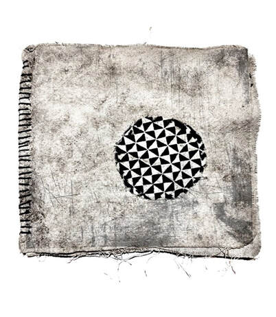 Art by Anne McGrath Essay by Anne McGrath Having been crushed by art teachers early in life, I was as frightened of drawing as I was of taking the math portion of the SATs. Humiliating attempts at making art had revealed my inability to create anything resembling anything I was aiming for. By the age of six I’d written an obituary for artistic endeavors. Then the pandemic lock-down hit and I found myself at home with time and a small tray of my son’s leftover watercolors, crayons, and markers. I started scribbling, collaging, and experimenting with mark making using bright colors and wild lines. 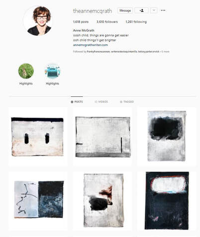 Instagram @theannemcgrath At the risk of making a fool of myself I posted one of my creations on Instagram. I connected with other artists and posted another, and another, and I have made and shared some form of art nearly every day for over two years now. 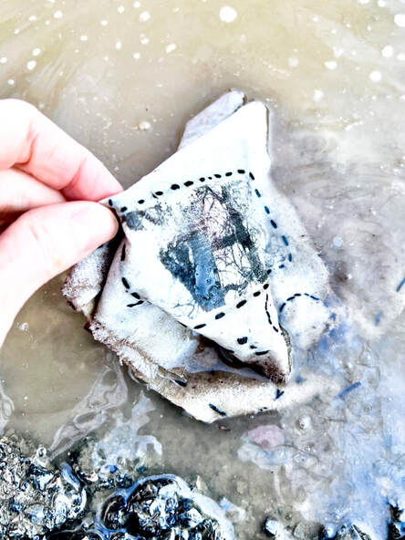 Photo by Anne McGrath I began trying every art form that caught my fancy. I hand-sewed textiles into little booklets made of scrap fabric and left them covered in dirt for months to deconstruct their surfaces. You never know what you’re going to get! I buried the one pictured above in the fall, dug it up in early spring, and washed it in a mudpuddle. It was underground through rain and snow and had delightful little squiggly marks on one page where a leggy bug had roamed through. The process was meditative and joyful, which is how I now think art making should be—full of wonder. 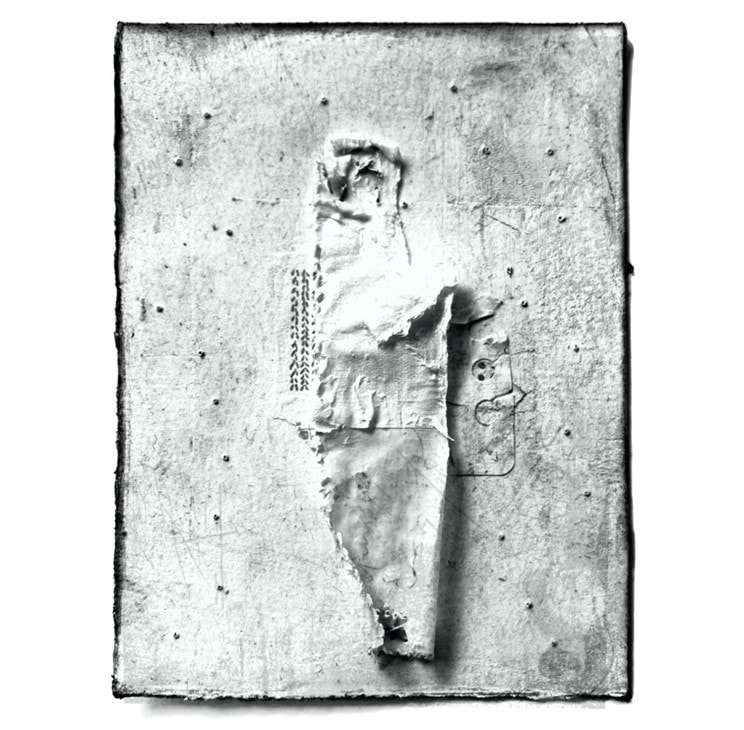 Art by Anne McGrath My pile of vintage books was perfect for making erasure poems. I was amazed when gorgeous literary journals like Thrush, The Indianapolis Review, The American Journal of Poetry, and The Ilanot Review agreed to publish them. I bought several Pilot Parallel pens and discovered the bliss of asemic writing—placing brush strokes on paper to form words without regard to logical language structure. It was thrilling to let my imagination run free and I had no problem looking beyond the illegibility of my writing to find beauty and inspiration. I was writing nonfiction before the pandemic but stopped to focus on worrying and am only now returning to a semi-regular writing process. My visual art practice—now mostly in black and white— has expanded the way I perceive the world and I’m hoping this shift will inform my writing. It’s easier for me to see value gradations in a limited palette and I want to approach words and sentences in a similar way, to keep things clean, to add wonder and meaning in layers. 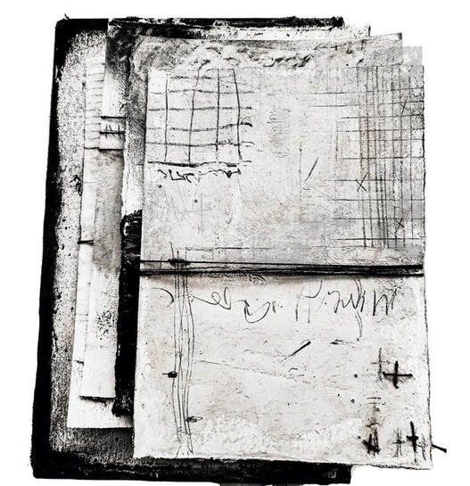 Art by Anne McGrath I’ve learned that using a range of values—light, medium, and dark—makes my visual work more interesting. I can create an energetic mood using strong contrasts or I can create a sense of calm using more subtle variations. I want to bring these nuances and juxtapositions to what I write. Something as simple as using different values in a piece reveals visual texture and a sense of depth which can be used to lead the viewers eye around a canvas or a page of text. Depth and texture might be added to writing by alternating big and small voices and varying the lens from closeup to distanced. If I can pair down my palette and my expectations for my writing, be open to taking to risks as I did with my visual art, I think I’ll find more satisfaction in the process. Anne McGrath was noted in the 2020 Best American Essays series, she was nominated for a Pushcart Prize, and she was the recipient of fellowships from the Virginia Center for the Creative Arts and the Vermont College of Fine Arts. She has work published or forthcoming in Creative Nonfiction, Fourth Genre, River Teeth, Ruminate, Entropy, Columbia Journal, The Writer's Chronicle, and other journals.
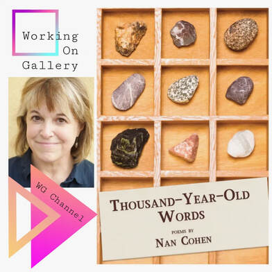 Today's Working On Gallery Instagram guest is Nan Cohen!
Her newest book, "Thousand-Year-Old Words", has just come out from Glass Lyre Press (Chicago local Publisher). She is currently a resident at the Ragdale Foundation. Please enjoy watching her reading on Instagram WG Channel.  First time I saw Francesca Preston's works was when she submitted her piece to RHINO Poetry. She added images to Luisa Caysedo-Kimura's poem, "Santa Rosa 2015" (RHINO Poetry, 2020). Her art was shared in RHINO Poetry Instagram. 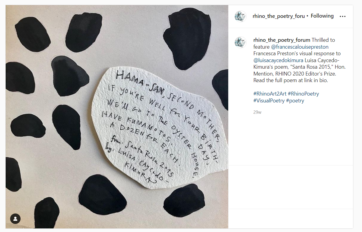 RHINO Poetry Instagram @rhino_the_poetry_forum Later, we exchanged some letters and email, she told me of an article about Anselm Kiefer. I acknowledged him in my book, "GLYPH", because I created my very first graphic poetry sketch in front of his gigantic concrete pieces in North Adams, MA.
After I read the article (New York Times, Interview by Karl Ove Knausgaard, 2020), Keifer reminded me of Professor Calculus from the Adventures of Tin Tin. Both are genius, but oddly strange -- perhaps, like movements of a pendulum. In case you are unfamiliar with his pendulum, you may visit this Q & A website about How does Professor Calculus's Pendulum work in Tintin? Yes, it is weird. I used a pendulum when I was sixteen in the countryside of Oregon. It was my first summer visiting the United States by myself without any English abilities. I was there as a part of school activities or sort. I knew that it was a pendulum (thanks to Processor Calculus), but I still did not know why a young Japanese girl with no English-speaking abilities ended up walking in circles with a pendulum in the middle of nowhere. Where does this pendulum keep guiding me? From Preston's picture (in the very end of her essay), there is a pendulum with Tony Himan, Water Witcher. I assumed that he used his pendulum to look for signs of water. "The question of whether water witching actually ‘works’ doesn’t interest me. I know it works, in the way that I know poetry works. What does interest me is how a poet, an artist, or a water witcher tunes their body to their craft. Writing a poem, like looking for underground water, is feeling for something you can’t see – a fluid source, a mystery that cannot be truly comprehended. But you can use that source, you can work with it." I wonder if my pendulum experience connected me with today's craft essay. My Language Wants to be Seen By Francesca Preston  Francesca Preston, "Impetus" I once spent time with a talented water witcher, a special man named Tony Himan. He’s gone now. He would be hired to dowse for peoples’ wells - still a common practice in the country. We stood together in the dry, rocky foothills of my grandmother’s land, and he showed me how he looked for water. On the surface it was simple – he was just holding a bit of dangling metal and walking around. Tony Himan was so good that he could tell not only where the water was, but how deep within ten feet, and what minerals were at certain layers: where salt, where iron. He was self-taught, and had spent years practicing in a big cardboard box out in the fields. He said it didn’t really matter what tool you used; in the end it was all about the relationship between your mind and your hand. You have to develop the rest of it. The question of whether water witching actually ‘works’ doesn’t interest me. I know it works, in the way that I know poetry works. What does interest me is how a poet, an artist, or a water witcher tunes their body to their craft. Writing a poem, like looking for underground water, is feeling for something you can’t see – a fluid source, a mystery that cannot be truly comprehended. But you can use that source, you can work with it. The comparison here is perhaps obvious. Word/image = water; writing/making art = tapping, listening, using your body and mind to locate, to place. But Tony Himan revealed something to me that I will never forget. He practiced in a cardboard box! The thought of him carrying an enormous cardboard box out into the fields, and sitting inside it while he concentrated with his mind, re-minds me of my childhood, and my inward-looking self. How the land tugged the fingers of his mind. 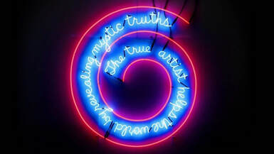 Bruce Nauman, "The True Artist Helps the World by Revealing Mystic Truths" I grew up in the country on a dead-end road. It was eerily quiet, and we had few neighbors. I spent a lot of time by myself, reading, drawing, and fantasizing about making 3-D houses out of white paper. Every once in a while we’d go to San Francisco and my mother would take my sister and me to an art museum. Eventually I noticed something internal: when I’d look at a piece of art on the wall, I would feel an intense urge to read the title underneath it first, or at the same time. My eyes would flick back and forth, out of my control, and I often couldn’t settle down. But when I looked at pieces where image and word, art and text, were fused – as with Jean-Michel Basquiat, Jenny Holzer, Barbara Kruger, and Bruce Nauman – I felt my body relax and a sort of ecstasy emerge. It continues to be this way for me. I have a presiding obsession with the relationship between words and images, and a desire to have them together. More specifically: to rejoin them where they have been broken apart, back to their birthplace in the earth itself. In working on this essay I realized yet again that my art is the pictographic version of my writing: symbols that circle back to what I’m tracking or constructing in the verbal realm. My art is writing too. When I encounter unnecessary jargon in the world – dead, technical language used to alienate people – I get really angry. This type of language refuses to allow images in the mind, which I believe are essential to live. My language wants to be seen. 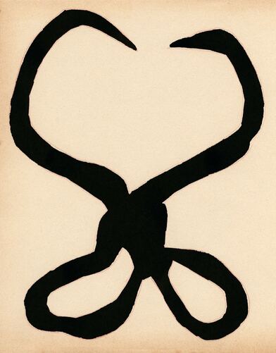 Francesca Preston, "The Two Parts Fell Open" These are old, blacksmithed ice tongs from the ghost town where my mother grew up, and to which my Ligurian ancestors arrived in the 1800s. I have never used them. There is no longer a need to lift heavy blocks of ice – cut from a pond! – in order to keep food cool. But the iron object, which resembles scissors or birth forceps or talking snakes, gnaws on me with its enduring presence. Hefting chunks of a frozen ‘body of water’ in order to keep something (that will be consumed in short order) seems related somehow to the act of writing – from fluid to solid to fluid again. Catching a thought-form in the right state, working with it as fast as you can, and then letting it do its own thing. * During the pandemic I’ve started listening to people more, or rather overhearing them. Perhaps it’s that the opportunities for stranger-exchange are fewer, so I am alert to any stray gems. A couple weeks ago I heard teenagers in a cafe discussing the holidays, what gifts they’d received, and the topic of gift cards. I heard one say, My family’s so weird. I had a massive laugh inside when I heard this. I love that she used such specific words (for a teenager, particularly) to describe what she didn’t want: tangibility, specificity, the physical evidence of choice. And I realize that is exactly what I do want in my writing, and my art. I want to use mysterious means to pull tangible and specific things out of the ground: coins, parts of old tools, bits of dialect, other peoples’ dreams, neglected words, uneasy memories, anything ancient. My poems are often dark-humored. It is no surprise to me that ‘humor’ originally meant ‘bodily fluid.’ The inner syrup of not only humans, but animals and plants, occupies me. 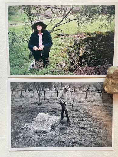 "My father being followed by a bummer lamb; My mother with moss over her left eye" No matter what I think I want to write about, there is often my family in the way, like a cow standing in the road on a warm night. By ‘in the way’ I mean part of the way; they are part of my work. By the time I was 10, my mother had fully become a painter, and would leave cryptic notes to herself around the house, things like ‘tiny, squash-eared babies’ or ‘precarious’ written twice. There were always words in her paintings. She walked on them intermittently, and then left them on the floor, where I would come to stare as if they were lost siblings. My father was (is!) a rebellious farmer who started baking bread when I was a child. The images of dough being kneaded and allowed to rest are visceral for me: flour and bread enter my poems regularly, like a kind of ghost. In a recent piece for the Ekphrastic Review I found myself describing my great-great-grandmother’s face: moon-wide as bread / squashed into a suitcase. The polarity of dough-rising (roundly expansive) and the truncated form it must sometimes take (boxy, contained) feels like what her life must have been, in shifting from one place to the next. My desire to retrieve things applies to my poems themselves. I have a chapbook coming out, {If There Are Horns, to be published by Finishing Line Press} after 17 years of not sending out poetry. I wanted to honor these older poems, written as I was navigating within and away from my family, away from academia, away from this country, becoming lost in an important way, and then back finally to the land of my ancestors. I wanted to give them a home, a suitable container, after all these years.  Thank you to Tony Himan, Photograph by Maggie Preston Francesca Preston is a writer, artist, and editor based in Petaluma, California. She graduated summa cum laude from Amherst College, and then dropped out of two MFA programs in her twenties. Her poetic works have been published or accepted by journals including Ambidextrous Bloodhound Press, Crab Creek Review, Ekphrastic Review, Fence, Feral, MALUS, Phoebe, Walrus, and her essays by various magazines. The land she mentions in the essay, a ghost town called Calaveritas, is located in the Sierra Nevada foothills. Her chapbook If There Are Horns is forthcoming in fall of 2022.
Website: francescapreston.com 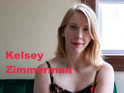 The first time I saw Kelsey Zimmerman's erasure poems at Indianapolis Review, I immediately contacted my dear friend Natalie Solmer, and I asked her to introduce Zimmerman. I sensed new elements of visual erasure poetry from her work, but I couldn't pinpoint exactly what they were. Her poetry erasure technique is similar to other erasure poets (erasing words from an intriguing original text), but something stood out and captured me. Coincidentally, this was around the same time I was discussing and observing erasure poems with students at Northen Iowa University. I eventually created a study guide for Visual Erasure Poetry, and in it I wrote Zimmerman has advanced versions of visual erasure poems that we were currently familiar with. 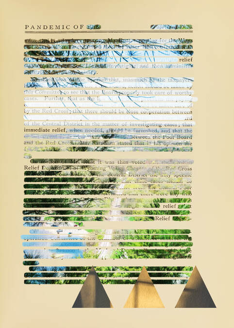 "Reliever" Kelsey Zimmerman, the Indianapolis Review I was glad that Zimmerman shared her creative process because it identified what I was seeing as new to visual erasure poems. Her work was indeed moving forward based on what we knew about visual poems - - she was inspired by many poets & artists such as Douglas Kearney, and then she created her erasure poems using new computer tools and existing photos that she took. Now, I understand how her vivid colors (she uses monotones, but those colors stand out) were adapted, and how she thoughtfully coordinated texts & images. There are new elements that uniquely signify her work. This is both unexpected and thrilling, and I seriously enjoy being in the front row of this visual poetry renaissance. YouTube by Douglas Kearney, Diana Khoi Nguyen, Octavio Quintanilla and Jennifer Sperry Steinorth. By Kelsey Zimmerman In March 2021, I attended an AWP session online that pushed me for the first time towards visual poetry. Compounding the Line: Visual Poetics in a Word Doc World with Douglas Kearney, Diana Khoi Nguyen, Octavio Quintanilla and Jennifer Sperry Steinorth. For some time, I’d been thinking about ways to integrate the photos I take with poetry and hadn’t been able to identify a method that didn’t feel tacky somehow—my worst fear was creating something that made someone think, “Looks like that was done in Canva!” But the examples of these amazing artists in this session reinvigorated this quest for me. Douglas Kearney shared a video of some of his process while working with Adobe Photoshop and Illustrator that, in particular, opened my eyes to the possibilities there if I could improve my comfort with the software – I was a novice, but already comfortable with Adobe Lightroom Classic and InDesign. The cross-platform functionality of all Adobe programs is somewhat similar, and my knowledge of the latter provided a much-needed entry point. Around that time in March, I was also in a poetry workshop in my MFA program that centered on the performance of poetry, not just as it’s spoken aloud, but how it performs on the page. I began to integrate that idea into my “normal” poetry, but also began to spend much more time thinking about how visual elements could perform on the page and what exactly I wanted any visual poetry of mine to say. I also read Hotel Almighty by Sarah J. Sloat, which proved highly influential, and a friend introduced me to Nets by Jen Bervin, Emily Dickinson’s postcard poems, and several other books on the history of concrete and visual poetry, and explored the work of several small presses, Ugly Duckling Presse in particular (and UDP is now very high on my list of dream publishers, given the esteem in which I hold their work!). Another friend had worked with Katy Didden at Ball State as an undergraduate, and her Ore Choir was another inspiration. Trying to situate myself into the context of the arena I hoped to enter was both daunting and inspiring: there was my little myopic self, surprised on some level that so many other people had worked to solve this same problem, make art in this same vein. All their work proved to be instructive and inspirational. 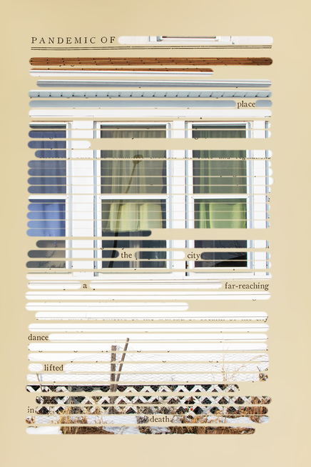 "Dancer" Kelsey Zimmerman, the Indianapolis Review I often think of my creative process as a sort of machine, or maybe an animal, where I go through weeks or months of input input input input, voraciously reading and exposing myself to ideas, and at certain points I sit down and switch to output. So I had all these things floating through my brain and had some half-formed ideas floating around, and there was one thing on my brain that superseded most other thoughts, and those were thoughts on the pandemic. The idea for how I would make an erasure poem of poetry had come to me, but I had to have the right text and the right images. Luckily, I already had a catalog of thousands of my own photographs to choose from. But for those initial text scans, I turned to archive.org and searched “pandemic.” That’s how I found the text for these works in The Indianapolis Review. A small tome, digitized in the infernal magic of the internet, on the 1918 flu response and vaccination, in the public domain on the Internet Archive. As far as page selection goes, I choose the ones I make erasures from more or less at random: I do scan the page for content, looking for words I think I can work from, words that interest me and spark something – I also especially like pages with ornamental designs (such as chapter openings in some books) and lots of white space (such as on chapter-ending pages). These allow for an extra dimensionality, another way of letting the original work speak for itself and highlighting what it says in a new way. The examples of my work in The Indianapolis Review are from the very first time I sat down to ever seriously try to create something like this. It’s fascinating to look back because, while I still like them, there are definitely things I’d do differently now – especially when it comes to figuring out ways to make the text flow more easily and stand out -- though in these pieces that the text and imagery battle for first relevance is a feature, not a bug. There are thousands of photographs in my catalog, and after skimming a page I’d picked to be an erasure, I comb through all those photos for one that seems like it would capture the right mood. From there, it’s all listening to the combination of words and image within the project, letting the final form reveal itself. Since March I’ve found it’s extremely difficult to find high-quality scans online, even on websites like archive.org or Project Gutenburg. Or if you can find them, they sometimes have restrictions associated with the file types or the scan quality as low. I take my own scans now, with books of my own or interesting ones I find at estate sales or thrift stores. In the meantime, I’m continuing to make more erasures in this vein, but am also always trying to think of what to do next. There’s always some boundary to be broken. Kelsey Zimmerman is a writer and visual artist from Michigan currently living in Iowa. A 2021 Best of the Net nominee, her work is published or forthcoming in Hobart, The Indianapolis Review, Nurture: A Literary Journal, and Ghost City Review. You can find her on the web at www.kelseyzimmerman.com or on Twitter @kelseypz.
It was an interesting coincidence that Leão talks about Yukio Ninagawa, a Japanese theater & movie director, in her essay.
Recently, one of Ninagawa's productions had its final show. He created Saitama Gold Theater with only actors who were over fifty-five years old. Due to the pandemic and declining number of performers over recent years, the company officially closed. Ninagawa is best known for adapting Shakespear plays into Japanese and fusion cultures. Here is one example on YouTube of his production of Hamlet. There are translations in Chinese and English; however, the actors perform in Japanese. Their stage sets and costumes are deeply influenced by Japanese traditions.
The majority of Japanese people were not familiar with Shakespear until Tsubouchi Shōyō translated all the collections from 1909 - 1930. Some of his translations have free online archives available at Aozora Bunko. So in Japan, Shakespear is considered "new" reading. Many people do not have the opportunity to read Shakespear in its original English, but they seek life answers from translations. I also did not know that Tsubouchi spent his childhood in Nagoya, my home city. (Borrowing Leão's words, I had never researched - - until now.) In addition, he was one of the first to highlight the differences between European and Japanese writing styles. He explained European key writers such as Homer and Dante. Tsubouchi also wrote a textbook of English Literature 101 contrasted with Japanese writing history. "I had never researched - - until now..." This is what I want to achieve with Working on Gallery. A curious dot guides the us to unknown, large reflections. I met Lúcia Leão in Miami when SWWIM hosted their monthly poetry reading event at the Betsy. She helped me order a magically tiny emerald-like key-lime pie and a small porcelain cup of coffee in Little Havana. I indeed felt like Alice in Wonderland. There, people often speak both Spanish and English, switching flawlessly between each. I witnessed how Leão's writing reflects this fusion culture. 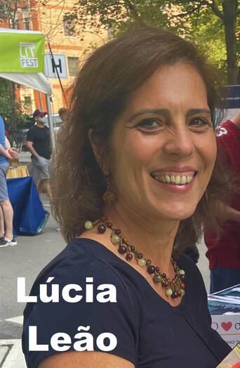 This w-place By Lúcia Leão I often feel that writing poems takes me to the theatre. The morning I was imagining this piece, one image caught me. It had been laying on top of a chest of drawers in my bedroom for years. It would not leave me. My eyes traveling around it, thinking − Graphic? Appealing? Flowing red strips made of silk, so scarlet I had to look for wounds. It seemed it was not by chance that the mouth and the hands exposed the hurt. Places of words and writing. Eyes facing grief. 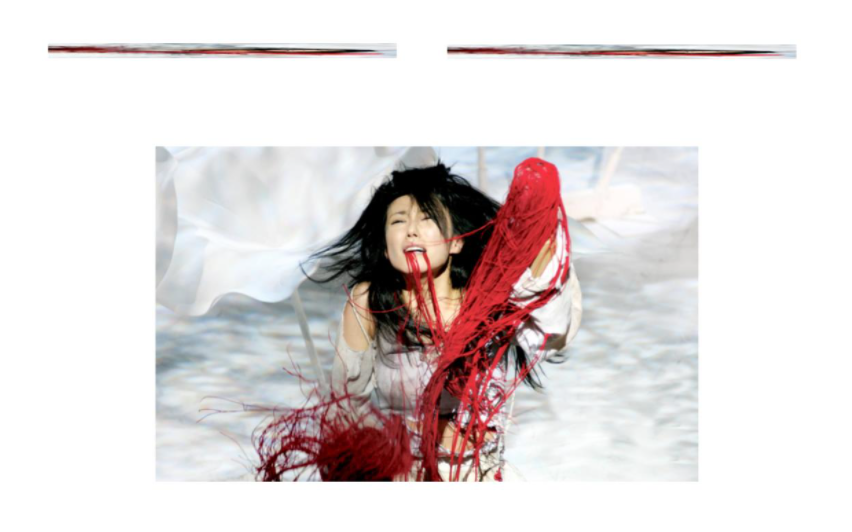 Directed by Yukio Ninagawa, Photo by Ellie Kurttz Trying – able? – to stay with the movements of meanings. The photo is on the cover of a book. It is from a Japanese production of Titus Andronicus, by William Shakespeare. Directed by Yukio Ninagawa, designed by Tsukasa Nagagoshi, Royal Shakespeare Company, 2006. 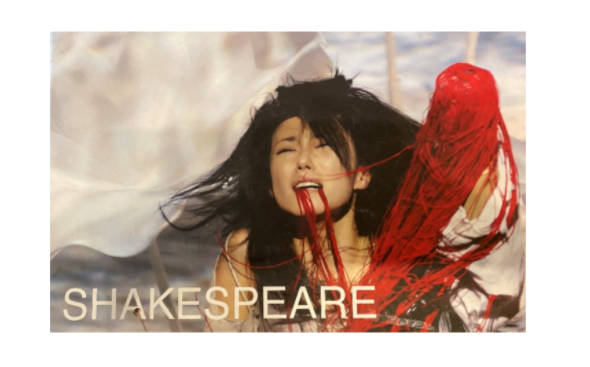 This is Titu’s daughter, Lavinia. She suffered a kind of violence we can and cannot absorb from this picture. Blood has been replaced by silk, to soften the horror, to increase it. My mind recalls Artaud and traps me there. Where to go with this? The page as the stage. A flow of words being held and escaping. A corridor opening to many. I am still looking at the picture, my eyes in a curious fashion, with hers. There is no tongue. There are no fingers. I am an explorer. It is a tragedy. And this, not an exit sign: 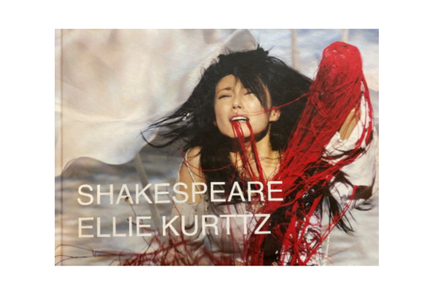 A name under Shakespeare not familiar to me. But of course, the photographer is Brazilian. My roots not a point of departure but of a meeting. She lives in London, not in Brazil. The traveling eyes and the traveling mind continue. It was in a bookstore in Rio de Janeiro that a friend and I got together, both by then foreigners in our city of origin, drunk on the joy an antique friendship releases. About to leave, she bought me the book, gift-wrapped it. The cover a postcard I kept of a time, of the craft of theater. I had never researched the photographer or the stage designer, until now. London, Rio, Japan, the places where I am – restart and mix. Pain, cruelty, hatred, and love – subtitles that move. They walk on the surface where the names stay. This is more than a postcard. But the leap to graphic poetry seems to be missing. In the play, Lavinia is able to grab a staff, put it in her mouth, and write on the sand the names of the people who had harmed her. There is a deeper wound the photo doesn’t show. While approaching this frame, I was drawing myself close in the process of her, sentences brushing against sensations, opening air. Papery silky strips in this  w-place. The leap missing. But first we circle, select, gather, leave behind pieces. Lúcia Leão is a translator and a writer originally from Rio de Janeiro, Brazil. Her
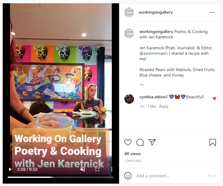
poems have been published in South Florida Poetry Journal, SWWIM, Gyroscope Review, Chariton Review, Harvard Review Online, among others. Her work is included in the anthology Grabbed: Poets and Writers on Sexual Assault, Empowerment & Healing, edited by Richard Blanco, Caridad Moro, Nikki Moustaki and Elisa Albo. Lúcia has been living in Florida for twenty-five years. 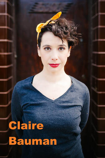 Photo by Layne Dixon I met Claire Bauman at Enrich Chicago workshops, where we learned how to update ourselves for an anti-racism initiative in Chicago art professions. We had the opportunity to learn about each other (she knits for her family members!) and I was interested in knowing more about her theatre directing along with her ballet and dancing experiences. "Just technique is stiff and academic. Expression alone is chaotic. But, together, they are exquisite." Bauman compares her art theory with "form" and "structure". I think that if dancing is cooking, "form" is the ingredients (pumpkin, flour, & spices...) and "structure" is the recipe. What can we cook with pumpkins, flour, & spices? Pumpkin pie? Or Pumpkin tempura? With the same ingredients, the outcomes can vary depending on how we approach them. The performer takes their ingredients (emotions, academia, & experience), and uses them in a performance flavored with the nuances of how each were prepared. The outcome becomes a tragedy or comedy. Her conversation reminded me of my recent Instagram TV guest, Jen Karetnick, who said, "Everyone gets the same ingredients & recipes, but the cook must tweak it for the best taste. It is same as writing poetry". "It may be easy to write off an arm gesture as icing on the cake, but I see such movement as an inextricable aspect of choreography that transforms simple dance steps into a form that can be manipulated to carry meaning." Bauman is my first guest outside the writing community. But I love to realize again how art and creativity connect different professions. 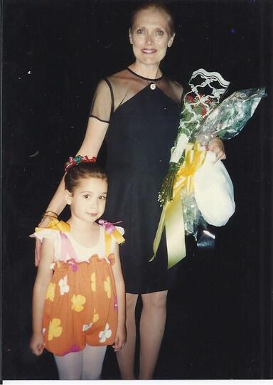 Claire, as a Munchkin, with her first ballet teacher in her first-ever performance, "The Wizard of Oz", in 1996. PERSONAL MUSINGS ON FORM AND STRUCTURE By Claire Bauman (she/her/hers) Every ballet class begins with pliés. As the knees bend to a demi plié, the arms float to first position, and the head tilts, gazing at the palm. As the knees extend, arms open to second position, and the head follows the hand out. This exercise not only begins class, but also forms the foundation of most balletic movement. But it is not just the mechanics of the movement that matter. The épaulment, or positioning of the shoulders, head, and neck, and the quality of the movement are essential in creating subtle, twisting lines, a sense of effortlessness and grace, and depth of emotion in any movement. Moments like the Black Swan’s 36 fouettes are easily memorable and spectacular even, but what is Swan Lake without the iconic floating, beating arms of the swan corps de ballet? It may be easy to write off an arm gesture as icing on the cake, but I see such movement as an inextricable aspect of choreography that transforms simple dance steps into a form that can be manipulated to carry meaning. My interest in theatre began with ballet. The story goes that I begged my mom to allow me to take extra ballet classes in preparation for the annual exam required to pass on to the next level of training when I was in kindergarten. Throughout my childhood, my teachers taught me to point my feet properly through reminders to avoid “dead fish,” to expand and lift through my chest by feeling the sun shining onto it, and to elongate through my neck by imagining myself wearing a crown. This imagery allowed me to tap into the creative and emotional qualities of ballet. I didn’t have the highest grand battements or the most pirouettes, but I stuck with ballet for as long as I did because the rigor of the technique gave me an emotional outlet to explore storytelling. I loved both the technique and the expression because they needed each other to be a complete artistic form. Just technique is stiff and academic. Expression alone is chaotic. But, together, they are exquisite.  Photo by Nate Bartlett I would not work the way I do as a theatre maker if not for ballet. Whether I am directing, devising, or choreographing, I seek to create meaning through form: the shape, appearance, or quality of something. I build images, metaphor, and juxtaposition to construct meaning and evoke visceral responses in audiences. If form is the essential construction of an entity, I believe those inherent qualities can elicit emotion. Let’s return to the ballet. Throughout Act II of Giselle, it’s a common stylistic, or formal choice, that Giselle and the Willis (maidens who have died before their wedding day) dance with their eyes downcast. The eyes downcast is part of the form of the steps for these characters, creating an eerie aura of grief. The Willis would not be half as powerful without this choice. I do not think form is synonymous with structure (the organization of things). But structure is an important component in creating meaning, and another study ingrained this perspective in me. I chose to take Latin in high school (following after my brother). I loved it because it also uses form and structure to create meaning; in this case, through cases (pardon the pun). Cases are like verb conjugations but for nouns and adjectives. Latin uses cases because it does not require word order. So the ending of the word tied it to other words rather than its location in a sentence. And by changing the case, you change the form, and therefore, the meaning of the word. With a different case, the word “painting” becomes “to the painting” or “of the painting.” Words and their cases could have their meaning further manipulated through rhetorical devices. This leads us from form to structure, from the manipulation of the thing itself (words, in this example) to the manipulation of their organization. Rhetorical devices are the structures that elevate language into poetry, layering a visual and auditory meaning onto the simple definitions of the words. Alliteration is a good example, since we also use it in English, and such repetition of consonant sounds can add to an emotional response. Because of the use of cases and the fluidity with which words could be placed in a sentence, Latin gave us other devices like chiasmus, a mirroring device that placed words in an “a b b a” pattern. Another favorite is caesura, a word break in a phrase. This makes Latin poetry even more powerful through its visual structure.  Photo by Claire Bauman A rehearsal photo from "The Grandmothers", a devised dance theatre piece. I fixate on form and structure in theatre because I think they are often overlooked as the containers of meaning which can evoke emotion in an audience. And form and structure are a choice. Choice is where my artist perspective and inquiry emerge from. So often, in art and society, we forget that everything is constructed, and anything that is built can be built anew through different choices. Antonin Artaud hones in on the power of theatre to challenge social inequity in his essays collected in Theatre and Its Double. He laments that, “our theatre never goes so far as to ask whether this social and moral system might not by chance be iniquitous.” I want theatre to be more than just a story that happens onstage. Form can evoke a reaction more powerful and subliminal within an audience than the combined definitions of words spoken by a character that feels relatable. I hope such an emotional connection can challenge how people view themselves in space and in society. I deeply believe that movement, form, and structure hold the power to change systems and people and that theatre is an essential tool in imagining and creating such change. Claire Bauman a director and choreographer who creates theatre, dance theatre, and performance art through devising practices and ensemble-based collaboration. She approaches her self-produced and devised work with an interdisciplinary and feminist lense. She has worked with Red Tape Theatre, Interrobang Theatre Project, Walkabout Theater, Rhinofest, Broken Nose Collective, and Chicago Theatre Marathon. She is the Grants Manager and an ensemble member with Red Tape Theatre and an Institutional Giving Consultant with Artistic Fundraising Group. Claire has participated in DirectorsLabChicago, Stage Directors and Choreographers Foundation Observership Program, and Hangar Theatre's Directing Apprenticeship. She graduated from Vassar College and further trained at the Moscow Art Theater School. You may also like...To read the full essay, click on the picture. 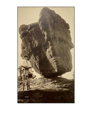 Glenore Dallenbach was Ann Hudson's great-grandmother. Here’s a photo of her at age 19, beside the Balanced Rock in Colorado. The photo is dated 1904. We think what we can't see can't hurt us. I met Ann Hudson when I joined RHINO Poetry in 2016. She pays meticulous attention to everything; especially to identify side-stories in our submission reading process. In other words, our editors are often convinced to reconsider poems nearly rejected after hearing her unique interpretation of them.
Her new book, "Glow" (Next Page, 2021) has just released. The opening reading event will be hosted by the press on October 26. This collection entangles her family, Marie Curie's discovery, and girls in the Radium Dial Company. The narrative bounces between science and history. The Radium Dial Company opened a factory in Ottawa, Illinois in 1922 to be close to Westclox, major clock manufacturing company in the area. Radium Dial hired young women to paint watch faces with luminescent paint; they were ideally suited for this work, it was believed, because of their fine motor skills and attention to details. They were explicitly taught to press the paintbrush between their lips to get the brush tip to the finest point possible. In doing so, they ingested radioactive paint, which managers assured them was safe This book is one only Ann Hudson can pull off. The language is beautifully tragic. Today, Hudson shares her zuihitsu-like-list essay (her essay reminds me of Sei Shōnagon's "Hateful Things") showcasing the story behind her new book, "GLOW". Ann Hudson, Glow 88 Pretty Much True Facts
 9. John Dean Caton, exhausted by overwork, moved from Chicago to Ottawa in 1838. He farmed for a few years before returning to the law. 10. In 1849 he helped establish the Illinois and Mississippi Telegraph Company, and 18 years later, sold to Western Union. 11. We spent a weekend at Starved Rock State Park, just outside Ottawa. My favorite spot is Council Overhang. 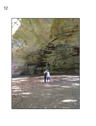 13. One afternoon we visited the nearby Ottawa Scouting and Historical Museum, where Mollie Perrot, local historian and JDC enthusiast, agreed to meet with me. She was excited to meet a Caton descendant. I was excited to see his giant, honorary hat outside the museum. 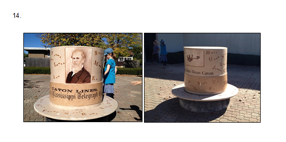 15. The kids were restless. On our way to get ice cream, we found the statue to the Radium Girls. I’d known it was nearby, but wasn’t looking closely for it. 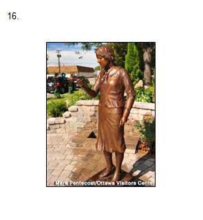 17. It’s an odd, sad statue. The “girl” in question was likely in her late teens or early 20s, though there’s something about this statue that makes her look considerably younger. 18. The tulip in her right hand sags: defeated, deflated. It’s flaccid. It’s uncomfortable, no matter how you think about it. 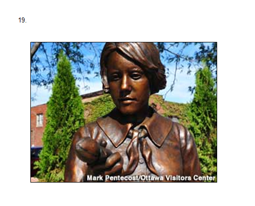 20. By the time I got home to Chicago, I was more curious about the Radium Girls than JDC. I didn’t have any intention of writing poems about them. 21. I think “Work (1922)” and “Work (1923)” were the first poems I drafted, intending to leave it at that. 22. 88 is the atomic number of radium. 23. Marie Curie discovered radium. 24. Which makes it sound like she was digging through an attic and found it in an old box. Or she dug it up like a fossil. 25. No. She guessed it was there. She worked in foul conditions, laboring with the heavy materials, tending to a cauldron of what I imagine to be foul-smelling pitchblende she’d somehow finagled to be shipped to her from what is now the Czech Republic. 26. Pierre was interested and supportive. Marie did most of the heavy lifting. 27. At the time she didn’t get her share of the credit. 28. That’s my grandfather’s watch on the floor. It tells time, but it doesn’t glow. 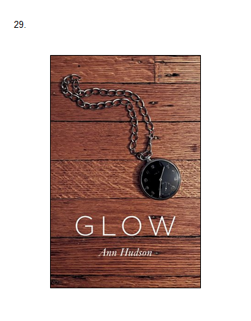 30. My grandfather was JDC’s great-great-nephew. JDC died in 1885, 24 years before my grandfather was born. 31. There are a zillion Johns, Charleses, and Williams on that side of the family. It makes research confusing. 32. Maybe you’re still thinking of that limp tulip. 33. It’s odd to think we vacationed in an EPA Superfund site. 34. The Cleanups in My Community map is pretty sobering. 35. Marie Curie’s cookbooks are kept in a lead-lined vault. If you want to visit them you have to sign a release form. 36. Loie Fuller’s birth name was Mary-Louise Fuller. She was born in what is now Hinsdale, a western suburb of Chicago. 37. I haven’t found Fuller’s Radium Dance on film, but you can see her Serpentine Dance and get a feel for what she was up to. 38. It makes me think of ribbon gymnastics. 39. Fiesta dishware had uranium in its glaze; red was the most radioactive. 40. Fiestaware remains highly collectible. 41. There were casinos where you could play roulette in the dark. The ball and roulette wheel were painted with radium. 42. A musical number called “The Radium Dance” was written for a Broadway musical called Piff, Paff, Pouf, which is pretty mystifying in its own right. 43. One brand name for luminescent paint was Undark. 44. The Radium Girls weren’t just in Ottawa, IL; there were other factories in New Jersey and Connecticut. 45. One bite from a radioactive spider changed Peter Parker forever. But no bad side effects, not even a headache, and he gets the girl. 46. Necrosis: the death of all or most of the cells in an organ or tissue due to disease, injury, or failure of the blood supply. From Greek nekros = corpse. 47. Body burden: the concentration of chemical in the body at any given time. 48. Until the 1970s shoe stores would x-ray your feet to ensure a proper fitting shoe. 49. In 1998 the US FDA declared Mercurochrome as unsafe. 50. Marie Curie’s niece, Helena, was known as Hela. She died by her own hand in Chicago in 1921 at the age of 29. 51. Curiously, scientists refer to the oldest and most commonly used human cell line as HeLa, after Henrietta Lacks, from whom the cells were stolen. 52. A 1933 article in the American Journal of Public Health opens with the paragraph: “The excitement caused by the poisoning, or alleged poisoning, of a number of women engaged in applying a radium compound to watch hands and dials is well remembered. We understand the company was very liberal to the victims, and that new methods have been insisted upon which obviate the danger.”[i] [i]“RADIUM POISONING”, American Journal of Public Health 23, no. 4 (April 1, 1933): pp. 350-351. https://doi.org/10.2105/AJPH.23.4.350 53. After the Radium Dial factory closed down, it reopened a few blocks away under a new name: Luminous Processes. 54. Luminous Processes. Shining Procedures. Glowing Practice. Shimmering Exercise. Radiant Problem. 55. Marie Curie also discovered polonium, which she named after her country of origin, Poland. 56. Peg Looney started working at Radium Dial when she was 17. She made good money: $17.50 a week. She died on August 14, 1929, at the age of 24. The causes of death listed on her death certificate were diphtheria and anemia. 57. Radium can also be instrumental in treating certain cancers. 58. Dial painters were paid eight cents per dial. The faster they painted, the more money they made. They were taught to pinch the tip of their camel-hair brushes between their lips to create a fine point. 59. Chemists at the factory operated behind lead screens. They used tongs. They wore masks. 60. Starved Rock State Park is on land once inhabited by Hopewellian, Woodland, and Mississippian tribes. From the 1500s to the 1700s, it was the land of the Illiniwek. 61. According to legend, Chief Pontiac of the Ottawa tribe was killed by an Illiniwek warrior during a tribal council. During a battle to avenge his killing, the Illiniwek wound up trapped on a cliff overlooking the Illinois River. The Ottawa and Potawatomi surrounded the bluff, but the Illiniwek refused to leave, and many starved to death, giving the area its name. 62. There’s no evidence that suggests this story is true, but it’s so widely disseminated most people take it to be true. 63. John Dean Caton recounted the story during an address to the Chicago Historical Society on December 13, 1870. 64. JDC also turned his attention to studying the natural world. He sent Charles Darwin a copy of a book he wrote on antelope and deer; Darwin sent a gracious thanks, and artfully avoids mentioning whether he plans to read the book. 65. Ottawa has a lot of large, vibrant murals that celebrate its history.  67. The high-quality silica sand in Ottawa is mined to make glass. One newspaper article called it “hypermining.” Turns out it’s not just good for glass; hydrofracking operations use this high-end sand to “prop open cracks in deep underground shale deposits, allowing natural gas to flow freely toward the surface.” [i]The sand is rare, and plentiful in the region. Intense sand mining is putting the local ecology in danger. [i] Dan Ferber, “Scenic state park at center of Illinois frac sand fight,” Midwest Energy News, 6/4/12, https://energynews.us/2012/06/04/state-park-at-center-of-illinois-frac-sand-figh/ 68. The Peltier Glass Company in Ottawa used to produce marbles.   71. William Penn Caton married Elizabeth Steele. They had six children (one John, one William, one Charles, by the way.) 72. Charles Caton married Fannie Hull. They had seven children (including a William and a Charles.) 73. THAT William Caton married Glenore Dallenbach. Here’s a photo of her at age 19, beside the Balanced Rock in Colorado. The photo is dated 1904. 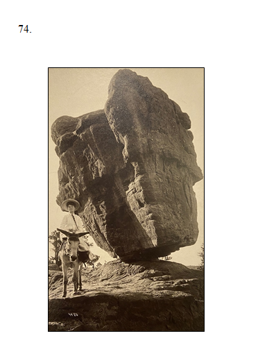 75. She lived to be 100 years old. 76. Glenore had a life-sized doll at the top of her stairs. It scared me and I ran past it. 77. Glenore was my great-grandmother. 78. Glenore’s husband (William, of course) disappeared in 1912. He boarded a train to work and was never heard from again. 79. There’s a glass blowing shop in Ottawa where you can get your loved one’s cremation ashes turned into a paperweight. 80. JDC is buried in the same Ottawa cemetery as William Dickson Boyce, who founded the Boy Scouts in 1910. With the exception of Mollie Perrot, folks in Ottawa seem much more interested in Boyce than JDC.  82. When he lived in Chicago, JDC had a big house on Calumet Ave. Family rumor had it that there was a tunnel of some sort that led from his house to another house. 83. I looked it up in the Chicago History Museum archives. Turns out JDC’s son, Arthur J Caton, was married to Delia Spencer. After Arthur Caton died, suddenly and unexpectedly, Delia married her neighbor Marshall Field, founder of the famous store that bears his name. The tunnel rumor made it to print, with the implication that Delia and Marshall were using it to tryst. 84. So that clock on the corner of State and Washington is in my family. Pretty much. Actually, there are two clocks: one at the SW corner of the building and one at the NW corner.  86. Marshall Fields went bankrupt years and years ago. Its flagship store is now owned by Macy’s. 87. But the clocks are still there. 88. And they still tell the time.  Ann Hudson (she/her) is the author of The Armillary Sphere (Ohio University Press); a chapbook about radium, Glow, has just been released from Next Page Press. Her poems have appeared in Cider Press Review, Orion, Crab Orchard Review, Colorado Review, North American Review, Spoon River Poetry Review, and elsewhere. She is a senior editor for RHINO, and teaches at a Montessori school in Evanston, Illinois.
  Miami-based poet and writer Jen Karetnick is the author/co-author of 20 books, including the cookbooks Mango and Ice Cube Tray Recipes. Her food, health, and lifestyle pieces appear recently in Allrecipes.com, Business Insider/Insider, The Counter, Indulge Magazine, NPR, Shondaland, and elsewhere. See jkaretnick.com for more or find her on Instagram @JenKaretnick and Twitter @Kavetchnik.
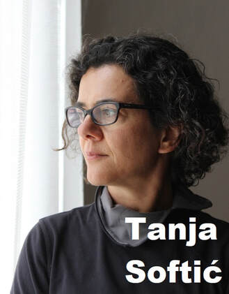 "How do we articulate these feelings and this new way of experiencing the world so that we can communicate it?" When I read Tanja Softić's essay, I realized that my experience being a foreigner in the U.S. may actually be beneficial for the first time. That was really surprising when I thought about it. Often people talk about the disadvantages of being an Asian women or immigrant in the U.S.
"These days, we have all become immigrants: we can clearly see the destruction of life on the planet that is our home, by the forces that seem overwhelming." Indeed, in this dramatically evolving society -- tremendous technological developments & our short attention span with longer life span -- how we find who we are and how do we adapt new methods into our old habits to create a better society? Immigrants who experience multiple cultural backgrounds have experience with this process, because for them, adapting to American life means they have built new life methods onto their comfortable, familiar foundations. In other words, immigrants are really ready for this future normal. Therefore, I understand why Softić introduces Anna Lowenhaupt Tsing (American anthropologist) and Lebbeus Woods (American architect) the way they did. Tsing sees human community as a fungal network, and Woods observes how we make homes by adding new material to distorted buildings after wars. Artists often find an idea from unrelated things. Artists are scholars, like Isaac Newton who compared a falling apple with the moon and crafted the theory of gravity. Softić is masterful at connecting those dots -- disintegration of her native country of Yugoslavia, Japanese-washi-paper, Covid-19, American social issues, chicken foot in a street drain -- to create her visual masterpieces. 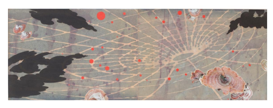 "A Sound Like a Mighty Rushing Wind 2020" etching, photopolymer etching, chiyogami and digital print collage 16"x 47" 41 cm x 104 cm Tanja Softić Landscapes for the Last Century My visual art work combines the media of printmaking, drawing, photography and collage. I started writing poetry in my mid-forties. I should probably say “again and, this time, in English” because I used to write it in my youth, in Serbo-Croatian. Depending on who you talk to, this language is now called Serbian or Croatian or Bosnian or Montenegrin—I choose to stick to the nomenclature of my school days. An immigrant to the United States from Bosnia and Herzegovina, I have been working with the ideas of memory and migration for about twenty years. When I came to US in 1989 for what I thought was a three-year graduate program, I came from the country called Yugoslavia. So, while I am fascinated by questions of cultural identity or cultural belonging on an intellectual level, I have a personal experience of what Edward Said called the contrapuntal reality of an exile: I have transitioned through three citizenships in addition to one period of being a citizen of no country. In both my new and old homelands, outdated notions of national and ethnic identity and belonging continue to shape the politics and the society. Unlike many people affected by the current pandemic, by storms, fires and crop failures due to climate change, by capitalist boom and bust economies, I have had a privilege of having the safe, creative haven to process the events, record my thoughts and make work that is informed by the situation. Perhaps this privilege is not something that I would have noted some decades ago, but I am acutely aware of it now, and I am grateful for that awareness and sobered by it. Thinking about death, survival and their meaning in the larger cultural and ecological contexts and witnessing what may be the first death throes of the neoliberal world order, I have been working on Plague Diary, an ongoing series of collages on small sheets of kozo paper. The shapes I kept coming back to either embodied nature's ever-adapting ways of insuring survival, or cartoony visualizations of disaster. 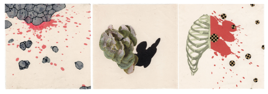 "Excerpts from Plague Diary 2020" collage, photopolymer etching, digital print, ink, pencil 7.5" x 7.5" 19x19 cm These days, we have all become immigrants: we can clearly see the destruction of life on the planet that is our home, by the forces that seem overwhelming. Each action we take and every contemplation of the natural world is tinged with sense of loss of our world as we know it and knowledge of how much we are losing every day to the climate change. How many autumns do we have left to observe the splendor of of turning leaves? How many species will disappear this year? How long before homes of millions of people and the territories of entire nations become submerged under rising waters? There is a sense of anger, despair and even helplessness in the face of inaction of world leaders. How do we articulate these feelings and this new way of experiencing the world so that we can communicate it? And how do we turn them into something actually useful, a new, creative way of looking at and reorganizing the world? Dreaming of the perfect past and simpler world is tempting, but it is fanciful: exactly whose simple past are we talking about? It is also useless. What if we learned to think about the loss not with nostalgia and mimicry, but aiming to understand the forces that shaped the culture and society then, in order to understand the inertia and fear that prevents us from seeing the value of alternative views or solutions to existential problems we are facing? The processes used for creating images for Plague Diary and my larger works on paper, involve material labors of walking, collecting, repairing, cutting, transforming and connecting, generally speaking. Specifically, I travel, hike and explore memory sites in order to create photographic material, I create photopolymer etchings from my photographs, I collect biological illustration, elevation maps, things like visualizations of meteorological data or geophysical forces, I cut and reassemble photographs and found images into collage works that are then further developed in drawing, print and collage. Almost always, I work on Washi--Japanese paper-- because it will hold the most delicate drypoint or aquatint mark as well as the densest mezzotint. In drawing, I use it for its versatility and its strength. Because of the length of the fiber, Japanese paper will endure the handling and folding that would turn any Western paper into a pulp. 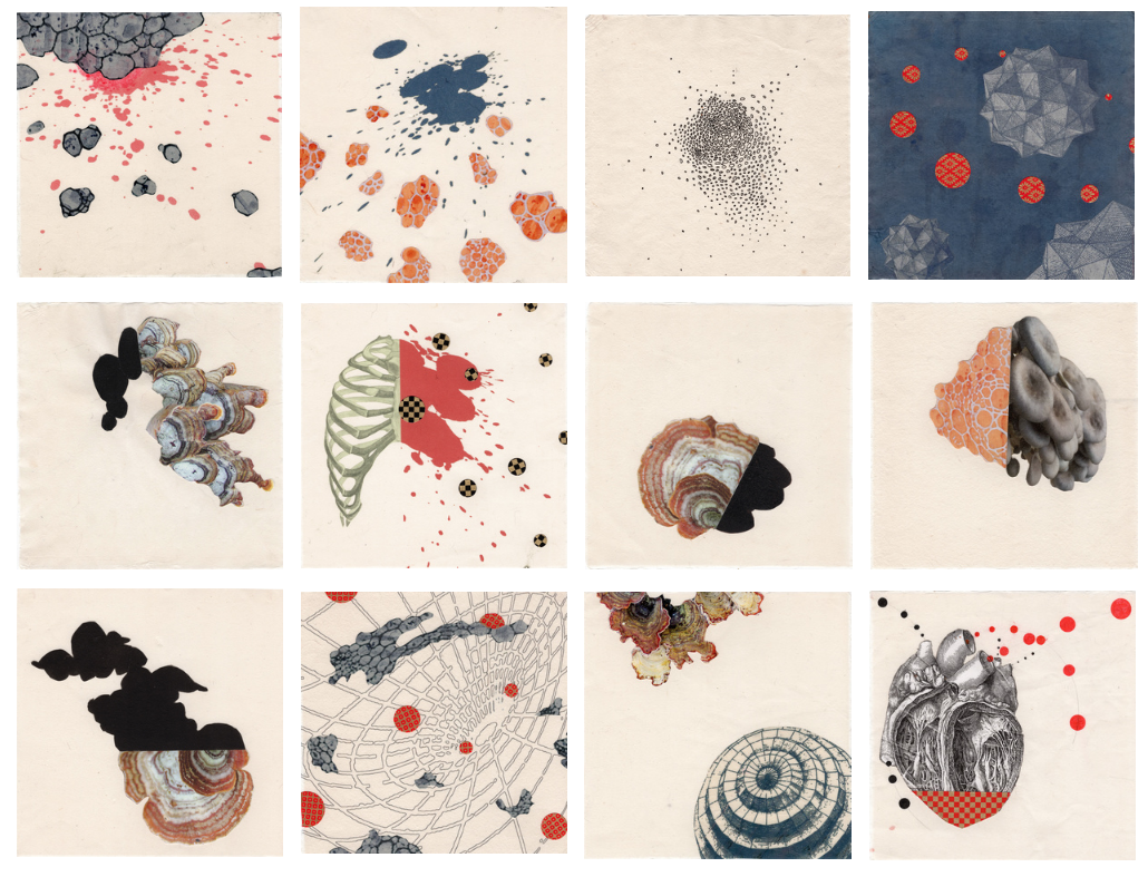 Plague Diary 2020 The processes themselves, the physicality of paper and drawing media, writing poetry, the visual sources I use all inform these works. While my poetic text is not obviously embedded into images, there is a vital connection, a symbiotic relationship between them: either the images generate poetry or the poem-writing provides insights that guides me in developing visual works. Night Blooms series of collage prints, for example, has been developed at the same time as some of my “Sarajevo poems”, such as Sarajevo Parataxis. Photographs of memory places interact with other elements (parts of old prints, traffic signage, photographs of mushrooms) in a visual, semiotic and lyrical ways: The city has a color in a way 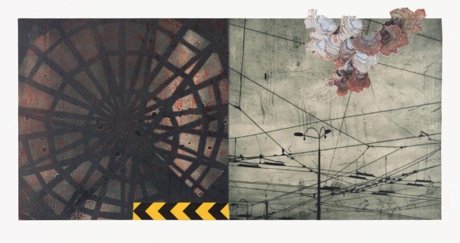 "Night Blooms: Sky 2019" photogravure, aquatint, chine-collé, digital print 12"x24"/ 31x62 cm I aim to create landscapes for 21st century, include the loss, displacement and impermanence, but include hope as well. The works are unsettled and without the center because they investigate the world without center, without solid ground, without permanence in the lives of increasing part of humanity. My graphic interventions on top of the larger backgrounds are a conversation with that reality, they are investigations of our priorities and they contemplate new ways of living, valuing and thinking in this new, rapidly changing world. My visual work is also informed by the artist book formats I have observed and created, multi-channel video installations and other strategies to disrupt and alter the expected narrative. It is built as a result of digging into my own archives of photographs of mushrooms, invasive plants, memory places in Sarajevo and elsewhere, illustrations, decorative patterns, diagrams, maps, medical illustrations, microscopic imagery etc. Ultimately, this new work comes from what has been the impetus behind much of my art and writing: what is it that emerges as fertile, as full of possibility when we look back at life and culture that has been lost. How can we recognize seeds of renewal in the midst of unfolding disaster? For a couple of years, I have been working with images of mushrooms and invasive plants, incorporating them into my work as signifiers of the strangeness and interconnectedness of life and unexpected growth in unlikely places, as well as metaphors for displacement, migration, and assimilation. 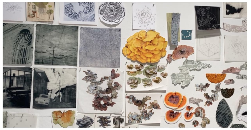 A “collage staging wall” in Tanja Softić's studio Anna Lowenhaupt Tsing, in her book The Mushroom at the End of the World: On the Possibility of Life in Capitalist Ruins, raises questions and offers ideas about sustainable life in the precarity of the Anthropocene through many distinct ways of looking at a species of mushroom, tricholoma matsutake: its biological symbiotic relationships, its role in processes of reforestation after disasters or logging, its vast underground fungal network, the communities and fringe economies it makes through foraging, trade, and global supply chains.(i) If I had to describe Tsing’s book in the ways one would describe a painting, I would call it a brilliant collage that plays with the notions of perspective that reveal not just deep mastery of it but also the need to escape perspective’s dictates and enter other means of envisioning pictorial space and what it is supposed to hold: “Without stories of progress, the world has become a terrifying place. The ruin glares at us with the horror of its abandonment. It’s not easy to know how to make a life, much less avert planetary destruction. Luckily, there is still company, human and not human. We can still explore the overgrown verges of our blasted landscapes—the edges of capitalist discipline, scalability, and abandoned resource plantations.”(ii) Another of my influences is the late visionary architect and artist Lebbeus Woods. In his book War and Architecture,(iii) he uses the term “scab structures” to refer to additive repairs to a broken building that call attention to war trauma and serve a distinct purpose, enabling new forms of habitation while witnessing the processes of destruction and repair. In terms strikingly similar to Tsing’s, Woods not only offers critique of capitalist architectural and urban planning practices that are based on the concealment of trauma and brokenness but also offers a vision of the more complex, more collaborative world in the aftermath of war or a natural disaster. “Architecture and war are not incompatible. Architecture is war. War is architecture. I am at war with my time, with history, with all authority that resides in fixed and frightened forms. I am one of millions who do not fit in, who have no home, no family, no doctrine, no firm place to call my own, no known beginning or end, no “sacred and primordial site.” Both Tsing and Woods visualize a habitable, sustainable communal world where brokenness is acknowledged, openly mourned, and woven into the landscape. We build upon the past, they acknowledge, but they warn us that nostalgia, sentimentality, ideas of “innocence” of past cultures and societies are slippery grounds to build upon. Preservation of memory without resorting to outdating solutions and concepts is possible: attention, as Simone Weil has said, is a form of prayer. And I would add, is the beginning of understanding, conversation and action. As an artist, I am hearing both Tsing and Woods inviting me to practice attentive, creative openness to a shifting terrain and its surprises—not unlike the kind of awareness one would need to forage for mushrooms, cross the sea to uncertainty in a flimsy boat, or set up home in the ruins. That is where the hope is. And that is how I hope to create the landscapes and portraits of precarious world-- decentered, polyphonic, surprising. If we listen, carefully, to the stories of migrants, exiles, and refugees, not only for the sake of exercising our compassion but in order to learn ways of coping and rapidly evolving by witnessing the unthinkable. Popular culture is replete with figures of tough lone survivors in a postapocalyptic world, with a gun and a supply of food cans. Actual survival on the Earth will call for much more complex thinking and actions. In this work, I reach back into my visual archives, I try and listen to the present and envision the possibilities in the future. Notes: (i.) Anna Lowenhaupt Tsing, The Mushroom at the End of the World: On the Possibility of Life in Capitalist Ruins (Princeton: Princeton University Press, 2015). (ii.) Ibid., 282. (iii.) Lebbeus Woods, War and Architecture, trans. A. Wagner (New York: Princeton Architectural Press, 2002), 1. Tanja Softic´ works in the media of print, drawing, photography and poetic text. A recipient of the Pollock-Krasner Grant, Soros Foundation Grant and National Endowment for the Arts Fellowship, she is currently working on a series of works of paper that examine migration and entropy, both in nature and in the human society.
Her work has been exhibited and collected by museums, libraries and galleries worldwide, including the Library of Congress, National Gallery of Bosnia and Herzegovina and the Department of State Art in Embassies Program. She completed print projects at Flying Horse Press, Tamarind Institute and Anderson Ranch Print Studio. Her work was published in Southern Review, Hourglass Magazine and a number of academic publications. She teaches printmaking and the art of the book at University of Richmond. Poets are hard trainers (Period)
It can be more relatable to observe athletes at the 2021 Tokyo Olympic & Paralympic Games; instead, poets are, perhaps, like Auguste Rodin's The Thinker. Poets reach the limit of ones capacity - - write, erase, re-organize, destroy, create again, and then the final product - - though the products may not be well received by audiences. They may be overlooked or invisible. I do not think that it is an ideal environment for our creative selves, it is one that may lead to self-doubt and wrong impressions about our creations. However, the process is part of poetic progress. In other words, we - - poets - - have to find the optimal balance between our perception of our work and its reception. Ina Cariño, Kylie Gellatly, & Mary Ruefle (her essay is shared by Gellatly later in this article) have similar sutras for this. I think I’ve finally made peace with the fact that things take time, and that time takes time, too. - - Cariño You haven’t even begun. You must pause first, the way one must always pause before a great endeavor, if only to take a good breath. - - Ruefle When I reviewed Gellatly's book at RHINO Reviews, I was immediately curious as to why she adapted found poetry with art, and why she chose that original source, The Arctic Diary of Russell Williams Porter. I was not expecting such vivid details. 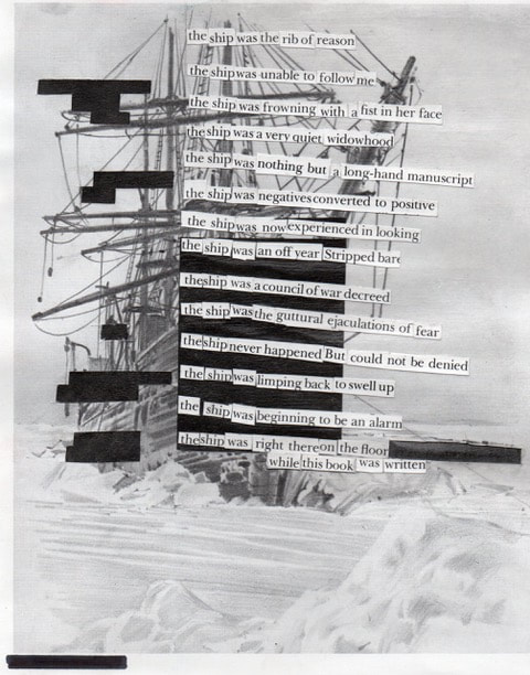 From "The Fever Poems" by Kylie Gellatly The Fever Poems by Kylie Gellatly The Fever Poems is the result of a myriad of circumstances; including but not limited to a head injury, a bad case of hives, the (then new) Covid-19, and a big move. I am tedious when telling the story behind this book, as it feels romantic in a way that I feel timid taking credit for. Maybe that is the nature of found poetry. Trying to tell the story of how this book happened is like trying to scoop a pile of shapeless things, or oozy goo blobs, into my arms and then try to carry them some distance and make an eloquent hand-off. What shape would you give to a head injury, hives, the pandemic, lockdown, packing up an apartment, the protests, isolation, the feeling that all I have is everything I have and is everything I will lose. How to contain this: The Fever Poems was a towel to clean up a spill, or a vessel—the kind of vessel that a towel becomes when it is entirely saturated. I had been working on a collection of poems and had just discovered the through-line, that the poems were about grief of self, or past selves. Then came the breath, the pause, the prescription: no screens, rest your brain, your eyes. Then, a physical enactment of the grief that I had recognized, under the circumstance of not knowing whether I would be able to restore my brain function to what it was before. The head trauma I was recovering from was one that had, at first, subtly hindered my ability to comprehend what I was reading, but under pressure, led to trouble with comprehension in both reading and writing. I was prescribed a month of rest and given strict parameters around what my brain could handle. I mostly just wrote letters to keep in touch and found so much creativity in this communication, which asked for something to be made in order for it to be said. I was drawing and collaging and writing a lot of letters, long letters, to various people; carrying on these disjointed conversations over gaps of time and distance. 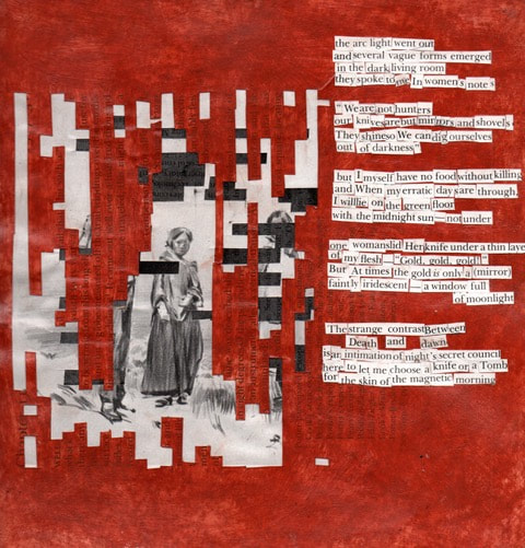 From "The Fever Poems" by Kylie Gellatly I think of Mary Ruefle’s essay “Pause”, in which she says, “You must pause first, the way one must always pause before a great endeavor, if only to take a good breath.” The choice to use The Arctic Diary of Russell Williams Porter started with reason and turned into another. At first, it was simply that I was preparing for a move, cleaning out my books, and questioning whether I would take this book to another new place with me. My collection of arctic literature had once been very enthusiastic but, by this time, Porter’s diary was the only one left. I had carried it around for years for sentimental reasons and for a very dear inscription inside. I thought, it can only come with me if I make it into something else. So I tore out the inscription and started pulling the book apart. My obsession with arctic literature was an antidote for a steady depression and had presented itself to me as a form of escape that bred optimism toward endurance, stamina, and unlivable conditions. The nature of this use became poignantly clear to me as the nature of its escapism and toxic kind of endurance pointed at a lot of the shame I had been carrying. The book became a symbol for a fixed narrative, something I had been keeping my fragmented selves inside of, on ice. In retrospect, the best way I can think of the creation of The Fever Poems is as a month-long play in which I enacted an homage to the grief I was holding inside me for every person I had been in my life and a deconstruction of the walls that I held around each of them. Instead of leaving a pile of rubble, these collage poems are mosaics, made in a fit of compassion, that create a myth all its own, starring a fluid “we” and “I” — sourced from the context of Porter either speaking for himself or on behalf of his crew — to meld into a single, whole, and present form. Creating one poem every day for a month suspended judgement, doubt, and question long enough for a trust in myself and my voice to grow. 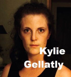 Kylie Gellatly is a visual poet and the author of The Fever Poems (Finishing Line Press, 2021). Her poetry has appeared or is forthcoming in DIAGRAM, Tupelo Quarterly, Iterant Magazine, GASHER, Literary North, Palette Poetry, and elsewhere. Kylie is the Book Reviews Editor for Green Mountains Review, Editor-in-Chief of Mount Holyoke Review, and is a Frances Perkins Scholar at Mount Holyoke College.
I often receive two questions:
To be honest with my audiences, I am annoyed by these questions because the answer to the first question is always, "yes," and the answer to the second question is always, "Leaning a craft takes time". When I read Ananda Lima's essay, I understood why they asked me these questions. Creating new approaches to poetry (even though there are many historical examples, like Brazilian Concrete poetry) can be lonely. Finding a graphic & visual poetry tribe can be trying, as if you are cutting through a bamboo forest to find treasure. I again realize how important it is to connect with communities and share knowledge about graphic & visual poetry at the Working On Gallery. Some poets may just be apprehensive to step into unfamiliar territory. Now, if they ask me these questions, I say, "Yes. Come join us!" However, drawing & collaging art do not create a good graphic / visual poem. Borrowing Lima's word, "intuitive", is a part of the process - - you develop a feel for what works in your vision, your decisions are made with more confidence - - though, the intuitive ability comes after studying text poems. It is a long journey, but exciting. I found a new tribe member today. 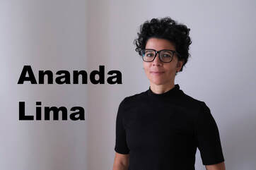 What am I doing here? Brief notes on being invited to hang out with graphic poets, and maybe line breaks By Ananda Lima As a poet, so much of the knowledge I have of my poems-in-progress or finished poems is intuitive. A knowing about whether something feels right, if it is doing what it should be doing, that is, ironically, apart from anything verbal. But a knowledge that is very much real. It might be only much later, often after the poem has been finished for a while, that a more verbal understanding might come. When asked to talk about a poem in an interview, discussing it with an editor, or talking to a friend, a verbal explanation might arise. An editor might wonder if a word should be shifted or cut, and only then, I develop a verbal understanding of why a specific word is part of the structure that holds what is underneath the poem, a structure that might not be entirely visible when skimming the verbal surface. Or a friend might make a connection that I had not expressed verbally, even to myself, but that I knew in some pre-verbal way was there. It's fun when I see those things come out in words. It can be illuminating. It can create new connections and generate new verbal or intuitive knowledge. It can make me feel understood. But it is always partial, tentative, not corresponding exactly to that non-verbal knowledge. This too can be satisfying/good news: if the poem can be paraphrased exactly, then it probably is not doing all it could do as a poem. A good poem, as a good story according to Flannery O’connor, should resist paraphrase.  Me, trying to figure out all how to describe my own poems and why I was invited to hang out with a talented group of graphic poets In a similar way, when Jennifer Sperry Steinorth asked me to join an event with a group of graphic poets and visual artists, including herself and Naoko Fujimoto, my membership in the group felt but intuitively right. This was despite the differences in the type of work members of the group were doing: there was brilliant and fascinating art that literalized and reinvented erasure while undoing a literal historical erasure, poems as transsensorial translation; a visual and sensory richness with mediums that included paint, white-out, lace, embroidery, and more, as well as words. 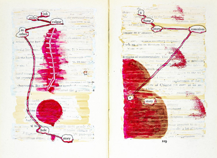 Jennifer Sperry Steinorth’s work (Her Read) Whereas I was had been keeping myself busy writing mostly good old regular text poems: 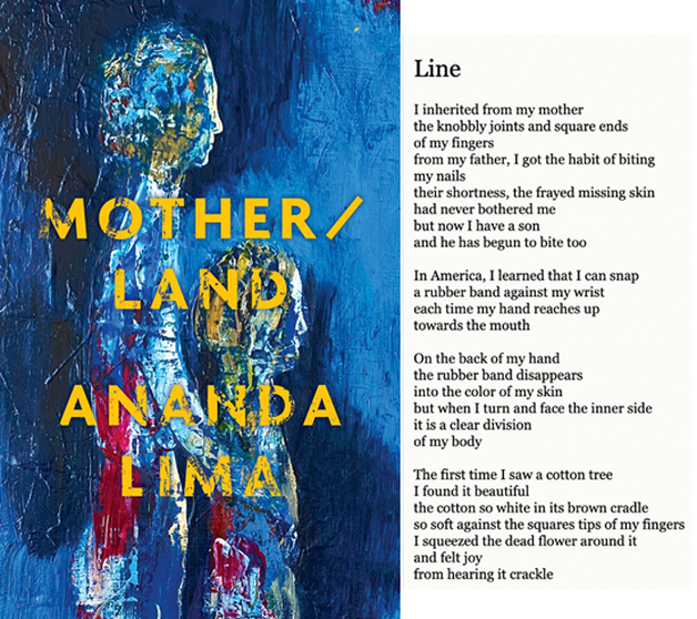 Mother/land cover (painting by Paula Langstein) and excerpt from poem from the collection (Though often these were poems where the visual played an important role.)  Ananda Lima, “Hart Chart,” part of Amblyopia Despite the contrast between the visual and medium complexity of the group and mine, I was only intimidated in the usual ways (ie, speaking alongside amazing people whose work you are very impressed by). But I did feel that I belonged with the group. Though I couldn’t initially verbalize why. In preparation for the event, I went searching for that verbal knowledge, trying to understand my feeling of belonging in the group. It wasn’t just that I was, separately, a photographer, as well as a poet. 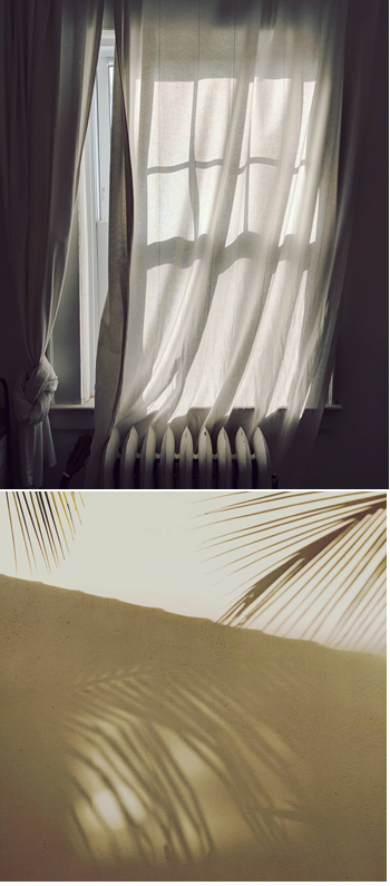 Ananda Lima, Photographs Or that I sometimes put photography and poetry together. 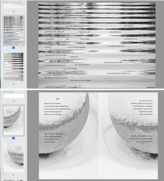 Proofs of Vigil (forthcoming), currently open in Ananda Lima's computer It wasn’t just that I had been interested in the friction that words and visual objects create in the page for a long time. 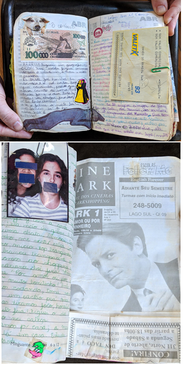 Photographs of early teenage diaries in the 90s It wasn’t that as a child I was introduced to Brazilian Concrete poetry alongside sonnets and ballads and thought of them collectively as just regular poetry: 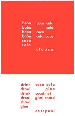 Décio Pignatari ("Beba Coca Cola") (Or that somehow concrete poetry for me is emotionally entangled with concrete concrete, as in cement, the concrete of the Brazilian modernist architecture from the 1960s and today. Or that geometric, intentionally graphic or brutalist concrete structures around the world transport me to a time and place that only exists inside me, bringing me home. 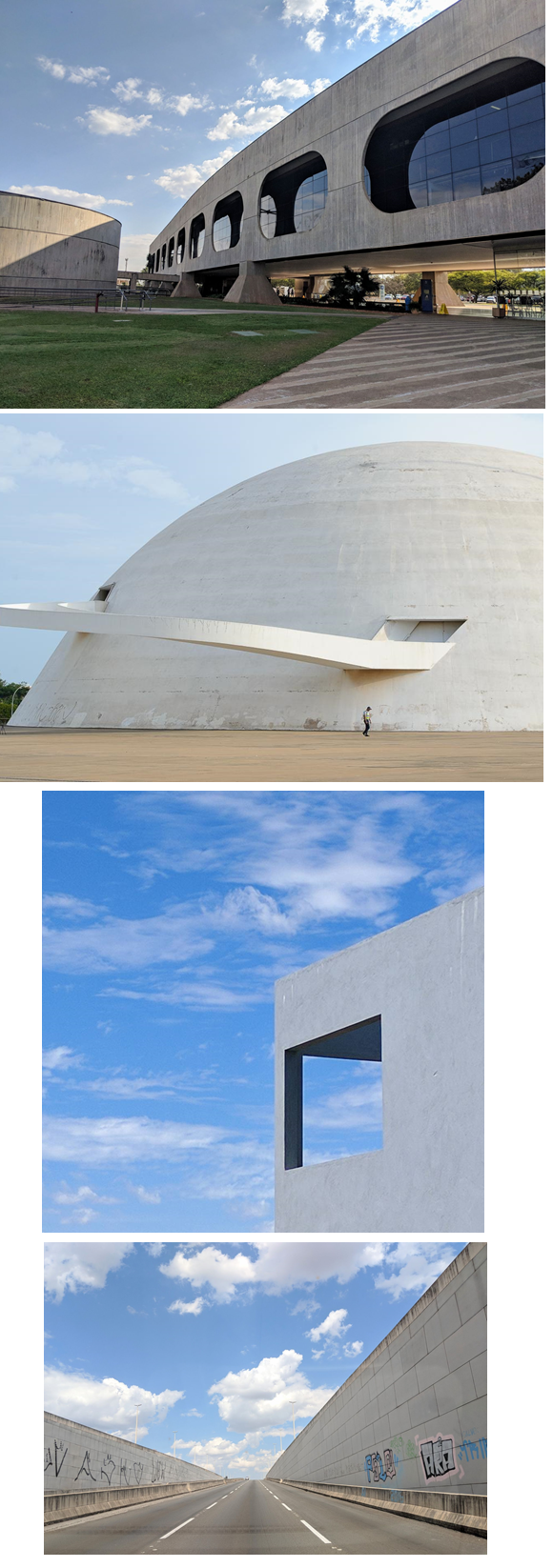 Ananda Lima, Photographs of Brasília Or maybe all of that was part of it, but there was something else, more fundamental. I felt connected to the work of those graphic poets in a more abstract way, which is less dependent on a specific medium or specific biographical events. I started thinking about the poem I would discuss with the group, “Amblyopia”: 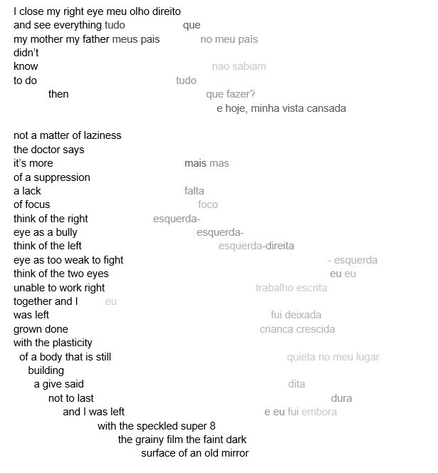 Despite reading it out loud in different ways in the drafting process, when it came to reading the finished poem, I just knew what to do. Again, that knowledge was fully present, but purely intuitive. I read the solid left side of the poem out loud, as I would any poem. But I only read the first two lines or so on the right side, letting the rest fade away into silence. That way of reading felt very right. It was both part of how the poem was saying what it wanted to say and what the poem was saying. And seeing that how and that what intertwined is what I want to see in a poem. As it often happens when thinking about poetry, all of this lead me to to line breaks, a fundamental feature of poetry (maybe even prose poems, in their opposition to the line). The line break is an additional meaning making element which interacts significantly and meaningfully with the verbal, but is not itself verbal. It can be combined to reinforce or be in tension with verbal language, a wrestling for breath between break and syntax. 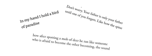 Erica Sánchez (“Amá”), Ocean Vuong (“Someday I’ll love Ocean Vuong”) Yesenia Montilla (“Imagining Him Running at the Sight of Deer”) Somehow the line break and that intuition about how to read “Amblyopia,” more than those explicitly visual art factors I mentioned before, were at the heart of why I felt I belonged with that group of graphic poems. Something about how the sound and the visual presence of text in the page sometimes reinforced each other, sometimes were in tension with each other and created meaning from their interaction. In graphic poetry, there is often a verbal component, words that have a stronger intrinsical link to sound, that can be read verbally without appeal for description. And there is the visual and/or tactile component, which “speaks” non-verbally. The poems are made of the two components working together to create something that cannot be simply replaced with description. In other words, graphic poetry is poetry. And it is poetry that makes that non-paraphrasable quality of poetry, fittingly, more visible. Verbalizing this, I am beginning to understand why graphic poetry, concrete poetry always felt to me, deliciously, a little meta, a little ars poetica, and very boldly poetry, even when the subject matter is not poetry or the poem itself. So the reason I felt I belonged there had less to do with the fact that I was also a visual artist, and much to do with the fact that I was simply a poet. A poet that cannot and does not always want to explain her poems. It had everything to do with that non-verbal factor that is essential to poetry, and a poem’s resistance to paraphrase. And there I felt right at home.  Ananda Lima’s poetry collection Mother/land (Black Lawrence Press) is the winner of the Hudson Prize. She is also the author of two poetry chapbooks (Amblyopia, Bull City Press, and Translation, Paper Nautilus), a fiction chapbook (Tropicália, Newfound), and a poetry and photography chapbook (Vigil, Get Fresh Books). Her work has appeared in The American Poetry Review, Poets.org, Kenyon Review Online, Gulf Coast, and elsewhere. She has an MA in Linguistics from UCLA and an MFA in Creative Writing in Fiction from Rutgers University, Newark. You may also like reading:
 Lea Graham in Quintay, Chile (credit: Mark Spitzer) I am so pleased to present Lea Graham's craft essay about her translation process for my anniversary month. The Working On Gallery turned one year old, and there is no better way to celebrate it than with her astonishing biographical essay. I had goosebumps the whole time reading it. This is why I started the gallery. This gallery is personal in the sense that it allows authors to share their creative processes, some created from years of intimate self discovery, culminating in the choices that define dreams and careers. Graham is a translator who currently works with a Chilean poet, Sergio Coddou. I translate Japanese waka-poems because I am seeking threads of my heritage through ancient words - - the use of language, images, and sounds - - If I study these poems, I feel the spaces between between my body (where I physically exist) and soul (where I belong) fill out. For me, waka-poems build my creative identity. My roaming soul (to borrowing some of Graham's translated words) is still out there. Time seems to crawl when I try to articulate what it seeks, or why it roams. But when the moment is right, it is beautifully answered. As if Coddou's wife said, “That word… it has a little bit of soil in it.”  Cerro del Plomo mountains (credit: Renato Warnken) It Has a Little Bit of Soil in It: Reflections on Translation & Place By Lea Graham Translation is intimate work. As with any significant relationship, there’s risk and routine. There’s something secretive about it too, as if you, the translator, have discovered what no one else has before. I often feel that I’m falling into the poem as I’m translating. The intensity of investigation into individual words, phrases or idioms; the searching into word histories, and the exploration of the poet’s life and concerns creates a familiarity, a camaraderie, an empathy. Like any intimacy, it slows the world down. When I first started translating poetry I was in graduate school in Chicago, living in the largely Spanish-speaking neighborhood of Pilsen on the Near West Side. The details of the living room in the apartment I worked from are vividly recalled: the honey-brown Mission-style desk (scored in a fancy North Side yard sale), a large red hibiscus flowering in one of the tall windows and a honey locust peering in from another. Both looked out onto 21st Place and Damen where I lived for nearly a decade and where later in the day I would hear the jingle of the elote man’s cart and then, the ice cream truck’s “Turkey in the Straw” as evening slipped into night. The ceilings were high, giving the room a sense of amplitude; various Spanish, English and etymological dictionaries lay in a half-moon around my computer and on the floor around my feet. Each morning two crows valentined each other—one from the roof of the house across the street, the other up in the tree. It took me a few weeks to realize that as I worked, they were having their daily coffee klatch.  Cerro del Plomo from the street in Santiago, Chile (credit: Sergio Coddou) My first project those years ago was in translating poems by the Chilean poet, Gabriela Mistral. My professor, upon learning that I was working in Spanish, said “Oh, you must translate Mistral.” She said it with such conviction but also in a tone that suggested I would continue to be the undereducated rube she thought I already was if I didn’t. What I learned from her that semester was the kind of teacher I did not want to become. Each class she made caustic remarks about all we didn’t know or would pointedly ask one of the older and more fluent graduate students to read our work out loud, not so subtly implying that she couldn’t bear to hear our pronunciation. Still, the lessons and experience of translating Mistral more than made up for the condescension. Gabriela Mistral was a poet and an educator who championed the rights of women, children and the poor before becoming a diplomat for Chile. She was a fierce advocate of democracy and education in her own country and throughout Latin America which is why so many schools still bear her name. All this appealed to me. I had spent a few years living in Spanish-speaking communities where, in one of my jobs, I worked as an advocate for Central American refugees. Weekly, I drove my clients to the Immigration Office in Paterson, New Jersey, stood in line, petty-bribing the guards with sticks of gum, a smile, and my whiteness, trying to get my clients moved up further in line. I still remember the negotiation process when we finally got to the counter: there I was in my ripped-at-the-knee-jeans, just out of undergraduate and my first time in the Northeast; my clients, mostly young or middle-aged Salvadoran or Nicaraguan men, all silent and anxious next to me. I could feel both their fear and faith as we negotiated their green cards in an exchange that was almost always rude and sometimes blatantly hostile. We always managed to get it done. Afterwards, I could feel the relief in their more relaxed postures as they insisted upon taking me to lunch at the nearby Salvadoran restaurant. That was where they would tell me details of their families back in San Salvador, Santa Ana, Managua or Esquipulas—of blackouts and nightly curfews, of the missing and the not knowing, of the last phone call they had with their mother, their brother, a niece. Those moments across a table where we shared plates of pupusas de queso y revuelta, tables covered in red and white plastic coverings, a picture of El Salvador up on the mostly bare wall, the low hum of conversation and small clatter back in the kitchen.  The Ozark Mountains, Northwest Arkansas (credit: Lea Graham) Despite these experiences and my philosophical connection to Mistral’s life’s work, I had never been to Chile. I had no sense of the breath-catching rise of the Cerro del Plomo from the streets of Santiago, the endemic flora that appears in her work—plants that couldn’t travel elsewhere because of the specific and confining terrain, or the Gainsboro to Spanish grays and Egyptian to azurite blues of the ocean off the Valparaiso coast that now, years and travels later, remain as some of the most mysterious and dreamy seascapes of my life. What I did understand was her loss of place and the identity that went with it. Mistral’s losses—both that of her lover and a beloved nephew by suicide, along with her name change from Lucila Godoy Alcayaga to her pseudonym (drawn from the names of two favorite poets; the Italian, Gabriele D’Annunzio and the Provencal, Frèdèric Mistral) were romantic to me at the time. But it wasn’t the kind of romance that made anything transcendent. Her pain for those she had lost, including a version of herself, were commensurate with her success as a poet, teacher and diplomat. Her poems were not salvation narratives; rather, they were fully immersed in both their anguish and their resoluteness in poetry-making itself. When I reflect now, I realize that the intimacy I felt that seemed so personal to me at the time was actually created through the poems’ specific locus and their energizing abstractions. It was the sense that all serious readers feel when they read good work: that the poet’s plight is your own. My own series of displacements in childhood began with my parents’ divorce in 1970s Northwest Arkansas when divorce was taboo at worst, and shameful at best. After relocating from a comfortable home in a small town to my maternal grandparents’ chicken and dairy farm, we moved to the nearby university town where we continued to change schools every two years. When my mother remarried, the displacement took on new characteristics in which my brothers and I learned in various ways that we were not valued, that we were burdens. It was this emotional displacement that complicated the geographical changes. It still translates all these years later like one loss blending into another. Alongside my early education of place, the graduate courses I took a decade later, with some notable exceptions, didn’t recognize me or my background. To paraphrase the poet Lucille Clifton, I had “windows” into other worlds through reading, but few “mirrors” in my education to recognize my own experience. The Southern towns and farm-scapes from where my language had grown and in which meaning and lyric were layered for me were dismissed as culturally impoverished. I sensed a dishonoring of my original places in the very place where I was learning to intensely read and write, a place where I was learning to teach other young people with even more invisible backgrounds than my own. Even with the privilege of whiteness and a certain kind of middle-classness, my lack of “mirrors” kept me from seeing myself as a serious writer and academic. But while I felt alone in my longing, I sucked it up, flattened my accent and embraced the urban North. My translation of the poem “Balada de Mi Nombre” (“Ballad of My Name”), stands out for me in its ability to inhabit both loneliness, the condition of being alone, and lonesomeness, that interior isolation that one feels no matter who they are with: My own name that I've lost, In this opening, the name has been lost to the speaker but still continues to live on in memory and the natural, sensory world. As the poem continues, we see the name personified; it is its own agent out in a familiar and beloved world to the speaker but apart from her. She, in turn, is a stranger to it: If without me, or if carrying away my youth, I love this poem for the way in which we see how profound the speaker’s isolation is. While the name is “lost” to her, it still lives on in this familiar world and fails to recognize the person who was, once upon a time, intimate with it. The speaker’s anguish at having others “tell” her that it walks “along the precipice of [her] mountain/ late in the afternoon” calls up deep loss and the pain of having to hear about it from others even as it still traverses the places that the speaker calls her own. The name has abandoned her without having abandoned the places she loves and the people she knows. The final line: “without my body and my soul roaming” can be read as both the name walking without her body and soul, but also as if “my soul roaming” is intrinsic to the name so that the name and her soul are companions, both lost to her.  Sergio Coddou Years, jobs and a few geographies later, I found myself translating poems for an anthology of contemporary Chilean poets and this question of identity raised its head in a different way. I worked all through that fall and winter with a native-speaking colleague at my institution. Irma and I would often meet in her office filled with brilliant-colored wooden animals, Day of the Dead figures, crosses and wall hangings from Latin America and Spain—color exploding from every wall and shelf so that you couldn’t help but feel a little more joyful no matter what kind of day you were having. We would happily haggle over words in the poems we were working on until one day when I was struggling to translate a small, spare poem that contained the word “alma.” Unlike the nature of Mistral’s spiritual work, this poem was far more bodily and overtly sensual. We struggled over whether I should go with “soul” or “spirit” or “essence.” We questioned how to render “soul” into the English language when it has become a word that means everything from religion to philosophy to personality to food to music? It’s a word that in meaning so much has lost its flavor. It was a conversation and translation dilemma that lingered long after the anthology was published. In working on that anthology, what caught my imagination most was the work of the poet Sergio Coddou, and his poem “Soy un Hotel” (“I Am a Hotel”). It was a poem that felt like a homecoming as I translated: I am a hotel decked out to receive your laments with a room especially accommodated to shuck myself in your presence and you make of me sublime popcorn with the fire of your glance. There was a shock of joy in translating the word “desgranarme” (to shell) when I finally landed on the word “shucked.” It was a word from my childhood that was fun to say—even before I learned what it rhymed with. The softness of the “sh” along with the hard “ck” sound had such satisfaction. But just as much, it was the connection to home—shucking corn with its satisfying sough and ripping sound along with the curious and maddening silks that we had to pick off for our grandmother so she could boil the sunny husks. While the poem was an early love poem to Coddou’s wife Rosario, it also had such a wonderful sense of place in its language and conceit. It was so beautifully raw and imaginatively romantic that I sent Coddou a message to see if he would let me publish my translations of his work in literary journals. When he told me he liked how I had rendered his work into English, especially the sound, it began an ongoing conversation. Then one winter night a few years after our initial email exchange, Coddou and his family were visiting Manhattan, and they invited me to dinner. I arrived at their Airbnb on the Upper East Side with a backpack full of cookies for the kids and a bottle of wine for him and Rosario. It was one of those New York City nights that smelled of snow. We had dinner in the spacious and warm apartment with their four children, who were clearly accustomed to their parents’ friends at dinner as evidenced by their courtesy and friendly ease. Dinner was followed by one of those conversations—full of art and poetry, Chilean politics and family history—which I relaxed into, never wanting it to end. Rosario told me that when he showed her that poem—the same poem that I had been so taken with—that’s when she knew “he was serious” about her.  Sergio Coddou and Rosario Navarro Our conversation continued as I told them about the process of translating the poems for the Chilean anthology those years before and, specifically, the struggle over the word “alma.” I told them about the dilemma of the English and how to go with “soul” was to invite religious or heavily philosophical baggage, while “essence” suggested the Clinton-Lewinsky scandal. So how could I do justice to the translation? The moment became especially vivid when Rosario touched her pointer finger to her tongue, marked the air with it, and said, “That word… it has a little bit of soil in it.” She explained that the word is connected to the land, to a specific place. It was one of those moments that stunned me in its brilliance. Why hadn’t I thought of that? After all, the word’s etymology came in part from the Arabic “al-ma,” meaning “on the water.” Her insight had concretized the word, turning it beyond the religious or the psyche and into locus—the place where things happen. It was a moment in which I had the profound glimpse at how embedded our language is in our place of origin. What she knew couldn’t be fully discovered in a book, but it felt deeply and intuitively accurate. There we were around a warmly lit table, the leftover dishes pushed to one side, the wine half-gone, several stories above the city where anything anyone might imagine was whirling around us like the snow that would come in the early hours of morning. In that extraordinary conflation of conversation, revelation, people and place, an intimate moment had occurred, a moment within a night that felt like my best experiences of translating. The most brilliant moments come unexpectedly and indirectly. I learned that while I wanted to be faithful to the original language of the poet, I discovered that what was really after and what I found was the spirit or genius loci within the poem’s stanzas and spaces. Lea Graham is the author of two poetry collections, From the Hotel Vernon (Salmon Press, 2019) and Hough & Helix & Where & Here & You, You, You (No Tell Books, 2011); a fine press book, Murmurations (Hot Tomato Press, 2020), and three chapbooks, Spell to Spell (above/ground Press, 2018), This End of the World: Notes to Robert Kroetsch (Apt. 9 Press, 2016) and Calendar Girls (above/ground Press, 2006). She is the editor of the forthcoming anthology of critical essays: From the Word to the Place: The Work of Michael Anania (MadHat Press, 2021). She is an associate professor of English at Marist College in Poughkeepsie, NY and a native of Northwest Arkansas. You may also like reading Dust in the Sunlight: Translating Light by Steven Teref and Maja Teref.  Working On Gallery, Summer 2020 - Summer 2021 I just cannot believe that my gallery, "Working On Gallery", is turning a year old! There were so many wonderful guests who talked about their crafts & writing processes from Summer 2020 - Summer 2021. Now, I have a list of new guests. They are all amazing poets, writers, translators, and editors. I am so excited to read and learn from their essays. Ananda Lima Chloe Martinez Hasanthika Sirisena Jamia Weir Josh O'Neil Kylie Gellatly Lea Graham Tanja Softić 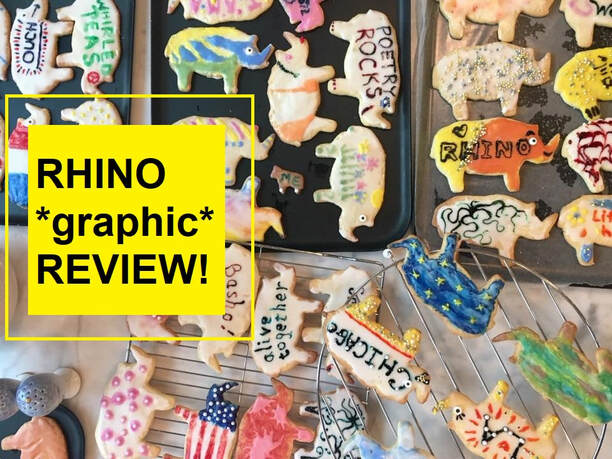 Moreover, one of RHINO Poetry's popular segments, RHINO Poetry *graphic* Review, will be out in September. This issue will be our third anniversary of *graphic* edition. All reviewers are experienced poets who also work with visual elements in their publications. It is going to be another phenomenal issue. Featured reviewers are: Aaron Caycedo-Kimura Anthony Madrid Chloe Martinez Crystal Simone Smith David Morgan O’Connor Frances Cannon Ina Cariño Jennifer Steinorth Kelly Cressio-Moeller Meg Reynolds Rodney Gomez Tricia Lopez * I will also have lectures and live reading events. The current (on-going) event is a 3D virtual graphic poetry exhibition at Kunstmatrix. Thanks to Tupelo Press, admission is free for all audiences. A 3D virtual graphic poetry exhibition will be held until May 22, 2022 at Kunstmatrix. Thanks to Tupelo Press, admission is free for all audiences.
This is the sample video what the 3D virtual exhibition will look like. There, you may learn about each piece closely along with process essays. All graphic poems were photo-recorded by a famous photographer, Jim Gipe, with his team. Their team also preserves historical art (paintings, drawings, & old photos). Their amazing projects involve scanning & stitching together files of artwork at the Eric Carle Museum. They also work with the Mark Shaw Photographic Archive leading to the publication of the film scans in Charmed by Audrey – Life on the set of Sabrina. (Sabrina and My Fair Lady are my father and my favorite movies all time) More over, they work with many museums & magazines. It is amazing how they took pictures of graphic poems and Tupelo Press created their first visual adaptation poetry collection. In this video, I am reading "Protest Against", which was originally published in North American Review. Poetry Editor Rachel Morgan & Managing Editor Jeremy Schraffenberger at North American Review discussed the graphic poem in Final Thursday Press.
Jacob Valenti created this promotion video. It is great because you can compare the original poem with graphic poem. Valenti filled in the words that I removed for the graphic poem. And my electric piano...(I know, I know that my dazzling smile might hurt your eyes.) It came from a dumpster. It was upside down on top of trash, and the electrical cord was missing. When I found it, I was like, "Who the hell throws a piano away like that!" I needed to rescue it. I practiced with it for a long time, and recently donated it to a Bulgarian family. Their grandfather and daughter played the piano. Now I have (drum rolls, please) a brand new beautiful, Yamaha! My friends asked me, "Did you find it in the dumpster?" This Yamaha is a little too heavy for me to carry from the dumpster. All craft essays are SUPER inspirational. I am really thankful that they supported this project. 本当にありがとう。A new collection of essays is coming soon!
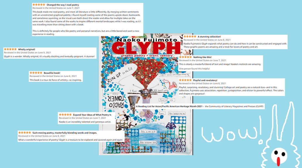 I have never had this many stars, even I was in an elementary school. This is the strangest feeling to describe - - I was already looking forward to the next summer when the last one ended. But once I am in the sun again, I feel like, "Oh, summer" - - then my eyes soak in the sunshine and I slowly feel, "Oh, that was what I was waiting for so long!" This delayed realization is exactly how I feel about "GLYPH: Graphic Poetry = Trans. Sensory". The book was officially released from Tupelo Press on June 1st. It is now available from independent book stores, and will be available soon from Amazon and large distributors by the end of June. About one week has passed since the book came out. Pre-order and exclusive poets, writers, and artists received them, and shared the kindest words with me. 本当にありがとう。  Tupelo Press Twitter @tupelopress When I received boxes of my books in the end of May, I was unexpectedly calm. I was chilling with it as if it was just another day - - but not. I know that it is hard to publish a book. It takes a tremendous amount of time & effort after trying, failing, learning, and fighting with my ego. Many, MANY people are involved from day one of GLYPH: Graphic Poetry = Trans. Sensory Project. They supported me in difficult times and when I was discouraged by rejections. They also shared my happiest moments with me. When I hold the book, this is not the end. Like a wedding ceremony, the commitment starts now. I will own this project and support the poetry & graphic/visual poetry communities with my experience and gained knowledge. 
This is a photo I created, but the KUNSTMATRIX is fun to explore.
One cool announcement: Tupelo Press set up an online exhibition at the KUNSTMATRIX. Please visit whenever you have a chance. 2020 - 2021 is a blooming season of graphic & visual poetry collections. * Rodney Gomez, Geographic Tongue (2020, Pleiades Press) Sarah J. Sloat, Hotel Almighty (2020, Sarabande Books) Judith: Women Making Visual Poetry by 36 women in 21 countries, Edited by Amanda Earl (2021, Timglaset, Sweden) Jennifer Sperry Steinorth's Her Read: A Graphic Poem (2021, Texas A&M University Press) Meg Reynolds, A Comic Year (Forthcoming, Finishing Line Press) * These collections were a part of this exciting graphic & visual poetry season. I was honored to know them and learn their crafting processes in the Working On Gallery. I am also aware that there are many stunning domestic and international collections that I have yet to be introduced. I am thrilled to meet more writers & artists though my lifetime. Jennifer Sperry Steinorth's Her Read: A Graphic Poem (Texas A&M University Press) just released in June. I recommend read this collection because this is a new type of erasure, visual, & graphic poetry. For more details, I wrote a review for the forthcoming RHINO Poetry Reviews. Steinorth shared the following craft essay of the making of her newest book along with her new erasure collections using Mary Shelley's Frankenstein, Or the Modern Prometheus. When I saw her Frankenstein erasure collection, it immediately reminded me of a theater play by Lookingglass in Chicago. Steinorth's color choices, textures, and mysterious, yet romantic art styles are like a performing art. Steinorth wrote, "I offer my erasure—rendered in ink and charcoal, thinking of the birth pains my monster necessitated through the voice of Mary Shelley, in what I imagine may as easily apply to her literary labors." Yes! That's it. Her process IS a performing art. I have been thinking about the future of visual & graphic poetry - - will it be tied together with films and theater plays? - - this notion is reinforced every day when I watch Netflix series of live action dramas based on comic books. The serial nature of the stories, along with the extended pacing shows a way more suited for the source material than film in some regards, and that flexibility may contribute to poetry adaptations. But I am still not sure that some short films & performance arts successfully adapt visual & graphic poems. When I observe their use of language, line-breaks, and other poetic elements, I feel like the visual aspects have more weight than the language portions. As a poet, I would like to see more word interactions. I am so lucky to see poets like Steinorth, Reynolds, Sloat, and Gomez challenging their mediums to find new ways to make use of such a great pool of poetry source material. 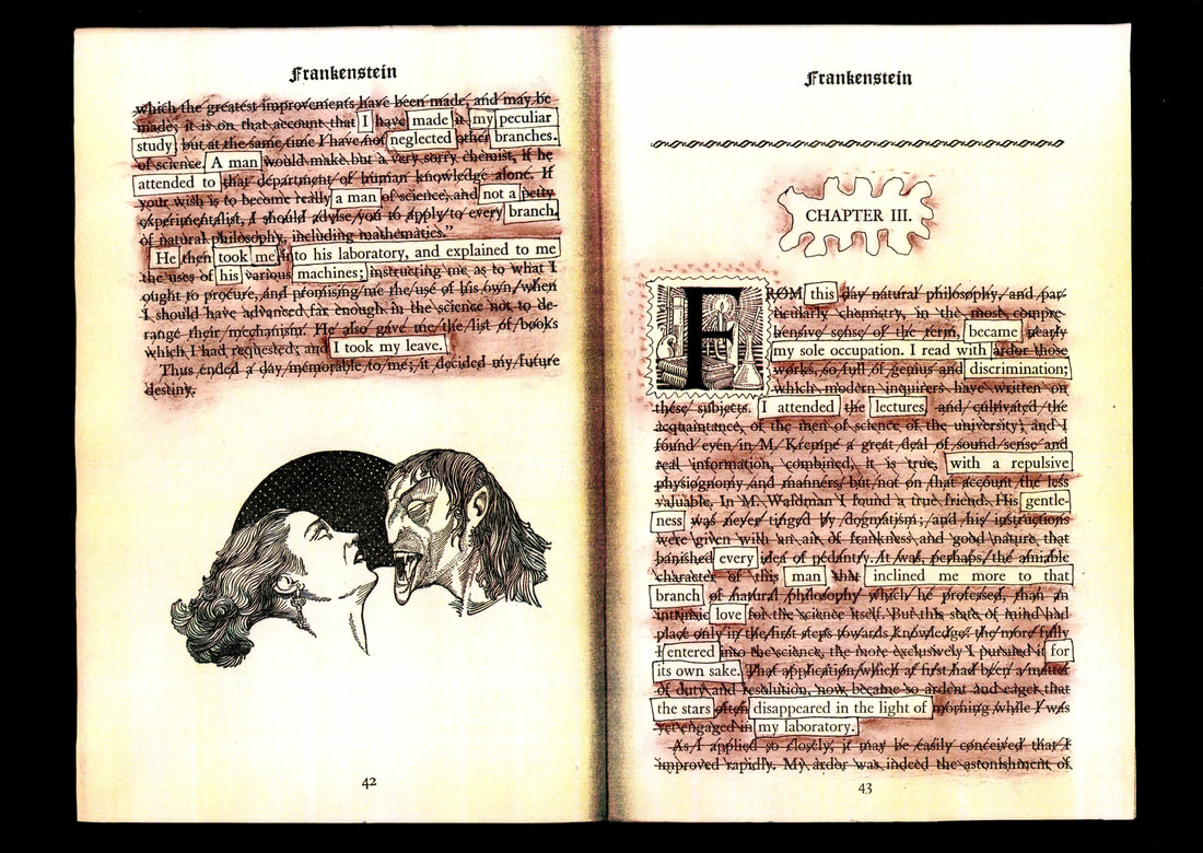 Jennifer Sperry Steinorth, "Mine the Dead", Visual / Graphic Erasure Poem Page 42-43 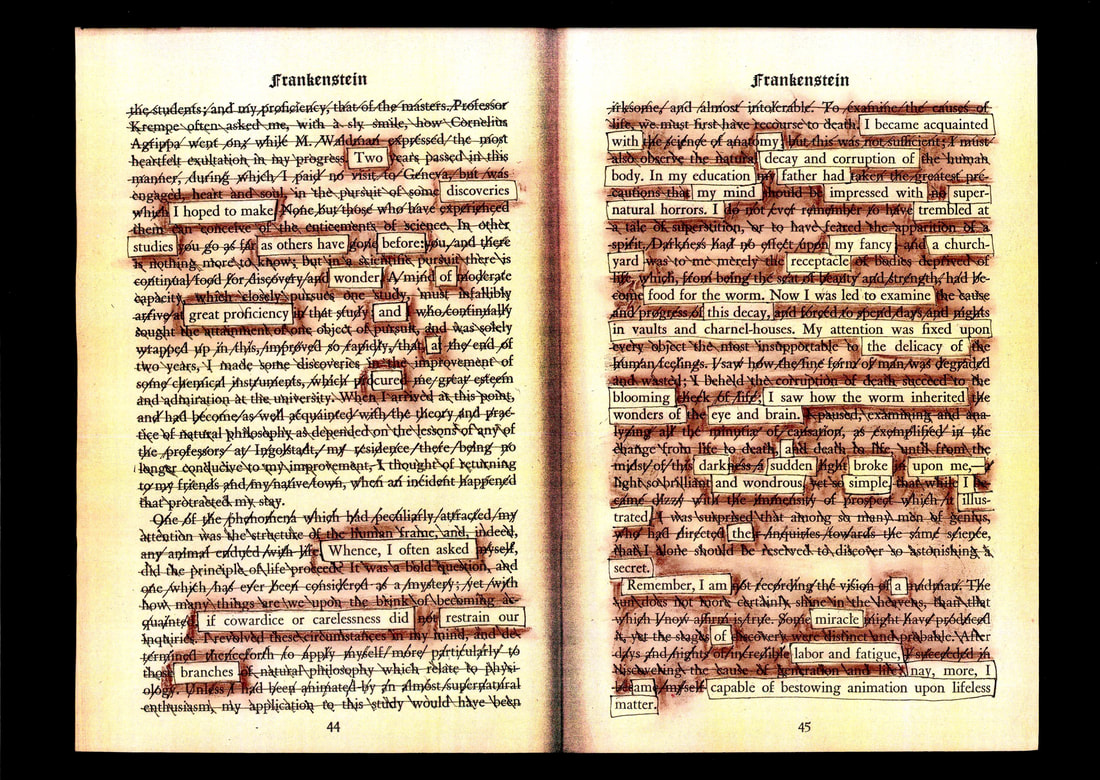 Jennifer Sperry Steinorth, "Mine the Dead", Visual / Graphic Erasure Poem Page 44-45 Mining the Dead: On the Making of Her Read, a Graphic Poem Craft Essay by Jennifer Sperry Steinorth In the summer of 2016—in the heat of that election—I set out on a project that would occupy much of my next four years: the poetic and visual erasure of The Meaning of Art by Herbert Read (Faber & Faber, 1931). I’d longed to try an extended erasure and finding myself too enraged to otherwise write, it seemed as good a time as any. I was immediately attracted to the physicality of the book—a red, mid-century, cloth bound text with the title and author’s name stamped in black modernist font, all caps. But while I was attracted to the body of the text, the title chafed. What hubris to unironically title a book The Meaning of Art—as if a single volume by one man could so deliver. And lo, in what turned out to be a survey of art from pre-history to the modern age, not a single female artist appeared—save one—and she not until the third edition in 1951. So from the voice of the male critic discussing male bodies of work, I began to excavate a first person female lyric. At times the excavation seemed literal—as tediously laborious as I imagine archeological digs might be. And the correction fluid I used to elevate the chosen words hardened to a veneer of stone that made the visible text appear freshly unearthed. And as I worked I sometimes envisioned women buried by station, gender, race, earth, time clawing through the rubble to gasp, clear their throats and speak. Once my undertaking seemed to have legs, I committed myself to deconstructing the entire text---all two-hundred sixty-six pages—including seventy black and white illustrations. But 266 pages was too long for my finished project. So I devised ways of conveying text from multiple pages into a single image. Windows could be cut between pages; multiples could be stitched together. Pages that weren’t pulling their weight could be amputated. As I neared the end and considered how to draw my book to a close, it occurred to me that I—we—the speakers and I—needed more control over the materials to articulate what remained to be said. Rather than continue to restrict myself to words in the order they appeared in the source text, I remove pages from the book and mined them for parts. I had done something similar with the six page catalogue of illustrations that appears in the fore word, surgically removing the names of all the artists and arranging them on a single page. In the Apologia to Her Read, I mention the years devoted to its creation were also riddled with chronic, debilitating physical pain. I worked from a standing desk because I could not sit in a chair. I would later be diagnosed with Celiac and Crohn’s diseases. The surgeries required to compose the late pages of the book were exceedingly tedious. I rested when I could no longer see; the pages I mined for parts became delicate—perforated (like my intenstines)—a kind of lace work. I affectionately referred to them as my “Frankenstein pages”. I felt like the Doctor hunched over my would-be creation. Like Frankenstein’s, my creature was made of recycled parts, and I dug the association with Mary Shelley—a woman shaped by numerous tragedies particular to women of her time. Not Mary the Virgin mother whose image is second only to Jesus in the Western cannon, but Mary, mother of a most beloved monster. The rhyming actions I perceived while manipulating the artifact gave rise to the appearance of Mary Shelley alongside the Virgin in the final pages of Her Read. And as I considered how I might approach a craft essay on the making of Her Read, I returned to Mary’s monstrous tale more particularly— zooming in on Chapter 3—the passages that chronicle the doctor’s art and the monster’s coming-to-be. I offer my erasure—rendered in ink and charcoal, thinking of the birth pains my monster necessitated through the voice of Mary Shelley, in what I imagine may as easily apply to her literary labors. 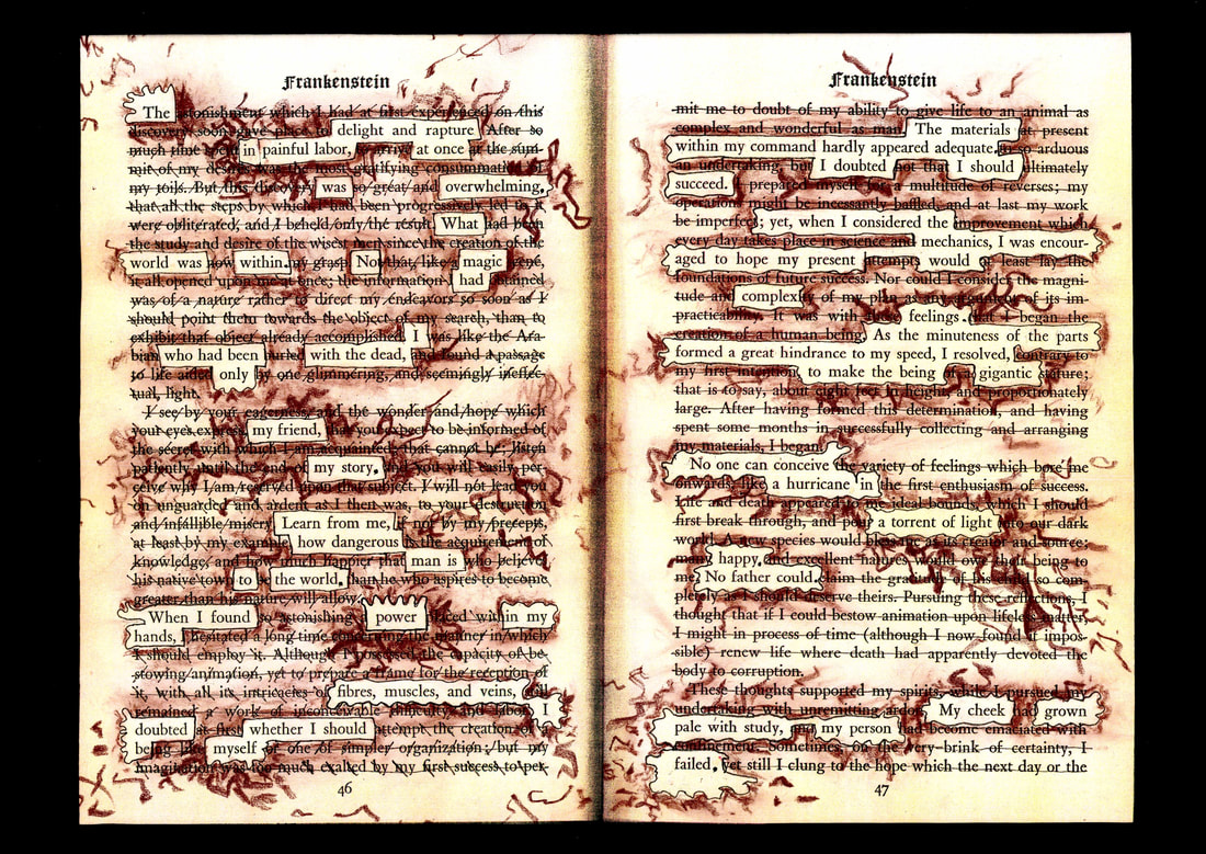 Jennifer Sperry Steinorth, "Mine the Dead", Visual / Graphic Erasure Poem Page 46-47 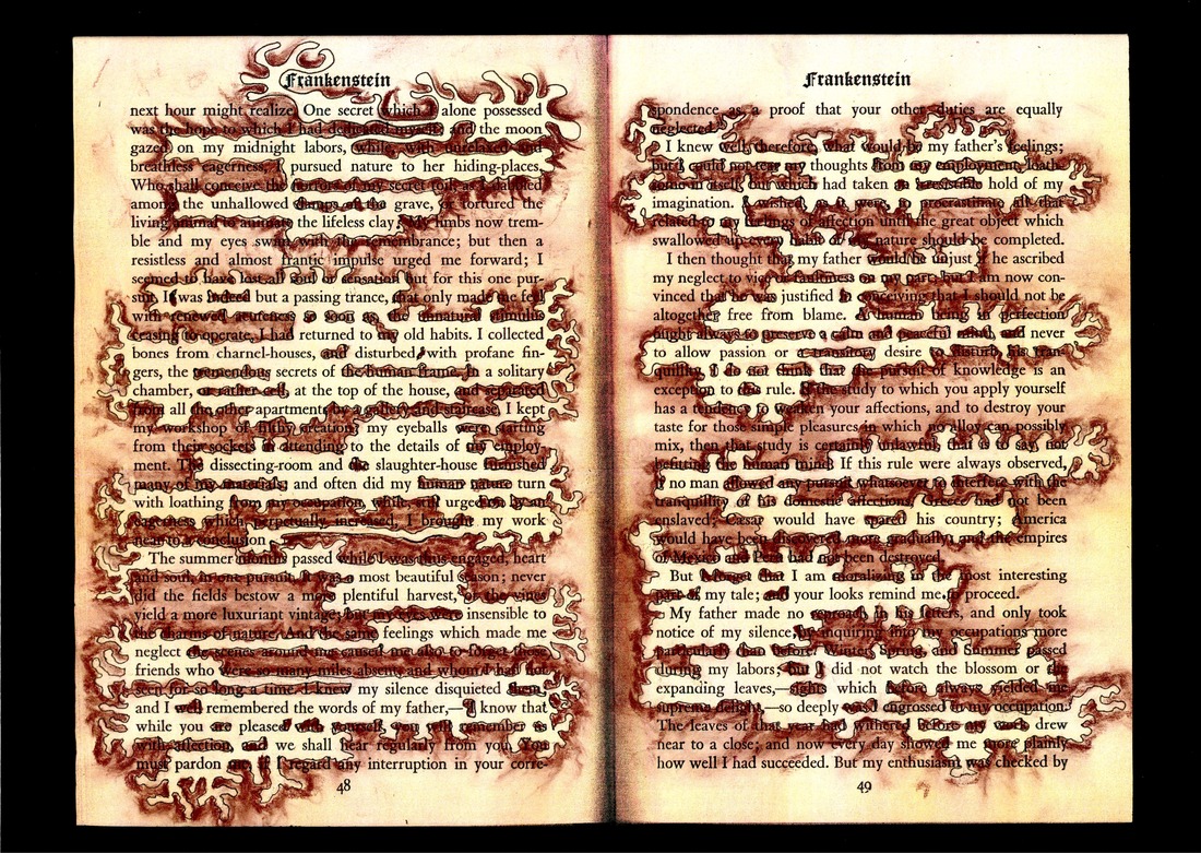 Jennifer Sperry Steinorth, "Mine the Dead", Visual / Graphic Erasure Poem Page 48-49 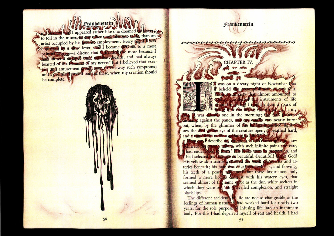 Jennifer Sperry Steinorth, "Mine the Dead", Visual / Graphic Erasure Poem Page 50-51 Bibliography: Shelley, Mary. Frankenstein, Or the Modern Prometheus. Garden City, New York: Halcyon House, 1949. Jennifer Sperry Steinorth’s books include Her Read A Graphic Poem (2021) and A Wake with Nine Shades (2019), both from Texas Review Press. A poet, educator, interdisciplinary artist, and licensed builder, she has received grants from Vermont Studio Center, the Sewanee Writers Conference, Community of Writers, and the MFA for Writers at Warren Wilson College. Recent poetry has appeared in Black Warrior, Cincinnati Review, Michigan Quarterly, Missouri Review, Pleiades, Plume, Rhino, TriQuarterly and elsewhere. Connect at jennifersperrysteinorth.com    Photo by Angela Narciso Torres RHINO Poetry Reviews' Editor, Angela Narciso Torres, posted the newest promotion video by Tupelo Press. This video has SO MANY HEATBEATS! "Making GLYPH" is created & edited by dearest Jacob Valenti, who gathered an enormous volume of my short videos and photos to tie together beautifully. My book, "GLYPH Graphic Poetry = Trans. Sensory", will be released on June 1st, 2021. I want you to "Trans. Sensorise"!  As of 05/29/2021, 6K Views!! Arigato!  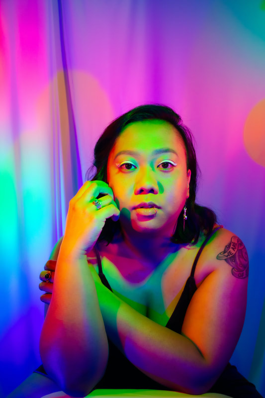 Ina Cariño I am not saying this because of the Asian/Pacific American Heritage Month, but are we - - Cariño, Fujimoto, or other Asian decedents - - living with certain expectations? When I read their following craft essay, "never good enough" strikes me. Being "perfect" is a curse of being an Asian, I wonder. I got to know Cariño's poems and art though #RHINOArt2Art. Then soon after, they won the 2021 Alice James Award for their manuscript Feast, forthcoming from Alice James Books in March 2023. I am really looking forward to reading the manuscript. It is definitely an exciting time for them, but it was not easy getting there. I know - - I am not Cariño - - but I feel the common moya-moya, which is like a haze covering a main core. I am about to reach it, but some doubtful emotion blocks me out. I started practicing the piano when I was four years old, and I had no doubt that I would became a pianist. During my teenage years, I had numerous concerts and competitions to prove my potential, but I ultimately failed. I realized that my skill had never achieved a professional level. But what kind of professional levels was I talking about? Like the International Chopin Piano Competition? This mindset was dangerous, and I do not know when it was seeded. It might be a part of me through Japanese society, education system, and culture around me. And I think that I expected success, much like I tried to learn perfect English when I came here, to America. My mind was changed when I was a finalist for the Kundiman Poetry Prize in 2015. That year, Jeffrey Levine (Tupelo Press) was the final decision maker. He told me, "Naoko, you have plenty of time". Yes. I - - we - - have plenty of time. Things that we learn co-exist through our art. Deep gratitude to Cariño. 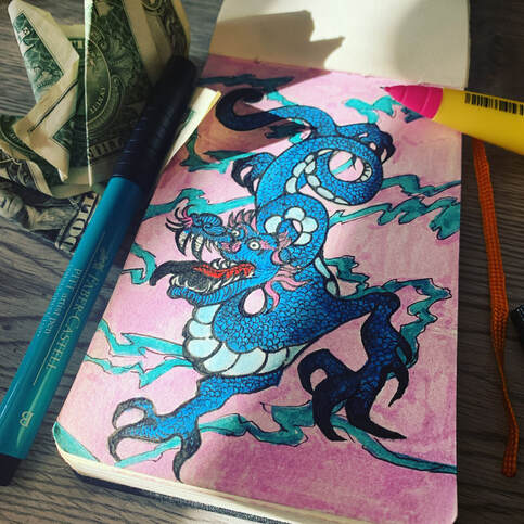 Art by Ina Cariño Taking Time by Ina Cariño When I was an undergraduate, I pursued, at different stages, degrees in music performance, visual art, and English literature. I started playing the violin when I was eleven—too old to really amount to anything in the world of classical music. But I was stubborn, and somehow passed the audition for a small but relatively well-known school of music. My Belarusian violin teacher warned me quite seriously that, though it wasn’t a conservatory, it would most likely be rough. And it was. It seemed I was never good enough, and performing in front of my peers gave me anxiety for the first time since I’d started playing. In fact, I think I got worse over time. A year and a half in, I switched to visual art. But I’m a failed art major too—after one semester of lugging art supplies around campus and barely passing my introductory-level drawing classes, I hopped right back to music. Eventually I would receive my bachelor’s degree in English, with a minor in music performance. It took me about eight years to finish college. 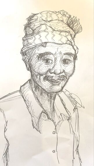 Art by Ina Cariño I come from a family of creatives. Growing up, my sisters and I took piano and painting lessons and sang in our school choirs. We were encouraged to read and write. I was kind of a sickly kid, and spent a lot of time indoors, so I guess I’m predisposed to creative activities—but looking back, I never really finished anything. I always stopped halfway. I mostly rode on being naturally good at things, which only keeps going if you put in the time and effort. Grad school was different, maybe because I was older and less concerned with the anxieties I had in my early twenties. The two-year MFA program I attended was a magical space for me. Because writing is at first a mostly solitary act, I felt I could take my time and breathe while drafting a poem. I didn’t have to perform for anyone in abstract ways. And though workshop could sometimes be rough, I never once felt crushed after a critique. At the end of my time at the program, my adviser told me that my thesis—the bones of my first poetry manuscript—was “ready.” Some are, he said, and some aren’t. Ordering the poems in my manuscript was a bit like writing a longer poem. At first, I (embarrassingly) ordered them in chronological order from the speaker’s point of view. My adviser laughed and told me to take stock: what motifs, images, forms, and emotional cores did each poem have, and what was heightened or muffled when one poem followed another? I spent so many nights in my last semester shuffling my poems, reading and rereading them. I read them out loud, over and over. So much time, creating this body of work. I had to finish, and I did. Finally, I’d seen something that I’d created through until the end. After grad school, I worked your typical after-grad-school job as a barista for about a year. When the pandemic hit, I made the decision to quit because I would make more money on unemployment. Those were hazy months. Between taking part in Black Lives Matter protests and spending more time in my apartment with my cat than I’d ever done before, I’d been sending out my manuscript everywhere, and was a finalist a couple of times for first book prizes. But really, I was losing hope for my writing; my manuscript was rejected over and over again. 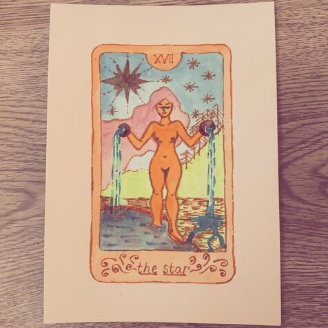 Art by Ina Cariño Unemployment didn’t last forever. Currently, I’m a technical writer for a loan and mortgage company. I work remotely Monday through Friday, from 8 to 5, with an hour lunch. Every workday has been a struggle. I don’t feel like writing after work, and, like others, I felt so isolated during quarantine. One day in March this past year, during my lunch hour, I got a call from a press to which I’d submitted my manuscript, and they told me that I’d won their book prize. It had been two years since I graduated from my program. I know that for many, it takes even longer. Of course, I was thrilled. Still, right now, I feel so far away from the poems from my thesis, and so far away from any poems that I’ll write in the future. I’m kind of in limbo, floating back and forth between almost writing and not writing at all. And I think that’s okay. In the past I’d wondered if it was too late to go back to art, to music. And I think it’s not. And we still have so much time in isolation, even as the new CDC mask guidelines have been announced. I’ve been drawing more. I’ve been trying my hand at watercolor, something I’ve always been terrible at. I picked the guitar back up, when I’d only dabbled in playing it in the past. And sometimes I worry that I’m not really a poet, which is a fear that many poets probably have. Every day is a struggle, each moment shifting and changing in ways that can sometimes make things seem more uncertain. And I’ll never be a violin virtuoso, or an artist with solo shows. But I think I’ve finally made peace with the fact that things take time, and that time takes time, too. Ina Cariño holds an MFA in creative writing from North Carolina State University. Their poetry appears or is forthcoming in Poetry Northwest, Apogee, Wildness, Waxwing, New England Review, Tupelo Quarterly, and elsewhere. Ina is a Kundiman fellow, a Best of the Net finalist, a Pushcart Prize nominee, and a recipient of a fellowship from the Vermont Studio Center. They are the winner of the 2021 Alice James Award for their manuscript Feast, forthcoming from Alice James Books in March 2023. In December of 2019, Ina founded a poetry series, Indigena Collective, centering marginalized creatives in the community.
 I am still collecting craft essays from poets, writers, and translators. I would also like to share my journey of releasing my newest book, "GLYPH: Graphic Poetry = Trans. Sensory" (Tupelo Press, 2021) in the Working On Gallery. The book will be nationally available on June 1st. GLYPH: GRAPHIC POETRY=TRANS. SENSORY by Naoko Fujimoto $21.95 All color Weight 0.5 lbs Dimensions 8.5 × 11 in Sample Page My first GLYPH journey was with DJ Daphne from the Poetry Show at Radio Boise. We talked about graphic poems, creative processes, and Japanese culture. Her warm, welcoming tone guided me beautifully. It was like a girl's talk. I really enjoyed having a conversation with her. As many people know, I am super not good at calculating time zones. I almost made a huge mistake (again), but I was fifteen minutes early, so I was playing the piano to pass the time. So I did not realize that she was there! The show was recorded on a peaceful afternoon. You may like listening to my 100% authentic NAOKO voice. "The Poetry Show!" airs from 5-5:30 p.m. MT (7-7:30 p.m. CT) Every Sunday The Radio Boise streaming service It is a really exciting time for Aaron Caycedo-Kimura. His debut collection, Ubasute, is a gorgeous chapbook. I am going to talk about his chapbook in RHINO Reviews (forthcoming). His full-length book will be available in 2022. He shared his new project, Aizome postcards. It is a strange coincidence, but my grandmother had practiced Aizome, Kusaki-zome, & Shibori for a long time. I still have some her works with me, so I just opened up my old suitcase thinking of her. Now, her Alzheimer's condition is worsening, and she was just moved to a hospital. Aizome blue is different from any other blue. It is dark, slightly brighter than the bottom of ocean. It is a blue mixed with both sunshine and shadow. It is the color of Japanese everyday life. Caycedo-Kimura's paintings captured it. When I was in elementary school, I tried Aizome-Sibori with my grandmother. Even though I wore gloves, I ended up died blue from the head to toe. I had blue spots on my cheeks all afternoon. My sister had a flower pattern and she succeeded. Mine was an incomplete mess with blue and white dots on a cloth. I feel close to my Japanese identity with Caycedo-Kimura's works today. ありがとう。 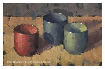 Aaron Caycedo-Kimura Craft Essay by Aaron Caycedo-Kimura Every year from December through January, I participate in an exhibit at the Chester Gallery in Chester, Connecticut, now owned and operated by artist Nancy Pinney. The exhibit is called the Postcard Show, a magical gathering of pieces that are 4” x 6” or smaller from about sixty local and regional artists. Inspired by Sol Lewitt, who had much of his framing done at the gallery and was an early contributor to the show, the former owners Jack and Sosse Baker came up with the idea more than twenty years ago, just because they liked postcards. The work ranges from watercolors to oils, from photographs to collages, from multi-media to the three-dimensional. Over the years, I’ve painted still lifes, landscapes, and buildingscapes in oil for this show. Since many of my still lifes sold in 2018 and 2019, I decided to make them again for the 2020 holiday season, but I wanted to try something a little different. In May of 2020, I started following the Instagram account of a boutique in Tokyo called Blue & White (@blueandwhite_japan) at the recommendation of writer Mari L’Esperance, author of the poetry collection The Darkened Temple. The store, which collects and sells blue and white crafts, is one of her favorites. The clothing and textile items in their inventory are all aizome products (indigo-dyed). They also collect old handmade tools and furnishings, which appeal to my rustic tastes. After following the account for a while, I thought it might be interesting to paint the postcard still lifes monochromatically in aizome blue. At the same time, I felt it was a bit risky. Part of the appeal of my previous still lifes was the handling of temperature—the degree of warmth and coolness in colors and their interrelationships—to create harmony, atmosphere, and depth. I had some experience years ago painting monochromatic figures and portraits, and so I knew that without a full palette of colors, including yellow in particular, one had to rely just on tonality to make a compelling image. 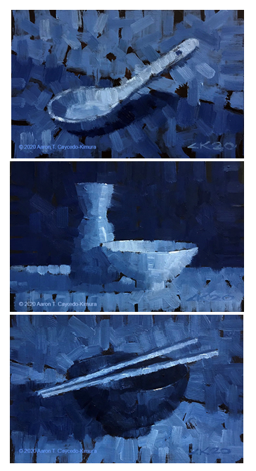 Aaron Caycedo-Kimura My first challenge was getting the right hue. I drove to the art store and bought a 200 ml tube of “indigo,” thinking that would be the easiest solution. I started by painting a white Chinese soup spoon. I like to paint from life whenever I can and used one that belonged to my mother. For paper, I used Wallis Archival Sanded Paper (museum grade), which is hard on the brushes—I use inexpensive ones that I buy every year—but I like the way it holds the paint. On finishing the painting, I loved the color; however, it wasn’t as blue as I thought aizome products usually are. It was grayer. So I mixed it with ultramarine and a bit of cerulean. I painted the spoon again, almost an exact copy of the first image just to compare. Satisfied with the new blue, I painted a series of fourteen postcards, the first five for the gallery and then an extra nine to sell from my studio. To test whether or not people would respond well to them, I started posting the first ones on my social media accounts starting in November. I still wasn’t certain the general public would “warm” to the them because of their lack of temperature. Many times I find that what I like isn’t necessarily what everyone else does. To my delight, they were well received. I think blue is just an appealing color. The most challenging aspects of painting these were making the relationships of light and dark accurate, or at least convincing, and also choosing objects that would give the paintings nice ranges of lights and darks. I usually block out a painting first by starting with the lightest tone then working my way down to the darkest, keeping in mind that the highlight will be pure white and needs to pop, even when it’s on a white object. The relationship between a white object and its highlight is greater than one might think. I tried different objects and combinations of objects, trying to keep the tonality dynamic. Generally, I found that white objects worked the best, standing out to the eye like an actor onstage in the spotlight. There were a couple of exceptions where I chose as the main object something dark, accented with a smaller, lighter object or objects. These seemed to work well, too. One special outcome of this endeavor is that many poets and other writers I know now own some of these postcards. I love the thought of these paintings in their homes as they create their own work, keeping them company, and maybe inspiring them in some way. I'm currently working on some larger monochromatic “aizome paintings” with the hope that they will be equally successful.  Aaron Caycedo-Kimura is a writer and visual artist. He is the author of Ubasute, which won the 2020 Slapering Hol Press Chapbook Competition, and the author of the full-length collection Common Grace, forthcoming from Beacon Press in Fall 2022. His poetry has appeared in Beloit Poetry Journal, Poet Lore, DMQ Review, Tule Review, Louisiana Literature, The Night Heron Barks, and elsewhere. Aaron earned his MFA in creative writing from Boston University and is a recipient of a Robert Pinsky Global Fellowship in Poetry. He is also the author and illustrator of Text, Don’t Call: An Illustrated Guide to the Introverted Life (TarcherPerigee, 2017).
 Love this book cover-art. I translate:
They are two types of translations; however, the both are utilized by Steven & Maja Teref mentioned in their craft essay. [A]s translators, it is our job to move the “data” and “information” of the source text to help the reader make sense or gain “knowledge” about a text, and we hope that by anchoring the music of the text in fixed English syntax, we have generated a blueprint for the reader to understand and enjoy it. That beautifully explains what translators do with their works. For my two translation works:
The translators build a bridge from the original written text to the readers who may live in a different time & place. Steven & Maja Teref have been perfecting their translation method together as a married couple. They translate from Bosnian, Croatian, and Serbian to English. It is a bit north of Croatia, but it was in Czechia that Kelcey Parker Ervick found inspiration for her book. It is a biographical collage (mixed with texts, footnotes, fragments, and images) entitled "The Bitter Life of Božena Němcová: A Biographical Collage". In today's craft essays, there are some original languages, and they remind me of texts from Parker Ervick's book. She also joined the graphic poetry audio exhibition. Craft Essays by Collaborated Artists in the Working On Gallery: Gail Goepfert x Patrice Boyer Claeys
Onetime, I asked Steven & Maja Teref how they find words? They immediately said, "Like when we do dishes?" I remembered that I thought about how romantic it is to search for one exact word after dinner, doing dishes, and wiping off plates together. It was just an envious moment for artists who have each other to achieve the same goal; in addition, the chores are also done. Two birds with one stone! I could image them working together, as if on an assembly line - - dirty plates into soapy water, brush, rinse, & wipe with a dried towel (with yellow & dark green flower prints of course) - - in smooth motions, they found a particular word for their particular poetic line. So, I would like to ask you today to read the following craft essay while imaging them at their dining table.  Dust in the Sunlight: Translating Light by Steven Teref and Maja Teref Literary translation is the seeking of a text’s light. The more difficult the text, the more difficult to see its light. Imagine a sunshaft through a skylight window, the soft heat stirring the air. In the updraft, dust motes clot the light. Imagine this dustlight as the difficult parts of a text. The more difficult the text, the more backscatter. To translate a text is to translate its light. Each writer we choose to translate comes with challenges, but our end goal remains the same: the reader has to see the writer. The most difficult writer by far for us has been our latest project: translating MID (pronounced “mead”), the nom de guerre of Mita Dimitrijević, the most enigmatic character of a group of 1920s Yugoslav avant-gardists who referred to themselves as zenithists. He is such an obscure figure that when Belgrade, Serbia recently mounted an exhibition this year in celebration of the hundred-year anniversary of the short-lived movement, MID’s presence was conspicuously absent. MID would seem to be the backscatter of zenithism. For context, zenithism was a unique literary and art movement in the crowded field of 1920s avant-garde Europe on numerous fronts because it was a cross-genre movement on two levels: it synthesized the various separate avant-garde tendencies into one aesthetic, and it embraced hybrid writing as a central tenet of its poetics. From the word-packed panels (like action-packed film frames) of Ljubomir Micić’s Your Hundred Gods Be Damned to the Dada-leaps of Marijan Mikac’s poetry in Effect on Defect to the cinematic jump-cut landscape of Yvan Goll’s long poem Paris Burns to the tragi-comic expressionist-proto-surrealist novel of Poljanski’s 77 Suicides, each zenithist scattered the light. And then there is MID. MID was so ahead of his time that his time is yet to come. His omission at the zenithism retrospective this year confirms it. MID published two books with the zenithists: The Sexual Equilibrium of Money (1925) and The Metaphysics of Nothing (1926) before seeming to drop off the face of the earth. We have translated the former, a work as innovative in 2021 as it was when first published. What makes MID so difficult to translate, what makes his work so buried in dustmurk is the density of his metaphoric language and the allusions worming through his work.  Yes, his work flips from prose to verse and from Dada to surrealism, but that’s child’s play for him. For a text punctuated, at times, by nearly empty pages, Sexual Equilibrium of Money is a dense work. Its alternation of word-bursting pages and ellipsis-strafed pages makes the work a dynamic feast as much for the eyes as for the mind. On its surface, it seems as if each page follows its own set of rules independent of the other pages. Is the work fiction? Poetry? A philosophical treatise? A collage? Found text? Is it even about money? Yes, all of the above. It is as much about economics as it is about Yugoslav identity, European politics, Kantian philosophy, the opposing natures of God and Jesus, the nature of nothing. Added to the mix were editorial errors such as cited text missing closing quotation marks. This isn’t to say that the book doesn’t have structure. The book is formally split between the verso and recto pages. The unnumbered verso pages generally repeat the word “KEY,” but the word degrades as the book progresses. The recto pages, their page count in descending order, can very loosely be chunked into four sections:
This is not a well-established theorized structure, since there has yet to be much literary criticism on MID, but this helped us understand how to approach MID’s esoteric text. The allusions are more times than not uncited or intentionally mis-cited. For instance, MID inserts a German translation of Hamlet’s famous line, “To be, or not to be” and attributes it to Schopenhauer! It must be noted that the verso pages begin with the declaration: “STEAL FREELY!” MID did this with aplomb. For all of the seemingly random quotes and concepts, the book is anchored in numerous refrains, such as Kant’s “thing-in-itself” and the word nothing. We workshopped an excerpt of an early draft of our translation at a Third Coast Translators Collective workshop (TCTC), but our fellow translators were daunted and perplexed by what we thought was a comprehensible first draft. Despite our best efforts at the time, all they saw were the “dust motes” or what Toni Morrison would call “data” and “information,” but the reading of the text for them remained largely hindered by the lack of rhythm and structure of the English language. The feedback was insightful and unanimous—keep the strangeness, the oddity, but the connective tissue needs to be familiar; keep the Hegelian/Kantian diction but adhere to English syntax. We were still far from Laurence Perrine’s “cone of light” or the ability to have the reader cull some knowledge from the text. Not surprisingly, since Bosnian-Croatian-Serbian has a developed case system, it has an incredibly flexible word order, something that English, with its sparse case system, doesn’t have, which accounts for its dependency on fixed word order. To help the reader see what we saw meant that we needed to tame the word order and expand the “cone of light” so that the light can contain or encompass the dust motes within its shaft. To backtrack a little to elucidate our process, doing the “trot” (or “gloss”) of MID’s text, felt more like taming a wild horse, or translating the first, literal draft. Although this project was not our first rodeo, translating MID seemed impossible at first: tackling a hybrid text which reads like prose poetry written in finance jargon with Hegelian and Kantian reasoning and sentence structure, printed on invoice banking paper with pagination in descending order and with the refrain of difficult-to-translate, opposites, necessitated, first and foremost, a slow, close-reading and, more than anything else, thorough reading comprehension. As we hacked and combed through the text, we often thought of Toni Morrison’s essay “Unspeakable Things Unspoken” in which she cautions us all to be aware of the progression of understanding from data to information to knowledge to wisdom. We felt at times palpably stuck on data interpretation of recurring opposites, namely the pairing in the phrase lice i naličje, so much so that Morrison’s information stage didn’t even seem in the offing. In our pursuit of clarity and light, the genealogy of lice (face, front, obverse) and naličje (back, reverse) took us from “reverse and obverse,” and “heads and tails” to “front and back,” “face and back,” “outside in and inside out,” “overt and covert,” “seen and unseen,” “visible and invisible,” or “recto and verso,” but through this journey, we began to gain some knowledge on how to think about his dust-thick work by trying to live in MID’s head. It became clear MID was satirizing the deceptively balanced yet hopelessly elusive, unjust Kafkaesque world of finance. The absurdity of his refrains started to sing for us, and we began to laugh with him. Yes, he was playing with the reader, much like a master Dadaist, but there was a logic underpinning his argument, as arcane as it was, so we also had to follow his clues. One allusive sentence in particular stood out: “Arius of Alexandria preached that the first perfect creation was dead matter (+), a ‘thing-in-itself:’ a WORD created from NOTHING: an eternal, self-important, UNCREATED divinity (–).” Up to the TCTC workshop, we had been only able to see the dust and not the light of the text. But for all of MID’s dust, he leaves hints of light. The dichotomy is not the front and back of a bill but the dual nature of nothing. Arius argued that Jesus had a distinct corporeal beginning and end that could be seen—he came from nothing and was therefore not eternal. Whereas God, without beginning and without end, cannot be seen and is eternal. This idea of being seen or not seen, coupled with numerous quotes with the word nothing, seemed central to understanding the work as a whole. The Sexual Equilibrium of Money is not a religious treatise, but the religious conceit serves as one of many conceits driving MID’s exploration on the nature of currency. In fact, the book, like its companion, is an early example of conceptual writing. If there was a single key to unlocking the cryptic secrets of Sexual Equilibrium, this sentence seemed as likely a candidate. If nothing else, it allowed us to find a way to make sense of the recurring references to “thing-in-itself” and “nothing” in relation to lice i naličje. As a result, we eventually landed on the “seen and unseen” as perhaps the best solution. Part of what makes translating MID so difficult is that there has yet to be extensive scholarship on his work. Working with Columbia University scholar Aleksandar Bošković, we’ve been able to decode many of MID’s allusions and make sense of his logic, and as a result, untangle his syntax into recognizable English-language sentence structures. The Sexual Equilibrium of Money will appear in the forthcoming Zenithism (1921–1927): A Yugoslav Avant-Garde Anthology on Academic Studies Press in 2022. To return, once again, to Morrison’s essay which we have applied to translation, as translators, it is our job to move the “data” and “information” of the source text to help the reader make sense or gain “knowledge” about a text, and we hope that by anchoring the music of the text in fixed English syntax, we have generated a blueprint for the reader to understand and enjoy it. And as for Morrison’s explanation of “wisdom,” it is our hope that our reader’s experience of MID’s text will better illuminate the world around them having read this translation. Maja Teref and Steven Teref translate from Bosnian, Croatian, and Serbian. Their books include Novica Tadić's Assembly and Ana Ristović's Directions for Use, the latter of which was shortlisted for the National Book Critics Circle Award, Best Translated Book Award, and the National Translation Award.
Maja is a past president of Illinois TESOL. She teaches English at the University of Chicago Laboratory Schools where she is also the faculty advisor for Ouroboros Review, a student-run literary translation journal. Steven's other books include Foreign Object, Pleasure Objects Teaser, and The Authentic Counterfeit. He is currently coediting with Aleksandar Bošković Zenithism: A Yugoslav Avant-Garde Anthology (1921–1927) (Academic Studies Press, 2022).  "Cherokee Road Kill" (Dr. Cicero Books) Some people have never done collaborated works. When I watched reality TV shows like Project Runway, candidates sometimes did not get along in their group projects. So did some writing classes that I took in the past. Do collaborated projects give us a headache? Often, we as artists are so focus on our individual achievements that we cling to what we've already established. I've done it. But through the experience, I think that only individual success means less than we think in the long run. Our individual creativity shines when we have multiple unique creations around us. If our community is boring, our own art might be boring too. Through 2020 and 2021, I witnessed multiple collaborative works between poetry & art. I asked about their creative processes, and one thing that I noticed was that they were light as a feather, in contrast to unsuccessful collaborations feeling heavy and incoherent. Craft Essays by Collaborated Artists in the Working On Gallery: Gail Goepfert x Patrice Boyer Claeys
 From "Cherokee Road Kill", Drawing By Kyoko Miyabe The successful collaborative works were rigid as a whole presentation, and I could feel trust and respect from the final products. It is so hard to find the best match for a collaborated work. But how exciting it is when you find a great teammate in your creative process! Today's guests, Celia Bland & Kyoko Miyabe, intermingled their creative approaches when they collaborated on Cherokee Road Kill & one broadside together. In the following video, I read "Brave" from Cherokee Road Kill. Bland kindly gifted me a signed copy. Thank you so much. I actually wanted to read "Trail of Tears", but my website did not have the capacity for a long record. It is a 6 page-poem, each page has a paired drawing on the side. I think that the poem truly highlighted both a collaboration of Bland's words and Miyabe's images. If you are interested in seeing the beautiful work, find out! 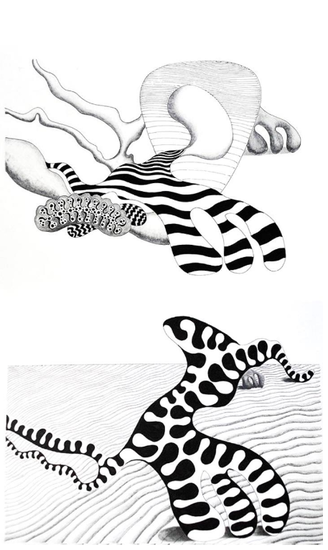 From "Cherokee Road Kill", Drawing By Kyoko Miyabe Sight itself is a picture. By Celia Bland My mother is an artist and even now, in her 80s, she paints every day. When she runs out of blank canvases, she begins painting over paintings. For her, the act, the practice, matters more than any objectified goal. Watching my mother as she opens her birthday presents -- the way she feels of the silky ribbon, lifts the deep pink of the birthday card to her face as if she would taste its color, smooths the wrapping to absorb texture and even sound through her finger tips – it’s almost too private to watch such a sensual dialogue with the world. Growing up with someone who creates beautiful things has made me greedy for beauty. My most recent poems, which take the form of scripts for a TV series about Andrew Jackson and the Seminole leader, Osceola, were spawned by memories of my childhood in Florida where my mother was an art professor. Shut-in, cut off, here in the Hudson Valley of New York, since March, I was reading about Mar-a-Lago and the pro-Trump regattas, about the absurd, tragic response of the Florida governor to Covid-19 and the death tallies, and I began thinking about the Seminole Wars that resulted from a very Florida-style land grab in the 1830s. President Andrew Jackson’s (illegal) proclamation that the Seminoles be “removed” from their lands in central Florida to Indian Territory west of the Mississippi, followed the removal of the Cherokee from the Carolinas and Georgia (an event underlying and influencing the poems in my last collection, Cherokee Road Kill). I was also remembering the three-dimensional “feel” of Florida. Black Palmetto roaches as big as your palms. Thunderstorms. The wind whipping moss-bedecked trees and spined palmettos until they tossed and twisted like grieving women. The sand that scalded your feet, and yet was cool and damp immediately beneath the sun-blistered surface. And the people who sat telling stories on themselves – their mistakes and foolishness, the world’s ridiculousness. Failure. That's what I wanted to write about. But not in the first-person. Almost as a listener who laughs wryly, bitterly. “Shooting Script: Brazen Jackson, Season One, Ep. 1-13” was the result. Kyoko, who collaborated with me on Cherokee Road Kill (Dr. Cicero Books), was kind enough to create drawings that could accompany these poems. Her work, like her conversation, is hyper-articulate. What she expresses in these drawings, as it relates to my poetry, is a parallel force: "The force that through the green fuse drives the flower," to quote Dylan Thomas. What she draws (literally?) from the poetry is not the action of the poem but the impetus of the poem. I find a correlative in Robert Rauschenberg’s work with Merce Cunningham. Rauschenberg related less to Cunningham’s choreography than to the revolutionary energy – the curving, tensile, spiraling propulsion -- he brought to dance. The yes’s and no’s as decisions are made each literal minute of music, noise, movement, and language. Rauschenberg’s backdrops, props, and costumes complicate and complement these aesthetic decisions. You see thinking in their work together. I find in Kyoko’s clarity of line the singular hand of an artist who creates life in her drawings. The evidence of decisions – so many! so infinitesimal! – is in every directive of the line. The slight bleed of ink on fine grained paper is heartbreaking. Her work leaps away from Phillip Guston’s organic shapes, infusing them with femininity. Rather than the heavy boots, factory chimneys, and hooded figures of his canvases, we find epidermal layers taking on the curling force of pistils, hairs, and sockets. Here is the dynamism of curving lines, resting and interdependent. Hairy tendrils of stem, sharp-bladed leaves, curves of hip and knuckle, bumper and mushroom cap. I recognize the thrusts and torques of poetic lines. Here is the anarchic “Shooting Script” -- its gallows humor, cultural naming, bitter vitality, critique, and tragedy. All of which will, I hope, prompt readers to ask: when the mediums are so different, the images so different, the languages of the lines so different -- what could possibly connect poem with image, image with poem? What are we seeing? What ideas are incited, provoked, and solicited here? You got me. Between Kyoko’s work and my own I find a frictive conversation. A sly enticement to look and listen. Our collaboration takes the form of a reiterative question that remains stubbornly and tearfully open to all comers. In closing, allow me to mention that our most recent collaboration is a broadside of new images and poetry published by Green Kill Gallery in Kingston, NY. If anyone would be interested in a pdf of the broadside, please write to: 229greenkill {at} greenkill.org. 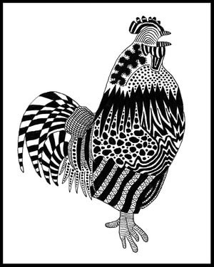 From "Cherokee Road Kill", Drawing By Kyoko Miyabe By Kyoko Miyabe When Celia approached me about a project to create drawings for her latest poems, I was excited about being able to collaborate with her again. What soon dawned on me though was that this project entailed a new approach. For Cherokee Road Kill, I selected some of the poems’ detailed elements that stood out to me -- such as a rooster, a green skirt, and “a whiskery catfish god” -- and created drawings of them. The images grew out of my vicarious engagement with the landscape and the inhabitants of the Great Smoky Mountains of North Carolina as recounted by the speakers in Celia’s poems. Perhaps this engagement was similar to how we become involved with places and characters in books, sometimes to the point where they can seem as real as, if not more real than, our immediate world, no matter how distant or unfamiliar they may actually be. Plus, while I did not know Louise -- to whom Cherokee Road Kill, I felt at the time, was ultimately dedicated -- I might have thought that I could maybe be permitted to take part in this elegy as another woman, as another private individual. However, this time with “Shooting Script: Brazen Jackson, Season One, Ep. 1-13,” I recognized the need not only to learn more about the poems’ main figure, Osceola, but also to find a way to approach their larger, more public, historical subject -- one that I felt I did not, and therefore could not be allowed to, share in as someone from a different heritage. The last paragraph in Jonathan Blunk's excellent review of Cherokee Road Kill (The Georgia Review, Summer 2018) offers an insight into this subject, and what is at the core of Celia’s poetry: Bland’s stubborn honesty reminds me of D. H. Lawrence and an essay of his that first appeared nearly a century ago, “The Spirit of Place.” Lawrence argues for the “great reality” of this idea that everywhere on earth has a distinctive and enduring spirit of place. Writing about America and its literature, Lawrence doubts whether we as a people can overcome the legacy of slavery and the genocide of native inhabitants driven from their homelands. This fundamental savagery—and the uncertainty we face as a country—are present throughout Cherokee Road Kill. By honoring a community blighted by this inheritance, Bland has given us a lyrical portrait of a neglected but essential American place. Celia’s latest poems address this "fundamental savagery" underlying the history of the United States in a manner that encapsulates the textures of American culture, both in its enduring and contemporary form. The entry point I was seeking emerged when I read Patricia Riles Wickman’s Osceola’s Legacy (The University of Alabama Press, 2006). In the preface to the revised edition of this book, Wickman writes: To be sure, a main objective of my researches since the initial publication of the book has been to gain a fuller understanding of the cultural, social, and historical context of the man and to locate his missing head. This latter aspect of his story has a high cultural and spiritual value to the Seminole people, and especially the Florida Seminoles, with whom I lived and worked for all the years that the first edition of this book was in publication. It is, consequently, they who have my deepest appreciation for their willingness to share of themselves and of their rich and fascinating universe. It is their belief that the spirit of a deceased person passes out of the physical body through the head in order to make its journey westward, across the Milky Way, to the realm of all the spirits. If the head does not remain connected to the corpus, therefore, the confused spirit may remain too close to the living and can become malevolent, at worst, or a wanderer, at least. (p.xiv) This paragraph immediately made me think of Noh drama, which often retells stories of ghostly spirits unable to completely leave this world because of strong lingering emotions, whether it be sorrow, rage, regret or resentment. I then thought of the image of the old pine tree painted on the back panel of the Noh stage. This image became the starting point for the set of drawings accompanying “Shooting Script: Brazen Jackson, Season One, Ep. 1-13.” These drawings do not directly engage with, but rather, exist in parallel to Celia’s poems. Like the painted old pine tree standing at the back of the Noh stage, they bear witness to the retelling of a tragedy that embodies the “enduring spirit of place.”  Celia Bland’s third collection of poetry, Cherokee Road Kill (Dr. Cicero), featured drawings by Kyoko Miyabe. Recent work has appeared in Plume, Witness, Copper Nickel, Southern Humanities Review, and the anthology Native Voices: Indigenous American Poets (Tupelo Press). With Martha Collins she co-edited Jane Cooper: A Radiance of Attention (University of Michigan).  Kyoko Miyabe received her Ph.D. in English Literature at Cambridge University, U.K. She is the Chair of the Humanities and Science Department at School of Visual Arts, New York. As a practicing artist, she has exhibited in galleries and art institutions in New York and Philadelphia, including Woodmere Art Museum, Jeffrey Leder Gallery, Stevenson Library at Bard College, New York Hall of Science, and Philomathean Society Gallery at University of Pennsylvania. A selection of her pen-and-ink drawings was published in Celia Bland’s collection of poetry, Cherokee Road Kill (Dr. Cicero Books, 2018). Along with Mariko Aratani, she is the co-translator of By the Shore of Lake Michigan, ed. Nancy Matsumoto (UCLA Asian American Studies Press, forthcoming), a book of tanka poetry by Tomiko and Ryokuyō Matsumoto.
 I sketched a portrait after a couple of first Zoom meetings in April 2020 A good friend of my mother's gave me a gift, which was a porcelain decoration with a lot of flowers. Her note said, "It reminded me of you when you were a little girl." Since March 2020, I have been decorating and drawing flowers more often. Flowers have the power to heal when I feel like a burden. 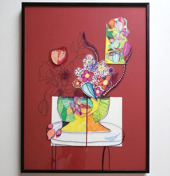 I think that this portrait will be done soon. (April, 2021) More from WORKING ON Gallery: |
Archives
July 2024
|
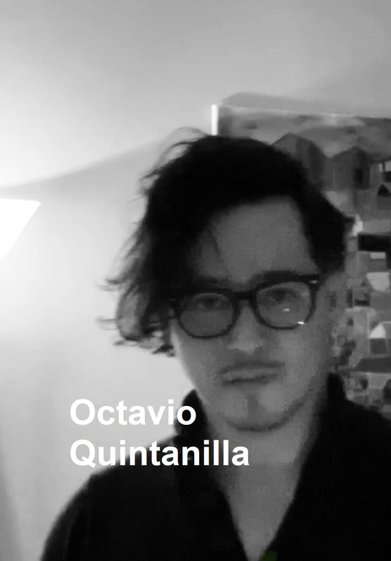

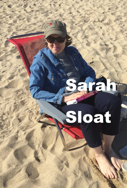
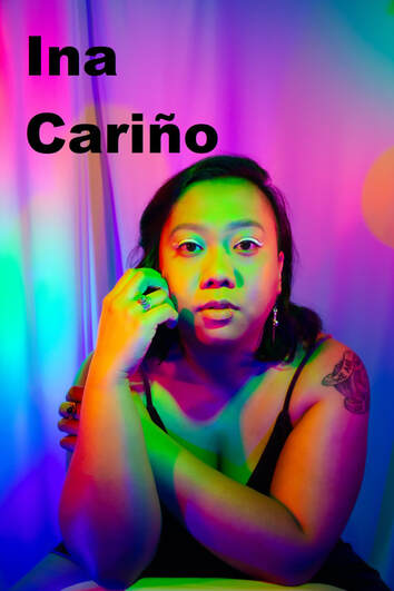
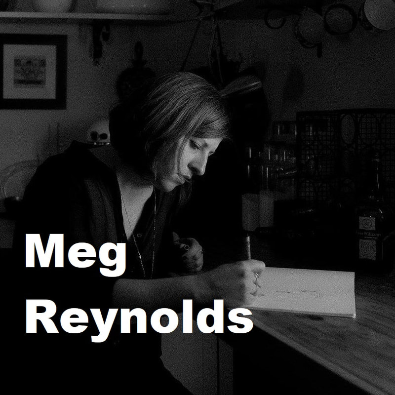
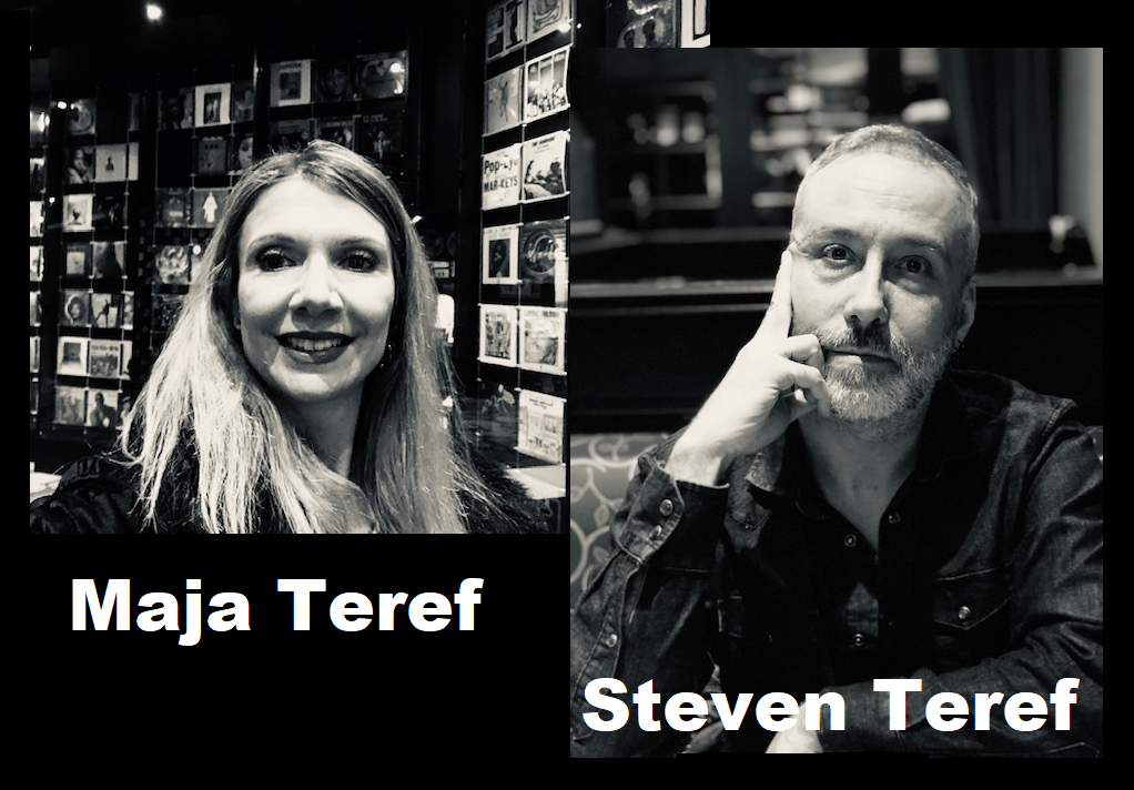
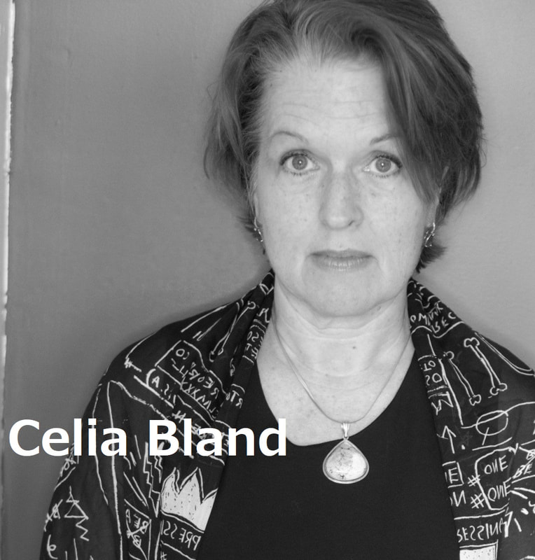

フジハブ
Welcome to FUJI HUB: Waystation to Poetry, Art, & Translation. This is not your final destination. There are many links to other websites here, so please explore them!
Welcome to FUJI HUB: Waystation to Poetry, Art, & Translation. This is not your final destination. There are many links to other websites here, so please explore them!
What are you looking for?
FUJI HUB Directory
Popular Sites:
Gallery of Graphic Poems
Working On Gallery
(Monthly New Article by Writers & Artists)
About Naoko Fujimoto
Contact
Naoko Fujimoto Copyright © 2024
FUJI HUB Directory
Popular Sites:
Gallery of Graphic Poems
Working On Gallery
(Monthly New Article by Writers & Artists)
About Naoko Fujimoto
Contact
Naoko Fujimoto Copyright © 2024
