|
New guests for "Working on Gallery" are lined up. I am SUPER excited to share their essays in this website. But I would also like to share my new writing project! I am taking Writing 2 at the Second City. Sunday was my first class, and I am truly excited to know all the fellow writers from all over the United States. For the next couple of weeks, I will share my progress and comedy writing here between my guests' craft essays. I learned about parody from the first class. One example skit was "Manson" from The Ben Stiller Show. This is a parody of a famous story of "Lassie Come-Home", but the main character (dog) was replaced by Charles Milles Manson (criminal). The similarity between Lassie and Charles Manson are both characters could not communicate. Lassie barked and Charlie Manson spoke nonsense. So, the parody is like Replace something to keep the original content.
Using similar ideas are better than adding random scenes, ideas, and characters. Though, the surprise nonsense may work occasionally. In the class, we experienced several exercises. One group session was to create a parody pitch from familiar TV shows, movies, commercials, etc. My team chose Harry Potter. In this Harry Potter's universe, they did not use brooms, instead, they flied with Rumbas (the electric vacuumed cleaner). Also they had a new professor, Marie Kondo, who tidied up their houses using her "spark joy" methods. In the end, Professor Snape was categorized as an unnecessary object, because he was not "spark joy". This was a quick 10-minute group session. The teacher's feed back was "needs a bigger twist!" Example: The setting did not have to be in the magical school. It can switch to an office, hospital, or any unexpected place. I got it! I am so excited to write 3 - 4 pages for my assignment. It will be so fun to think about it this week. During the warm-up, we made quick tabloid headlines and online click-bait lines. So each writer shouted a word, and the next person created a sentence with each spelling.
For example, as my turn, I need to say a headline using STICK. S - - Stinky T - - tea I - - is C - - cooking K - -Kookyly Now, I so wished that I could have said tentacles for T. Everyone was so quick to think! I had been living in a slow pace, so I am glad that my brain will be spinning faster as it goes. Some exercises are perfect for my little Japanese students (minus the tentacles). The visual poetry anthology, Judith: Women Making Visual Poetry, is edited by Amanda Earl. I interviewed her last February. Joakim Norling of Timglaset Editions and she launched their IndieGoGo campaign to raise 4500 Euros in 30 days to publish Judith: Women Making Visual Poetry. TIMGLASET will publish Judith: Women Making Visual Poetry, a 250-page, full-colour book featuring visual poetry from 36 women in 21 countries. The following creators contribute visual poetry to Judith: Firyal Al-Adhamy Rosaire Appel Erica Baum Jessica Bebenek Mez Breeze Kimberly Campanello Iris Colomb Susan Connolly Judith Copithorne Kate Daudy Paula Damm Lenora de Barros Johanna Drucker Amanda Earl CC Elian Cinzia Farina Mara Patricia Hernandez Tasneem F. Inam Effie Jessop Satu Kaikkonen Dona Mayoora Kerri Pullo Viviane Rombaldi Seppey Astra Papachristodoulu Mado Reznik Karen Sandhu Petra Schulze-Wollgast Ines Seidel Kate Siklosi Lina Stern Stephanie Strickland Hiromi Suzuki Ankie van Dijk Seet van Hout Terri Witek Ruth Wolf-Rehfeldt Audra Wolowiec The term ‘visual poetry’ within the book is a global term used for all work that integrates elements of language with another medium or engages with the graphical elements of text and mark making. All craft essays are SUPER inspirational. I am really thankful that they supported this project. 本当にありがとう。
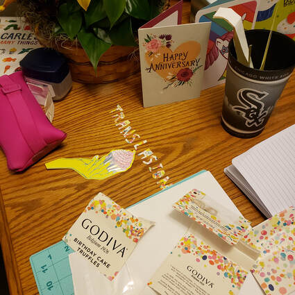
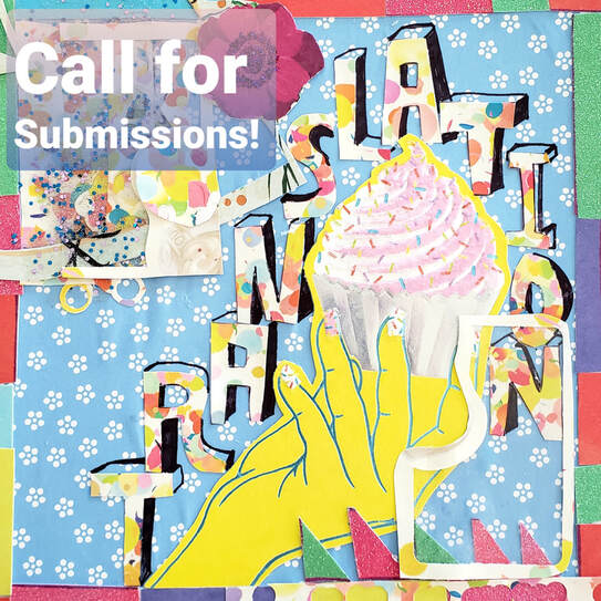
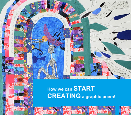
Recently, I received an email. "I do not have Origami Papers. Should I buy them?" My answer is that you can use any paper around you. Creating graphic poems can be a sustainable and reasonable project! Of course, if you have the budget to purchase authentic papers, you may. So, this is a good time to show how I chose material and created graphic art for a RHINO Poetry social media post. I also wrote about materials for my graphic poems. You may refer to this article. I became a Translation Initiative Editor at RHINO Poetry. One of my jobs is to spread the word that RHINO Poetry likes reading translation submissions though social media and emails. Instagram and Facebook are particularly good with colorful & cheerful notifications. You may see all paper material from the picture above; anniversary cards, birthday cards, and Godiva's Birthday Cake Truffles' bags. They were all from my birthday gift!
I used these papers because they were spring-like, pastel colors. It is bright & energetic. In addition, the cup cake has two meanings.
For this project, I did not buy any new materials. It was fun to think of how I could adapt these materials into my graphic advertisement. Much like challenging oneself to cook a meal with just the ingredients in their refrigerator at the time. #RHINOArt2Art's submission is open and we had the first editorial meeting. One thing I realize is poets are seemingly more open to visual explorations of their medium - - i.e. poetry formats: erasure, Golden Shovel, centos (see the previous craft essay) - - than before. Graphic / visual adaptations are not only fun for creators, but they also push their way of thinking about the poems they read and what potential lies in various creative approaches. We do not have a clear rule for visual adaptations like Golden Shovel and centos do. Visual adaptations have more varieties of final products like erasure techniques. But I believe that sharing my process notes may be useful to our community as a springboard to thinking visually, and making more exciting graphic adaptations. The rules for the Golden Shovel: (From Writer's Digest)
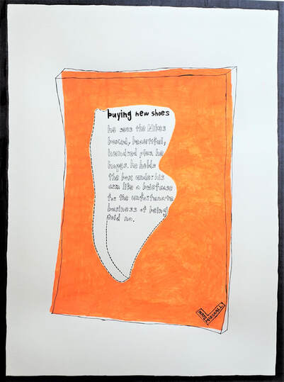
As you may or may not know, #RHINO Art2Art is an initiative to pair poems in RHINO Poetry's archive with graphic art, with a view to highlighting poets of color, and to draw more attention to our beautiful archive, thanks to our tireless interns. Between July and August 2020, I had a test-run for this project. I created three adaptations and recruited a handful of poets who were interested in creating various examples before the open submission. The following is my adaptation of Nate Marshall's "buying new shoes". buying new shoes When I read this poem for the first time, I saw many possibilities for images from Marshall's words, such as Nikes boxed, hundred plus, under his arm like a briefcase... This is a short poem, but it is full of striking imagery about a young male who wants expensive shoes. I also thought that the way the poems are arranged on the pages are of significant beauty. I could separate words and images to create a new visual adaptation; however, I did not want to disturb the line-breaks. The poem has a certain cadence. If you read it aloud, it is obvious. Therefore, I decided to keep all the words and play with the shape of its body, the iconic Nike box and shoe cut-out. The white dots represent the shoes that the speaker could not own. Meditating with Marshall's poem was a pleasant time for me. Though this poem is short, Marshall's work left a strong impression on me. It was his super poetic power. I always feel anxiety when sharing visual adaptations of a poet's work to them. But later, I heard from José Olivarez that he and Marshall had a long discussion about the line-breaks. You have no idea how much I was thrilled when I learned of that. #RHINOArt2Art
An Ongoing Celebration of RHINO’s Online Archives |
Archives
July 2024
|
フジハブ
Welcome to FUJI HUB: Waystation to Poetry, Art, & Translation. This is not your final destination. There are many links to other websites here, so please explore them!
Welcome to FUJI HUB: Waystation to Poetry, Art, & Translation. This is not your final destination. There are many links to other websites here, so please explore them!
What are you looking for?
FUJI HUB Directory
Popular Sites:
Gallery of Graphic Poems
Working On Gallery
(Monthly New Article by Writers & Artists)
About Naoko Fujimoto
Contact
Naoko Fujimoto Copyright © 2024
FUJI HUB Directory
Popular Sites:
Gallery of Graphic Poems
Working On Gallery
(Monthly New Article by Writers & Artists)
About Naoko Fujimoto
Contact
Naoko Fujimoto Copyright © 2024
