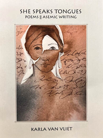
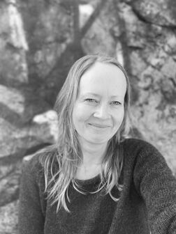
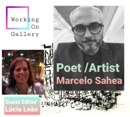
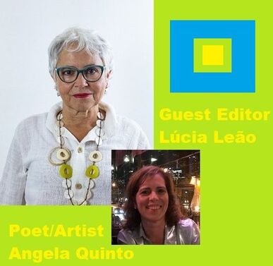
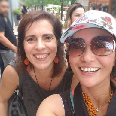
 Tana Oshima introduced me to Natalia Carrero, a writer and artist living in Madrid, Spain. Her writing themes are about maladjustments, addictions, and mental illnesses using images and words in Spanish. She occasionally writes in English. Her books are available internationally from Amazon. I am excited to share Carrero's work because this is the first bilingual issue of Working On Gallery! Carrero wrote two short essays:
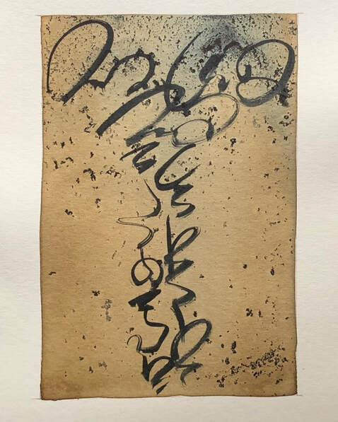
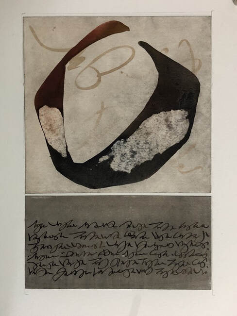
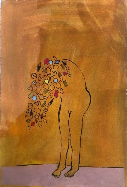
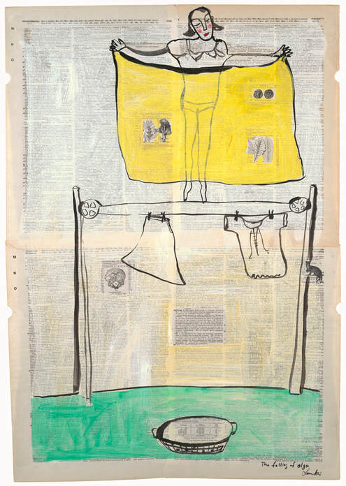
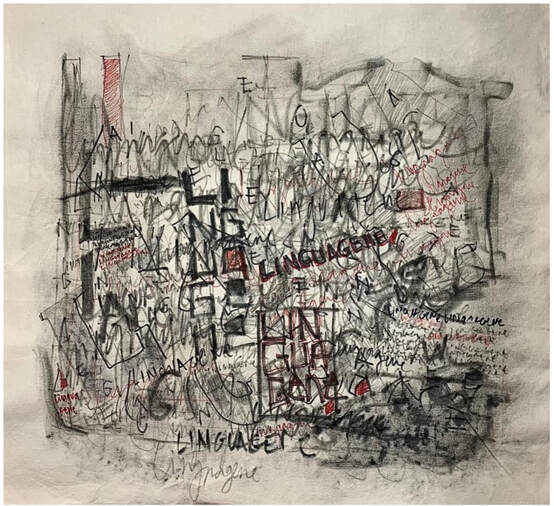
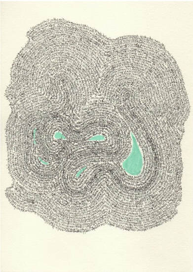
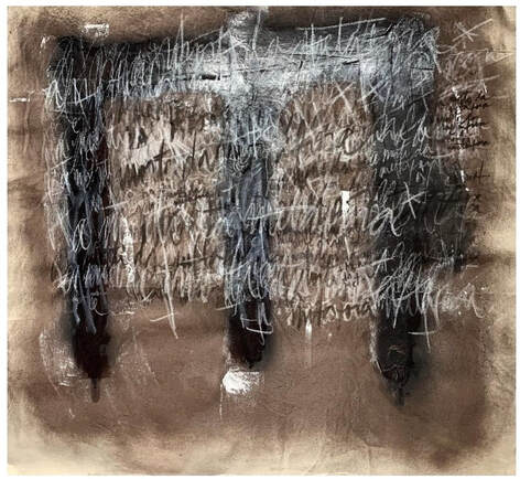
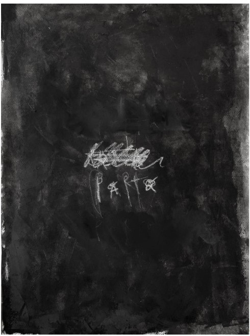
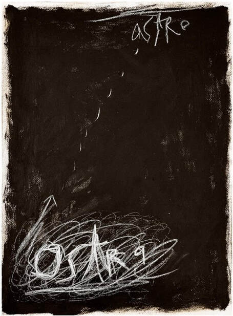
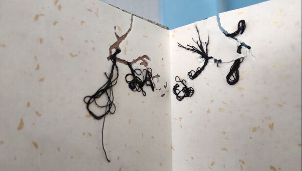
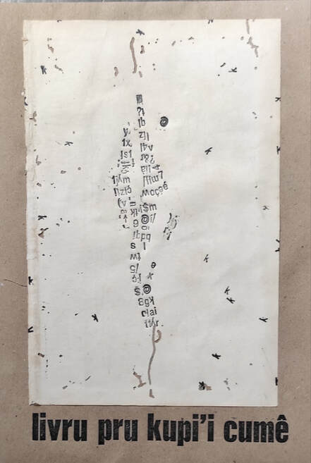
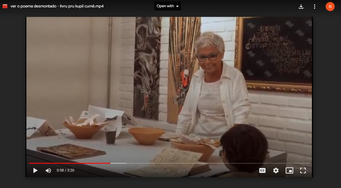
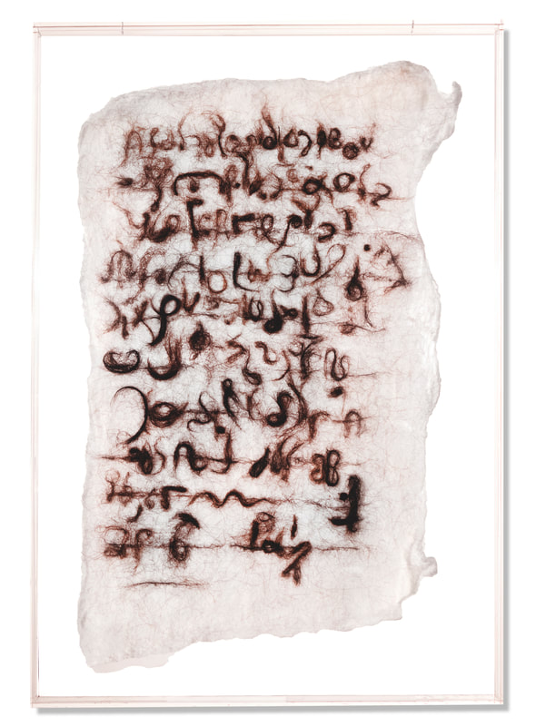
These essays are juxtaposed about controal. "Babbling pages" is about a writing process - - let it be - - embrace spontaneity and do not follow rules or previous methods. On the other hand, "Consulta" is about eczema. The narrative tries to control her condition first. I have never seen an accurate drawing and writing of this condition. Random letters rise up from the skin's surface. It looks very irritating. I truly know that itchy feeling. I am an eczema patient from birth. Therefore, I thought that it may be a good idea to translate "Consulta" from Spanish to English. I took Spanish classes for two semesters at my Japanese college twenty years ago, and I took Italian classes last year for my trip. It is obvious that my Spanish is an early beginner's level, but I thought that it may be a good experiment to use both Google Translate and my creative writing experience. If you are a translator and also translate Carrero's "Consulta" into English, let me know. I am happy to share your version on Working on Gallery and my Instagram account.  Instagram @lalectoracomun Natalia Carrero, Barcelona 1970. I doodle and draw, think fast and think slow. In my books, I combine both speeds to narrate maladjustments, addictions and mental illnesses. A novel: I'm a box, translated by Johanna Warren. A comic: Letra rebelde. Last fanzine: Gran ofertón. Spanish Version, I'm a box English Version, I'm a box  Instagram @lalectoracomun Babbling pages: Essay in English by Natalia Carrero A suspicion: she is not just she but a sum of voices and experiences, and also the tree and the street and all things and news around. She does not have the control of her words but she tries to understand why we are becoming more and more individualists. She wishes to comunicate anything more than a message. The algorithm of our lives always intervienes, the imperatives of consum this and that just now, and that over-sugared stuff too. She doesn’t control her writing decisions.  Natalia Carrero Sometimes she purposely went out of control. She releases the rules, the learnings. Her best texts are. Not are. Never the best. Her handcrafted productions. Her asemic else. Unreadable. Something uncomfortable. When she thinks she is realy loosing her comunication ability or she feels too tired to believe in bubbling and bubbling, she tries to draw. Literatura del balbuceo. Paper and ink, just it, do it, move on. Black and withe, simplicity. Not exactly, constant search. She also mentally scribble while she walks or she takes the bus. Life could be devoid of objectives, goals, targets, be a present space of undefined movements. improvisations with effects and defects, discoveries, and all the doubts and hesitations should become more prominent. Babbling again, come here.  Natalia Carrero Without knowing why, or to activate the latent power of all the useless gestures, last february she made a fanzine, direct literature from face to face, smile to smile, sonrisa, páginas repletas de balbuceos registrados casi para nada. Fotocopiados en papel reciclado, encantados de recibir cualquier día el olvido que las memoria les reserve. Sixty pages full of babbling registered almost for nothing. Photocopied on recycled paper, delighted to receive any day the oblivion that memory reserves for them.  Consulta: Essay in Spanish by Natalia Carrero Pregunta la doctora si es autónoma para darle la baja hasta que se le pase el curioso eczema alfabético. Resulta tan insólito que ha hecho fotos con el móvil, para su análisis posterior junto a colegas especialistas dermatología. Bueno, es autónoma en cierto modo, claro, cada mañana se viste y asea, y más cosas, sin ayuda. A efectos económicos sin embargo es dependiente, como algunas vecinas, del hombre blanco encorbatado que al final del día exige halagos, un esquema del siglo pasado. Con todo lo que ha trabajado, y el cansancio patente que le supura la piel, cómo pica, cuánto durará, ¿acaso ese mensaje que lanza el eczema no está diciendo algo? Pues resulta que la jornada aún debe alargarse más en formato juerga carnal unilateralmente solicitada. ¿Y si insiste para que la doctora lea de una vez lo que pone? ¿Qué le voy a decir, doctora, soy o no soy autónoma? Dejémoslo, no me dé la baja ni la pomada, si por la tarde encuentro el momento ya me leo yo el eczema y me autoprescribo lo primero que alcance. Con un poco de suerte todo esto también pasará. Consultation: Translated by Naoko Fujimoto The doctor asks if this girl can take a sick day off until unknown, alphabetic words disappear on her skin. It is so unusual that the doctor took photos with their cellphone to share with his fellow dermatologists in later analysis. Well, in a way she takes control, of course, every morning she dresses and washes herself, and deals with more daily complications without anybody’s help. She relies on her expenses as other neighbors do. The white man wearing a tie only receives praise at the end of the day, this economic system has been dominant for the last century. Despite her effort, her skin oozes out. It will last forever; how irritating it is. What does this want to tell? Well, it takes her eternal future like a unilaterally requested carnal spree. Doctor, what are the words written on her skin? Can she control them or not? Don't give the sick leave or the ointment. Let's leave it as is, so she will find the time to explore eczema. She will prescribe the first thing she can this afternoon. With a little luck, all of her conflicts will pass too. You may be interested in purchasing... Five Euro, Chapbook on Sale Primera página First page fanzine babbling literature. 60 páginas, tercera versión en abril 2024 If you would like to purchase this chapbook, please contact: Natalia Carrero You may also like to read...To read the full essay, click on the picture. Your $25 donation will be a tremendous support for Working on Gallery's future guests and running costs. If you become a patron, your name will appear in the next Working on Gallery's article. In addition, you will receive my first poetry book, "Where I Was Born", for U.S. shipments. You will receive a thank-you letter for international shipments. Working on Gallery has been used by universities, advanced-level art lectures, and writing workshops. Your donation will help this gallery be more successful. Thank you so much - Naoko Fujimoto
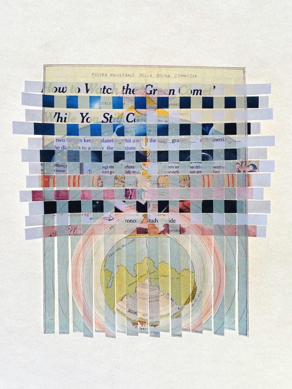
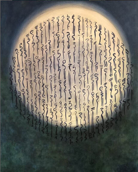
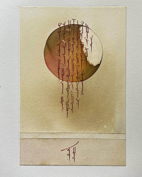
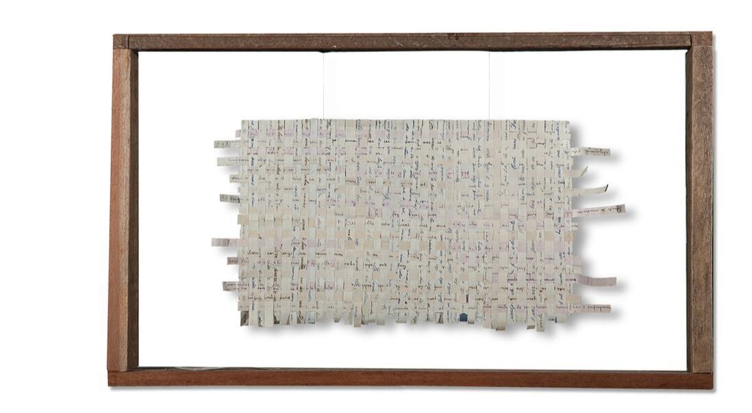
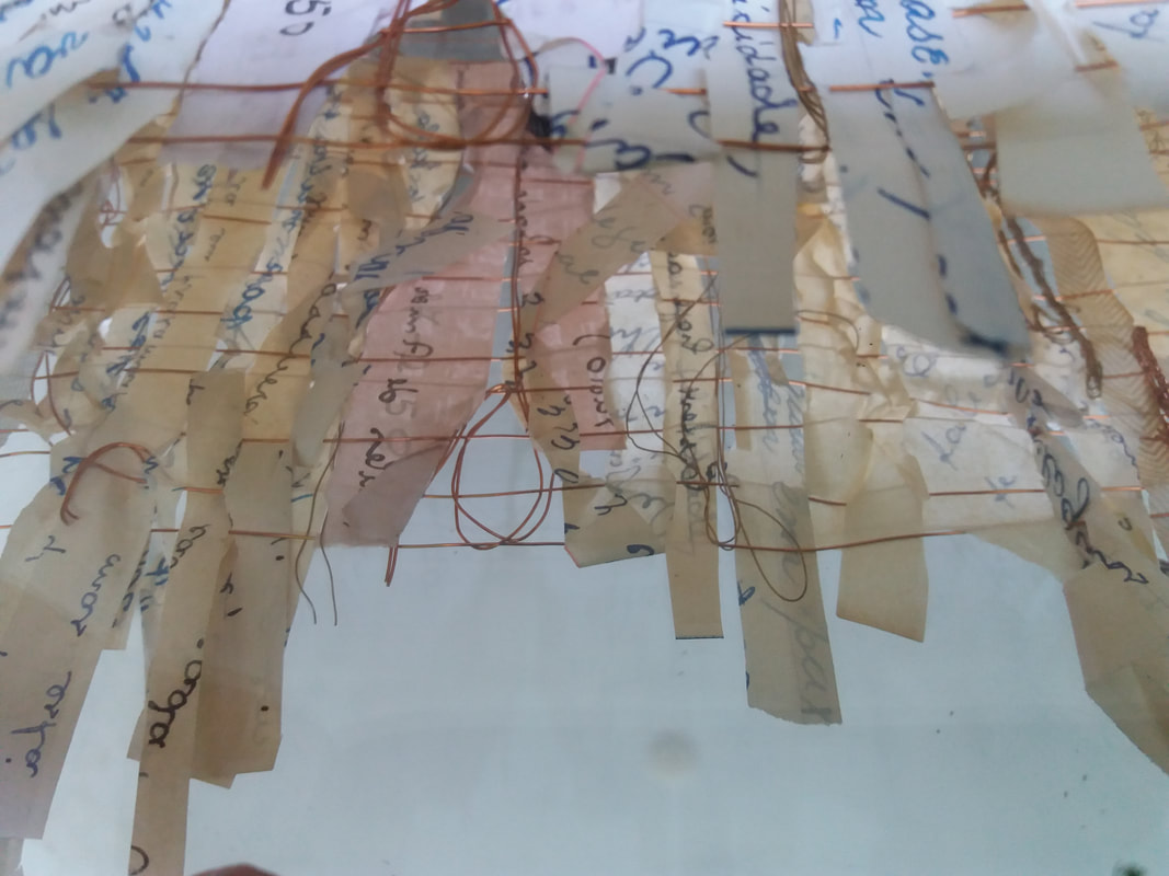
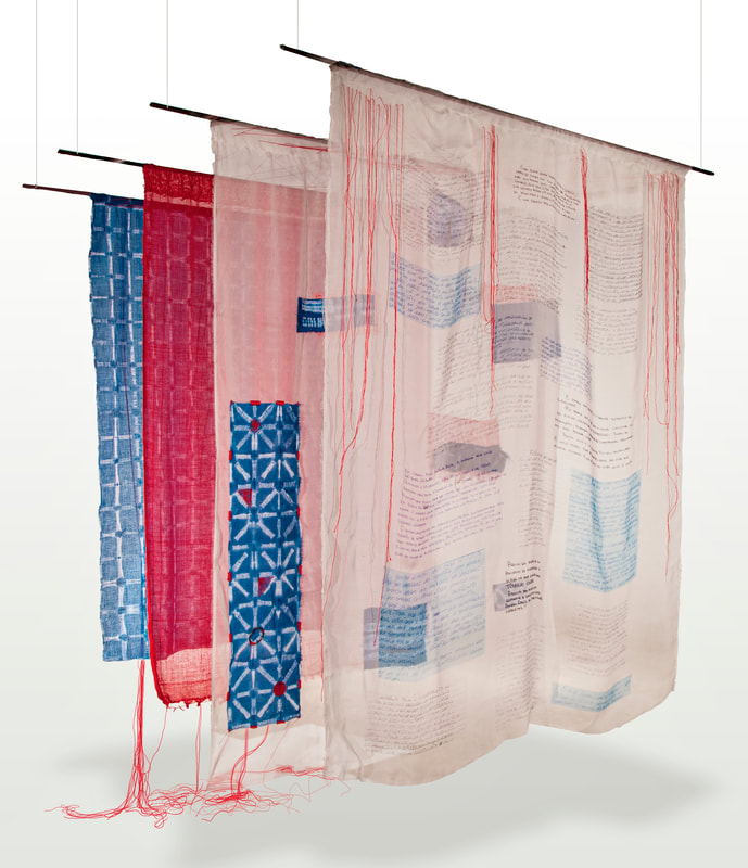
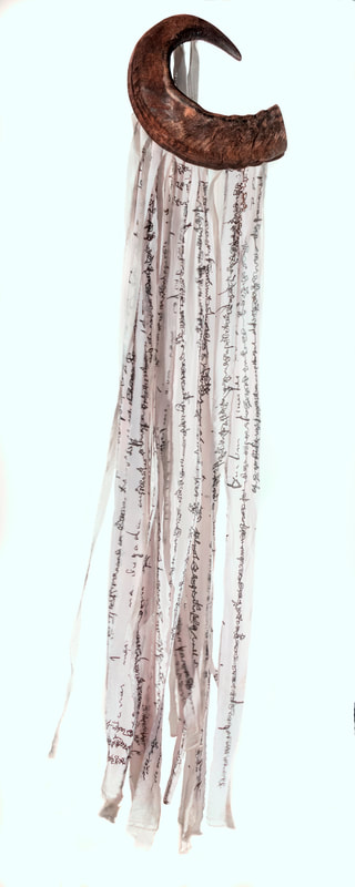
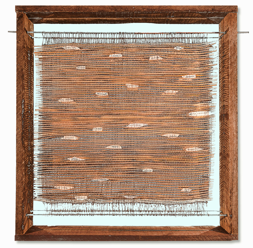
 Toad Press leaped into my mind when I started entering translation communities. During the pandemic, I had the chance to read translation submissions from several magazines.
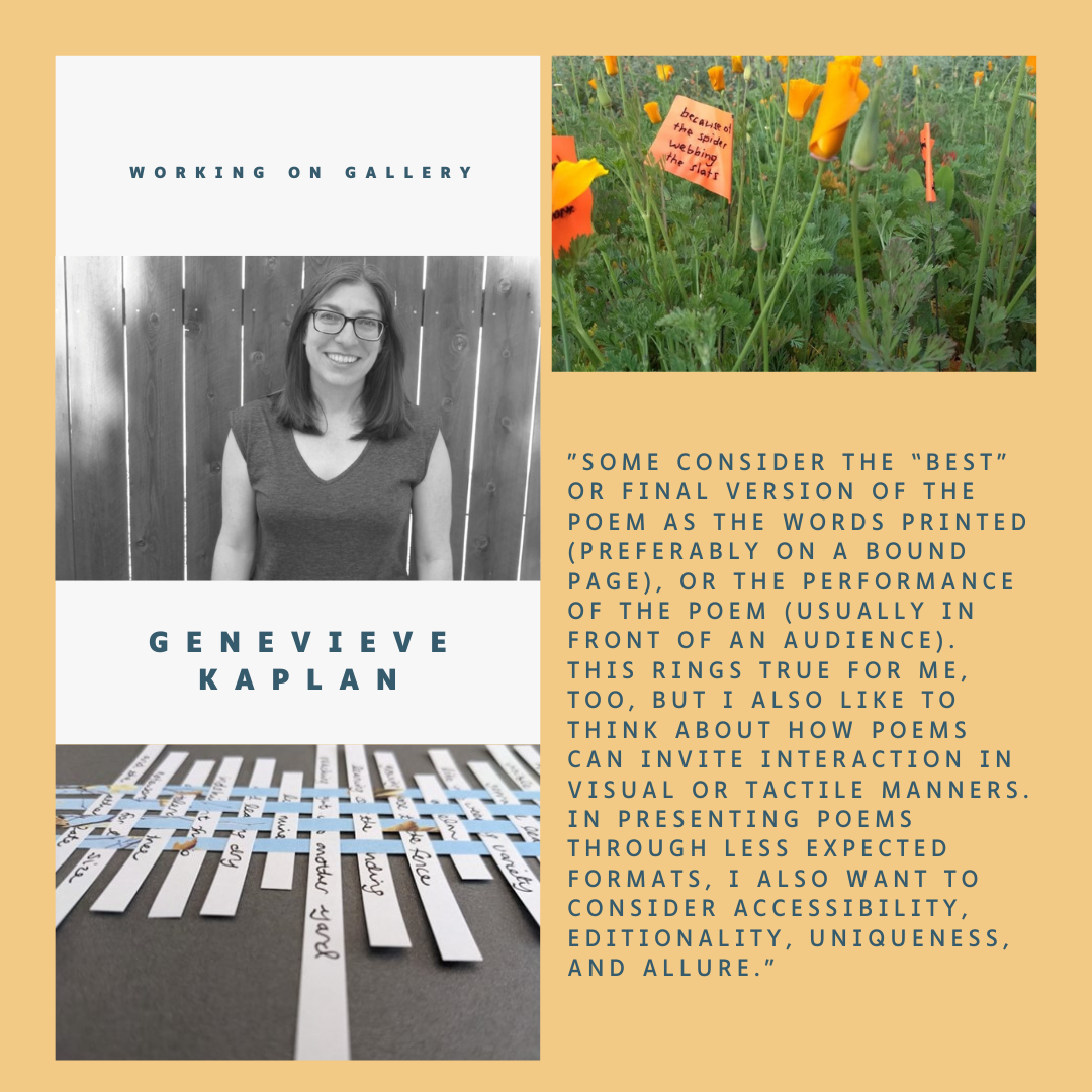
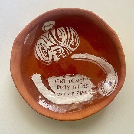
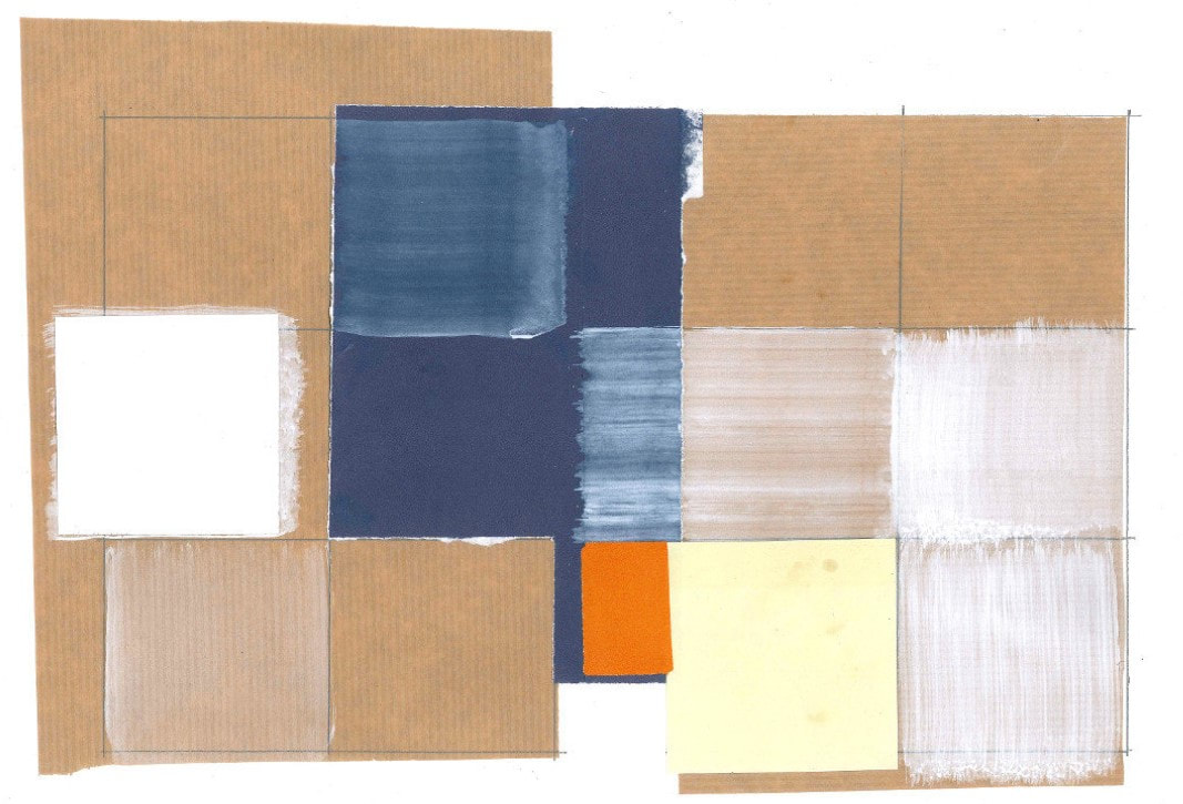
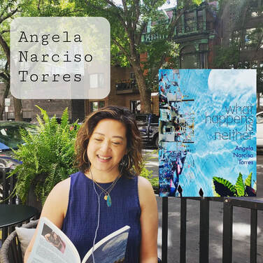
"I love this translator!" I googled the person, and my online search ended with Toad Press several times. It was a strange feeling because this publisher seemed like to create handmade, small collections. However, their list of translators is really phenomenal. I submitted my first translation collection and received a rejection with a kind note. For the following year, I also learned that Genevieve Kaplan (editor & publisher) is a friend of my poet sister Angela Narciso Torres. I introduced myself to Kaplan at AWP Kansas City and we exchanged friendship bracelets. The Toad Press chapbooks were truly beautifully, carefully crafted - - this is really made by a passion and love of books -- and I learned that she also practices experimental poetry writing. "Some consider the “best” or final version of the poem as the words printed (preferably on a bound page), or the performance of the poem (usually in front of an audience). This rings true for me, too, but I also like to think about how poems can invite interaction in visual or tactile manners. In presenting poems through less expected formats, I also want to consider accessibility, editionality, uniqueness, and allure." - - Genevieve Kaplan I love how Kaplan approaches poetry. This definitely relates to my graphic poetry theme, "Trans. Sensory". In addition, I am so excited to have my first translation chapbook with Toad Press. Their new chapbook collections will be available at the end of this year. Genevieve Kaplan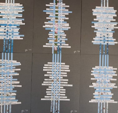 Pictured: “a symmetry” broadsides, 2024. Series of 7, Each 8x10.” Cardstock, paper, ink. Genevieve Kaplan This series of woven paper broadsides is the latest iteration of my explorations into expanding possibilities for poems and thinking about how I want a poem to be experienced. Some consider the “best” or final version of the poem as the words printed (preferably on a bound page), or the performance of the poem (usually in front of an audience). This rings true for me, too, but I also like to think about how poems can invite interaction in visual or tactile manners. In presenting poems through less expected formats, I also want to consider accessibility, editionality, uniqueness, and allure. I’m pleased with this new series of broadsides, and I’m also interested in how I can trace the lineage of this series in some of my previous projects. I started moving some of my poems off the page and into other spaces a few years ago. I wanted to think about how else a reader might encounter a poem. And during the encounter, could a reader/viewer be invited not only to read but also to perhaps to physically interact, to move their body to follow the lines of poem? For example, in the flag poems pictured here, I sewed lines of a poem onto landscape flag markers and “planted” them among the poppies in my front yard. They’re small—the flags are about 4 x 5”, and they aren’t rigid, so I knew if someone wanted to read one, they’d need to bend down, get up close, and maybe touch the flag to straighten the letters. To read another flag, they’d need to move further into the poppy field. 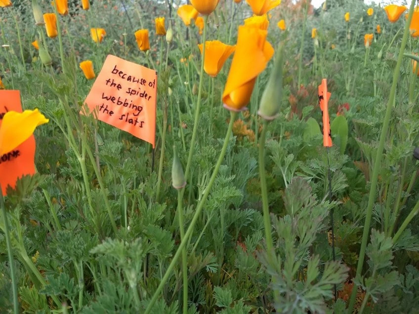 Pictured: “Holding the sugar higher,” (detail). 2019. Textual installation: poppies, flag markers, thread. Genevieve Kaplan At the same time, I was working on a series of sewn and woven broadsides. I think of the broadside as a fairly traditional form, as it’s one we literary types encounter often enough, at bookstores, readings, colleges, and publication events. Most often literary broadsides are printed (letterpress or even laserjet) and present a single poem accompanied by an illustration. Poetry broadsides isolate and elevate a poem: once printed in broadside form, the poem becomes not only a poem to read but also a piece of art to admire. I have several poetry broadsides in my home, and because these poems are hung on the wall I find that I read them both more often than and differently from the poems contained in the books on my shelves. 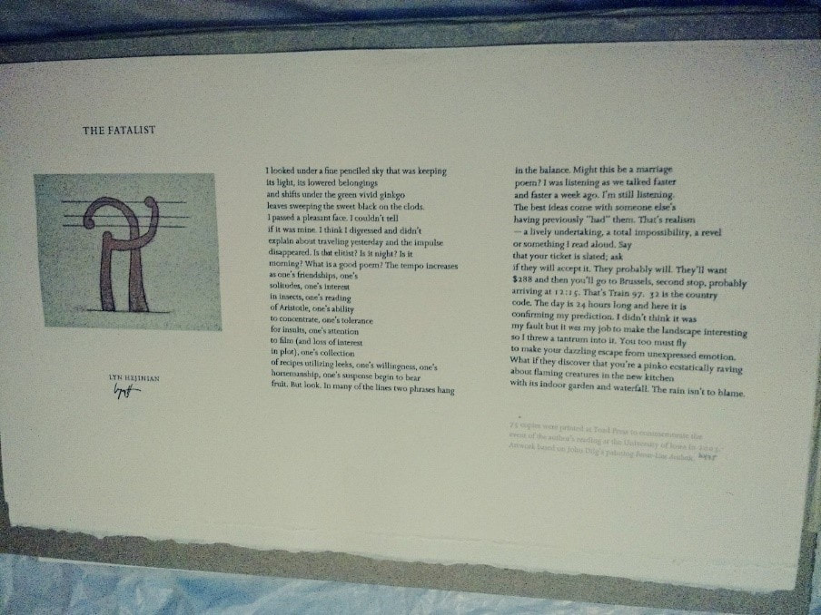 Pictured: “The Fatalist,” broadside, 2003. Edition of 75. Letterpress. Poem by Lyn Hejinian; artwork based on John Dilg’s “Power Line Aesthetic.” Genevieve Kaplan For creating broadsides of my own work, I knew I didn’t have ready access to a letterpress or a large format printer; nor did I have a lot of patience to learn new technology. But I did have a loom and some spare yarn, so I decided to sew and weave a poem into a broadside. 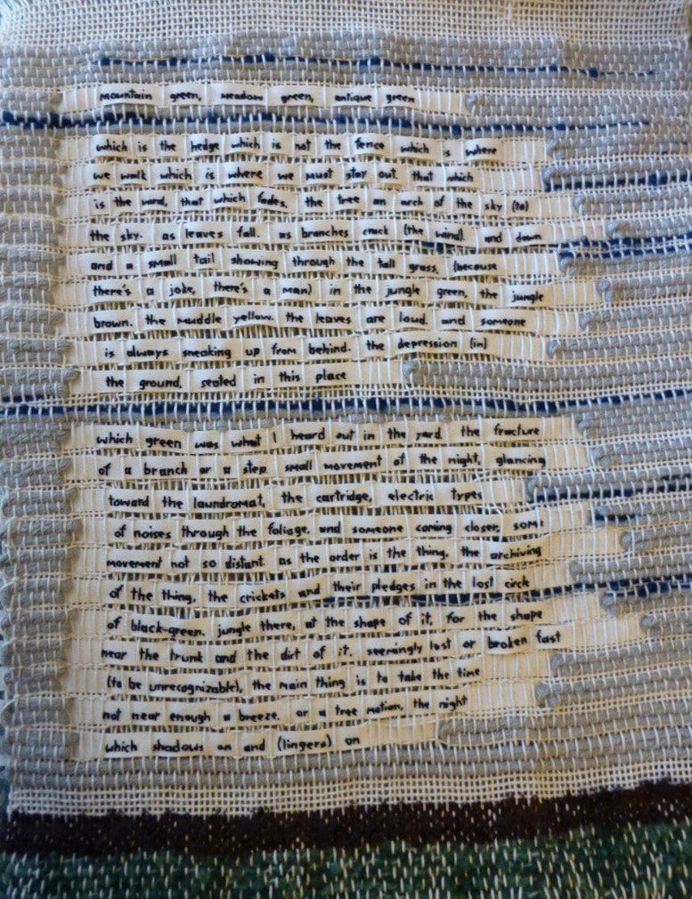 Pictured: “Shift up and down the wires (that close them in),” woven broadside. 2020. Yarn, ribbon. 18 x 24” framed. Genevieve Kaplan I created a total of three woven broadsides, each of a different poem. Then I framed the broadsides in shadowboxes and tucked them into my closet. I love the broadsides’ tactility, and their unique nature. In their woven form my poems behave differently: there are wonky letters, tufts of wool, and evidence of many imperfections for a reader to contend with. Reading the woven lines makes you—well, me, anyway—want to touch them. I enjoyed the process of making them, too: I liked the idea of making a poem material—literally, making the poetic line a physical line, by embroidering letters, words, and phrases on a thin ribbon. And then later, when I wove the ribbons/lines together, those embroidered lines combined with yarn, with other discrete threads, to create a larger piece of material—in this case a poem composed of physically connected lines. These woven broadsides achieve what I intended—they offer a singular and active experience for a reader, and they underscore the labor behind the words. But these broadsides are also bulky and heavy (as framed), and, because of the time and materials that went into creating them, they’re cost prohibitive. No one really gets to see them. They don’t tap into the type of accessibility that a broadside printed in an edition of 50 or 100 might have. These material broadsides are not fancy posters one could frame or even pin on the wall. Instead, my woven broadsides are un-replicatable, unique poem-art objects. Is the best, most final version of my poem “Shift up and down the wires…,” the one tucked into my closet? I’m not sure. So I started thinking about how else to create handmade broadsides. In addition to having a lot of yarn, I also had a lot of paper, and I thought I could use the paper to create a more accessible visual and maybe tactile experience. 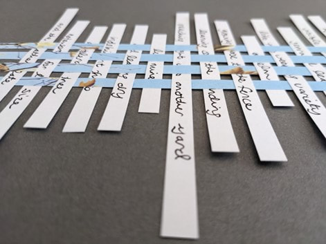 Pictured: “a symmetry” (detail), 2024. Paper, ink. Genevieve Kaplan For this next project I cut strips of paper, handwrote lines of my poem “a symmetry” onto them, and then wove into them with vertical strips of decorative paper. The text of my poem responds to my neighbor’s tree, which grows over our shared fence, drops leaves and twigs and fruits, and is always in need of trimming. When adhering the woven poem to the cardstock, I glued the weave at its junctures, and the warp—the vertical lines, the trunk of the tree—to the paper only, allowing the lines of the poem a little freedom and movement as they extend. I was excited about giving the lines of the poem (the weft of my weave) the same kind of unkept reach as the tree. I intended to create multiple “a symmetry” broadsides so the project would resemble a printed edition, a more mass-produced series. But as I was writing and weaving and gluing, I became interested in exploring variations: considering different angles and spacing for my lines, incorporating stanza breaks into the poem, and embracing variations in the printed paper warp I’d selected. The seven broadsides in the series each present the same poem, the same language, and the same paper, but each does so just a little bit differently. This woven paper broadside project achieves the kind of invitation and accessibility I’ve been after for a while now. The broadsides invite the type of curious interaction that I want for my poems; rather than presenting a legible text alongside a complementary image, they present a poem that is also itself a visual experience. The words of my poem aren’t completely clear because of the weave; some language is obscured by the warp, which means readers may skip over words or try to fill in the blanks, or just decide to engage with the words visually instead of logically. The handwritten text adds another level of visual interest and potential illegibility. I also like how the materials are simple and inexpensive. Cutting and weaving paper text in straight lines was tactile, meditative, and enjoyable but not overly time consuming. The 8 x 10” size of the finished broadsides means they’re easy to transport and simple to frame. The broadsides are flat, or can be flattened, making them essentially a two-dimensional page. And, importantly, these broadsides are a little less ephemeral. They weren’t planted briefly with my poppies, they don’t exist mainly in my experience creating them, and they aren’t only hidden in my closet. I’ve sold a few—at art fairs, on Etsy—so they’re already popping up on walls and finding new readers/viewers.  Pictured: Framed broadside of “a symmetry” hanging in a librarian’s office, 2024. Genevieve Kaplan For me, these broadsides reside in a sort of charming middle ground of the concerns I’ve been exploring in recent years. They succeed in evoking editionality, accessibility, uniqueness, and visual appeal. And, they invite readers to interact with the poem. Is this series the “best” version of my poem “a symmetry”? I think so. The poem also lives on the page as a text only version, but it feels a little lonely there. I find my experience looking at and reading one of my “a symmetry” broadsides to be more complete: here, the poem has tangible depth, it challenges, it evokes, and it prioritizes the experience of reading or thinking about the work over the work—the poem—itself.  Instagram @vievekaplan Genevieve Kaplan is the author of (aviary) (Veliz Books, 2020); In the ice house (Red Hen Press, 2011), winner of the A Room of Her Own Foundation‘s poetry publication prize; and five chapbooks: Felines, which sounds like feelings (above/ground, 2022), I exit the hallway and turn right (above/ground, 2020), In an aviary (Grey Book, 2016), travelogue (Dancing Girl, 2016), and settings for these scenes (Convulsive Editions, 2013). Her poems can be found in Third Coast, Puerto del Sol, Denver Quarterly, South Dakota Review, Poetry, and other journals. A poet, scholar, and book-maker, Genevieve earned her MFA in Poetry from the Iowa Writers’ Workshop and her PhD in Literature & Creative Writing from the University of Southern California. She co-edited Et Al.: New Voices in Arts Management (IOPN, 2022), an open-access collection of ideas, action, and inspiration from contemporary arts managers. Since 2003, she’s been editing the Toad Press International chapbook series, which became an imprint of Veliz Books in 2021, publishing contemporary translations of poetry and prose. Genevieve lives in southern California. Toad Press New Translation Chapbooks You may also like...To read the full essay, click on the picture. Support Working on Gallery
$25.00
Your $25 donation will be a tremendous support for Working on Gallery's future guests and running costs. If you become a patron, your name will appear in the next Working on Gallery's article. In addition, you will receive my first poetry book, "Where I Was Born", for U.S. shipments. Or, you will receive a thank-you letter for international shipments. Working on Gallery has been used by universities, advanced-level art lectures, and writing workshops. Your donation will help this gallery be more successful. Thank you so much - Naoko Fujimoto I have been traveling, so I do not have a guest for this month. However, I was pretty excited to adventitiously pass the Masaoka Shiki Memorial Baseball Field in Tokyo. I shared some of my traveling stories on Instagram. Recent Highlights:
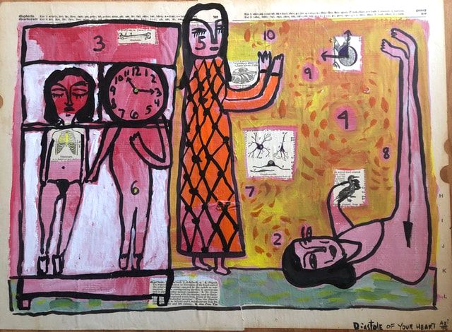
Working On Gallery Previous GuestsTo read the full essay, click on the picture.
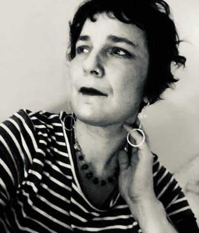
I got to know Maggie Queeney through the Poetry Foundation because I was one of their visiting artists in 2023. She facilitated and organized online workshops and events. Her learning prompts are available at the Poetry Foundation's website. They are great tools to use for classroom and individual settings.
It is incredible to host free lectures for people from all over the world so they can learn about poetry. I also met students from India and Great Britain. Queeney has contributed significantly in building our global art community. It is a safe and welcoming environment for everyone who wants to learn.
I finally met her at the 2024 AWP in Kansas City. She came to a panel for The Rose Metal Press Field Guide to Graphic Literature with Kelcey Ervick, Nick Potter, and Lauren Haldeman. After AWP, I was wondering why I was excited to talk about words and images. Where do I want to head with fellow writers who practice art? It is corny to imagine, but we are running toward a bright light, though it is so vague.
"I leave my body and enter the world created in language. The present the body exists within can be left behind." - - Maggie Queeney We live until our existence fades, as it should (which is so simple); so does our creativity. But it often gets lost between the Yin and Yang. How can we block out the noises around us to enter a world governed by language? How can we merge with "the letters inside the words as mine." Her book In Kind, winner of the Iowa Poetry Prize, is forthcoming in 2023. 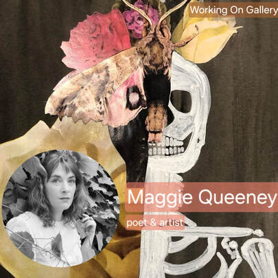 In 1990, when I was eight years old, beloved children’s author Beverly Cleary published Muggie Maggie, a book about another eight-year-old girl who refused to learn to write in cursive. I never resisted drawing the strange, ornate characters over and over during cursive practice. I could compose each letter, but when asked to write whole words, then sentences, then paragraphs, I struggled to reproduce the loops and staffs, hoops and turns. When tasked with turning shapes into strands of meaning through the black and blue rules of the notebook page, my hand still tangles, trips, and scribbles the words illegible. 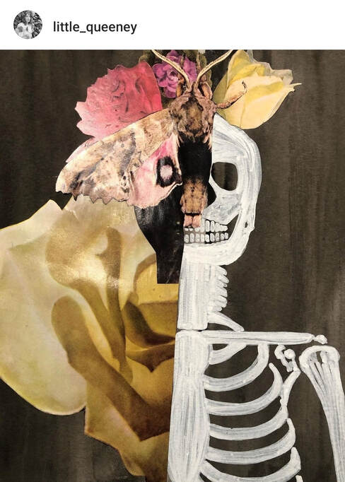 Instagram @little_queeney In 1992, when I was ten years old, I was diagnosed with PTSD. Now, my health care providers type Chronic PTSD or Complex PTSD into the dedicated glowing square of screen. Neither diagnosis officially exists. I have to work to write sentences another person can read and understand. I am told my handwriting is bad, poor, illegible. I am told that the purpose of writing, of text, is to communicate with another, and I am failing. In my first eight years, I had only heard the word muggy used to describe the heavy, hot late summer. It was not a word for a girl with my name. I did not understand how the main problem in her life was learning a new way to write. How, in my memory, her fear of cursive was really a fear of growing up. For her, childhood meant familiar, safe. I knew each word, could write each letter in my own cursive, but I did not understand Muggie Maggie (the character, the world in the book, the story). The book could not communicate to me, but I knew, even then, that I was the one who was failing. 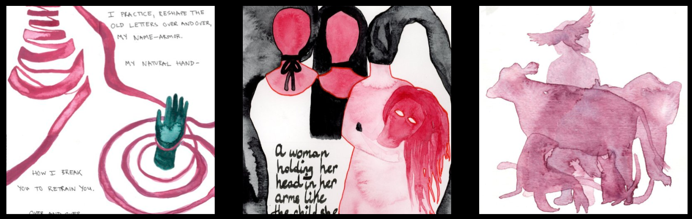 www.maggiequeeney.com Dr. Judith Herman, the first researcher and scholar to recognize and name my particular species of PTSD, begins her seminal book Trauma and Recovery by noting that trauma is, by its very nature, unspeakable. When worried or agitated or scared, I tic. I clear my throat a dozen times a minute. A thousand times an hour. I tic in my sleep, depending on the dream. I want to know what it is like, to want to remain a child. To live without this invisible bite always digging. Dream interpretation would say there is something I need to say that I cannot or will not say. Dream interpretation would say that I am choking on what I cannot or will not tell. Dr. Herman notes: 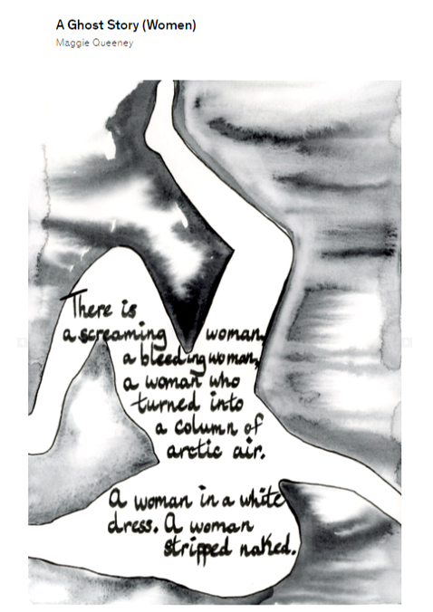 As a child, folded into the cold school desk, I filled the margins of my notebooks in eyes, wolves, snakes. The breasts and necks and heads of women in profile. Their elaborate hairdos. Lightning and roots, tornadoes and disembodied hands. Birds, eggs, trees, and nests. When do writing and drawing become different practices? How can I know, bent over the blank field of the page, whether I am drawing or writing? What decides: the body or the mind? A defining symptom of my disorder in frequent, severe, and uncontrollable dissociation, a state where the body is separated from the mind. A disassociated child can barely register a blow to the head, so far away she is from her soft body. A state of dissociation can be induced by writing. I leave my body and enter the world created in language. The present the body exists within can be left behind. Drawing, I am made to stay in the present. My mind slows to the speed of my hand and other materials: ink and paper, paint and pencil, blades and glue. When I draw each letter, I am made to consider each letter, each word, I write before I write. Made to mean what I mean. To consider what a wolf or root work or nest really looks like, and how to arrange each part into the whole of the page. I can stay inside a body engaged by the hand and the eye, recognize the letters inside the words as mine. Maggie Queeney is the author of In Kind, winner of the Iowa Poetry Prize, forthcoming in 2023, and settler (Tupelo Press). She is recipient of the Stanley Kunitz Memorial Prize, the Ruth Stone Scholarship, and two IAP Grants from the City of Chicago. Her poems, stories, and hybrid works have been published widely. She holds an MFA in Creative Writing from Syracuse University. Working On Gallery Past Guest Editors: Luisa A. IgloriaMeg ReynoldsFrancesca PrestonLúcia Leão Your $25 donation will be a tremendous support for Working on Gallery's future guests and running costs.
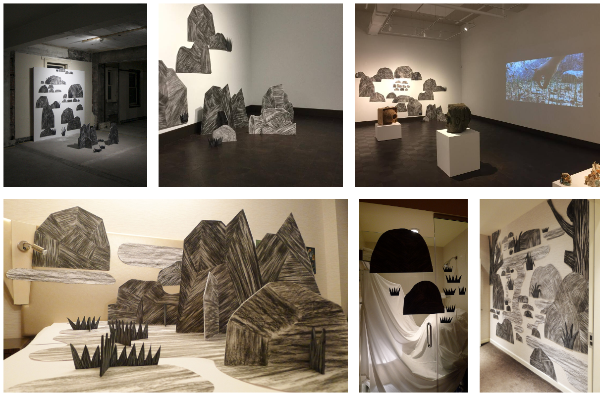
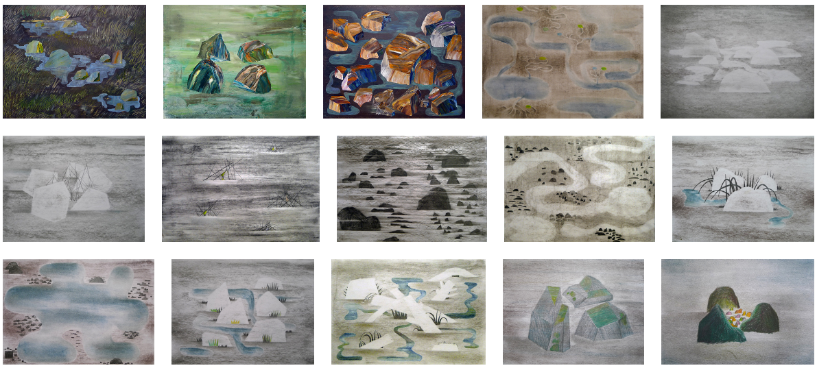
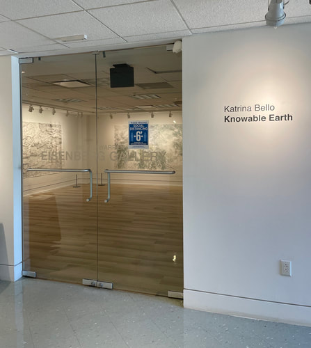
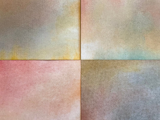
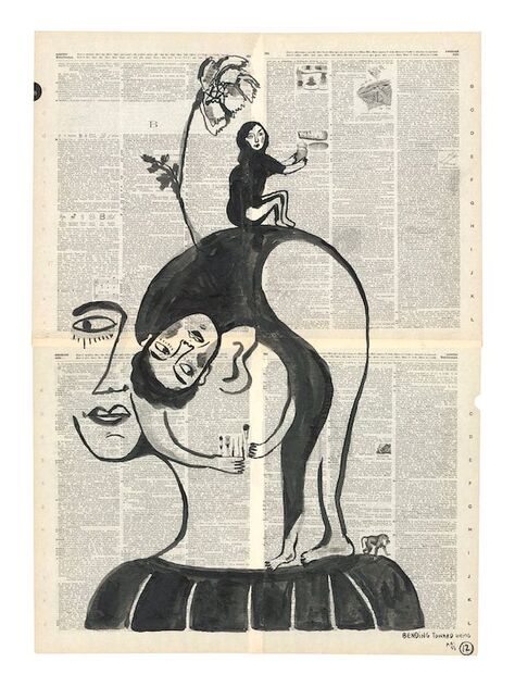
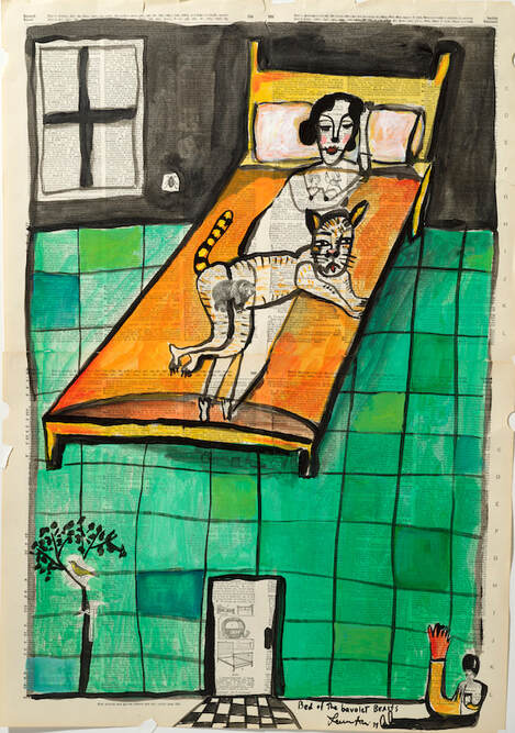
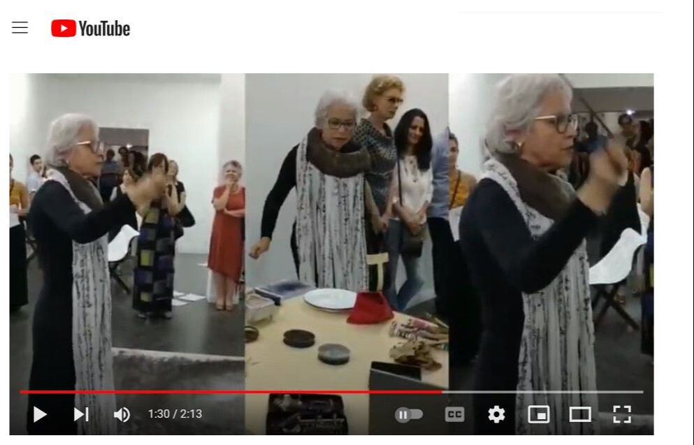
If you become a patron, your name will appear in the next Working on Gallery's article. In addition, you will receive my first poetry book, "Where I Was Born", for U.S. shipments. Or, you will receive a thank-you letter for international shipments. Working on Gallery has been used by universities, advanced-level art lectures, and writing workshops. Your donation will help this gallery be more successful. Thank you so much - Naoko Fujimoto This is the seventh volume of the Working On Gallery Guest Editor Series. Luisa A. Igloria interviewed Katrina Bello, who is a visual artist from the Philippines. This interview transcends my memories, which is deeply associated with my theme, "Trans. Sensory". First, I want you to click on the above two-hand video. What connects with your insights? When I was nineteen years old, I was in Mandaue City, Cebu to study a leprosy community and child education with nursing students from the University of San Carlos. There, my team from the Nanzan Junior College shared Japanese children's stories every day. One of them was a story by Awa Naoko (安房直子, 1943-1993) who was a well-known writer of fairy tales in Japan. Her pieces, The Fox's Window and Other Stories, were translated by Toshiya Kamei. The University of New Orleans Press published the book, but I am not sure that the book is still available now. However, you may like reading While the beans are cooking (translated by Kamei) in Kyoto Journal. The Fox's Window was a story about a man who walked into the deepest forest and met a fox that died the man's index finger and thumb indigo. When he made a window with his four fingers, he could see memories, including his lost mother. He lost this ability when he accidentally washed his hands when he returned home. Katrina Bello's video brought me back to things I forgot - - Awa's fox story, Pilipino children who made finger-windows together with their small hands pulled me into the excitement of life.  "Hawak/Hold (Teresa) 2020, Hawak is an ongoing series of animation and sculpture that has a drawing series component." - Katrina Bello *All photographs are from Katrina Bello's website. Artist Interview |
Archives
July 2024
|

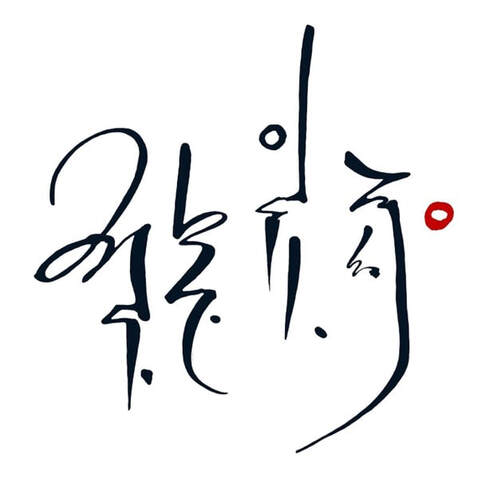

フジハブ
Welcome to FUJI HUB: Waystation to Poetry, Art, & Translation. This is not your final destination. There are many links to other websites here, so please explore them!
Welcome to FUJI HUB: Waystation to Poetry, Art, & Translation. This is not your final destination. There are many links to other websites here, so please explore them!
What are you looking for?
FUJI HUB Directory
Popular Sites:
Gallery of Graphic Poems
Working On Gallery
(Monthly New Article by Writers & Artists)
About Naoko Fujimoto
Contact
Naoko Fujimoto Copyright © 2024
FUJI HUB Directory
Popular Sites:
Gallery of Graphic Poems
Working On Gallery
(Monthly New Article by Writers & Artists)
About Naoko Fujimoto
Contact
Naoko Fujimoto Copyright © 2024
