|
Dearest Friends, (who also listened to my recent 8.55 minutes audio publication at the Indianapolis Review.) I am so honored to live this moment & share poems with you. I hope you have a wonderful last week of October. Love,
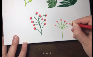
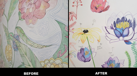
Naoko Fujimoto During the COVID-19 isolation, my schedule had been canceled and changed, so I meditated with drawing flowers. But soon I got bored, as if I had the same miso-soup every meal. It did not matter how I changed the ingredients. Miso-soup tasted like miso-soup. My flower paintings were my flowers…nothing excited me. Around that time, I was introduced to Sophie Lucido Johnson from RHINO Poetry Editor, Nick Tryling. Both jointed RHINO *graphic* Reviews Vol.2 in September, 2020. Sophie reviewed Unslakable (Paper Nautilus) by Rage Hezekiah. Sophie's art style was simple yet warm, and I love how she played with colors. Her style reminded me of my favorite children book's illustrations -- Matilda by Roald Dahl -- and many other illustrations by Quentin Blake. When I was preparing for the graphic issue, I also learned that she painted many objects such as flowers, mushrooms, animals, and cookies in her blog with her lovely articles. Some topics were like "How to Make A Little Book" & "How to Make Your Life Swole With A Page-A-Day Diary", which were all fun to read. So, I asked her to teach me how to draw flowers and she kindly had me for her art lessons. The Art Institute of Chicago currently holds Claude Monet's exhibition. He was the master of painting light. (I learned and heard that a million times.) It was so different until I forced myself to think about - - borrowing Sophie's word - - the white illusion of natural light. Here are pictures Before and After. I am more aware of where the light hits. And soft colored pencils (thanks, Angela Narciso Torres!) are perfect to collaborate with these effects. I took in so many details watching and observing Sophie's technique though the zoom lens. I am currently working on an English writing textbook for young Japanese children, so I will be upgrading my CAT drawing skills (maybe my cartoon RHINO too). Yes, Cats will be the navigators for how to write essays in English. Today's Instructor:
Sophie Lucido Johnson's work has appeared in the New Yorker, The New York Times, The Guardian, The Believer, and elsewhere. Her first book was called "Many Love." "This is not a poem. Please do not submit to us again". This comment came with a rejection letter before my graphic poetry, "Protest Against", was accepted by North American Review. I truly understood the concept of submission; however, this comment had stayed in the back of my mind. Since then, I started thinking of how I categorized my works and how they could be accepted as poems...though is categorization even necessary? This thinking influenced all my graphic projects afterward. Even though stories and poems with visual elements were not new ideas, some writers & poets made a clear division between written words and painted images. When I observed contemporary pieces that expressed both images and words with writers, they criticized the written parts of it. I was one of them. I had my own poetic vector and judged these pieces by my developing poetic knowledge. However, I am not saying that criticizing is a bad habit. It is necessary; especially in editing. All editors would like to cherish their selected pieces and create their publications for the best. In addition, the piece might not follow their current theme, even though it may be an interesting piece. During the last two weeks, I collected essays about visual submissions by editors at the Indianapolis Review and the North American Review for this blog. They were actively accepting their visual/graphic poetry submissions. Both editors had similar submission goals. Almost like I found my own craft tribes. The freedom I feel when approaching a blank page to write or paint on (or both) is exhilarating, as much as it is overwhelming. I think it helps tremendously to study what artists and writers believe about the practice and theory of making art, but ultimately you want to achieve that abstract, elusive goal: be an original: create in a voice that is all your own. -- Natalie Solmer, Founder and Editor of The Indianapolis Review I’ve begun using the word “excellent” or “best” less and less, preferring words like “necessary” or even “involving.” -- J. D. Schraffenberger, Editor of the North American Review The two editors also mentioned how important it is to be openminded. It might be easy to say it, but harder to do it!
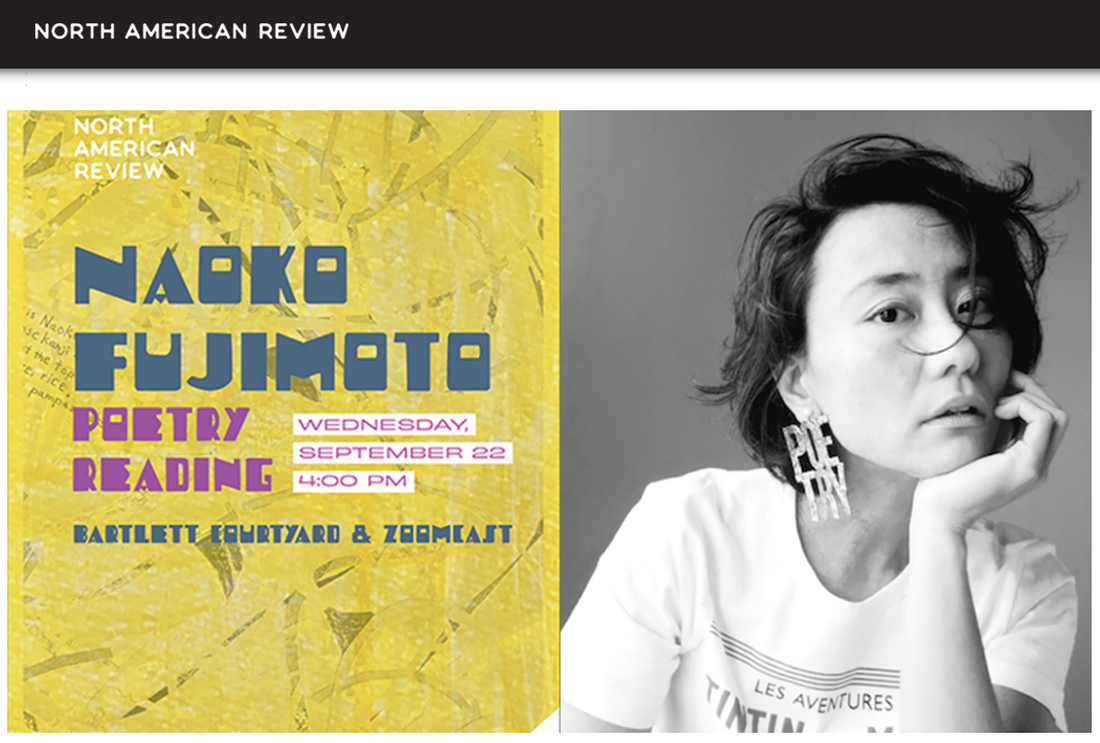
When I was processing the first issue of RHINO Poetry *graphic* Review in 2019, it took me a decent time to gather proficient contributors who understood the concept of writing a book review with visual elements, which means that some parts of their reviews might be expressed as graphics without words. I was seriously nervous when the first issue came out thinking some people might say, "They are not book reviews. Please don't do it again." Because of the first fantastic five contributors, the issue received phenomenal praises domestically and internationally. Therefore, the spirit could carry on to the second issue. The following year, new contributors were introduced to the review editor, Angela Narciso Torres, and me. The nine contributors created graphic reviews including two animations. I am already excited to organize the third issue in 2021, and am looking forward to meeting the new contributors who explore possibilities with words and images. Through my own graphic poetry submissions and RHINO *graphic* Reviews, I have been meeting talented writers and poets who craft their writing with visual elements. It was good to be reminded that I was not alone. When our RHINO Poetry editor, John McCarthy, my partner, and I had breakfast together, we talked about atheism; perhaps, poetry as a kind of religion. John mentioned the poetry collection, The Necessary Poetics of Atheism (Twelve Winters Press). Their conversation was really interesting; however, I had to leave for my early lecture for the North American Review Writing Conference. Even though I had strawberry waffles for breakfast, I could not resist a welcoming pastry at a reading room in the center of Seerley Hall at the University of Northern Iowa. There were a few people in the beautiful, gigantic room, but one person was playing the piano. It was a perfect morning with a chocolate croissant, hot coffee, and impromptu music. The pianist was Jeremy, the author of The Necessary Poetics of Atheism! Later that year, my graphic poem, "Protest Against", was accepted by the North American Review. In Final Thursday Press, the editors described my piece as, "The poem is a dance of boxed handwritten texts, my first love letter hid origami paragraphs, against Picasso-esque figures and face that populate the page. Red spills across the middle of the poem, and I love the way it takes the reader in, first visually and then through text." "Protest Against" was not an easy piece to be welcomed because words, sentences, & images each had a message (protest against this current society). However, they seemed like random ideas together. I was really happy that the editors accepted my original concept and interpreted it as their own thoughts. It is important to respect our traditional publishing style, yet I really think that we need no boundaries for our poetic forwardness. I respect the way that the North American Review is approaching their work. The North American Review Gets Graphic J. D. Schraffenberger After many decades as a glossy magazine with black and white interior pages, in 2019 the North American Review rebranded itself, a process through which we not only thought deeply about what our mission and goals are, but also what our visual and material identity was going to be going forward. As guiding principles, we asked how our magazine could be more open, how it might invite and support eclectic and diverse writers and artists, and how this work can be socially and personally restorative. The staff decided that in order to be open to the widest range of diverse work, including visual art, we would need to begin printing in full color, which has allowed us to present innovative graphic poetry like Naoko Fujimoto’s “Protest Against,” as well as a recent graphic review in our Summer/Fall 2020 issue by Frances Cannon of Ocean Vuong’s memoir On Earth We’re Briefly Gorgeous, and in the Spring 2021 issue, we’re featuring Gary Kelley’s graphic narrative about the blues musician Robert Johnson. Our commitment to publishing striking visual work is an ongoing process of discovering what is possible in our pages. For instance, “Protest Against” presented us a perfect opportunity to showcase a poem whose lyrical text was powerful in a traditional reading but whose aesthetic identity was more decidedly visual. We wanted it to serve as a declaration to our readers of how far into the visual we’re willing to go as editors. We are always open to visual art submissions in all forms, styles, media, and genres, including graphic poetry, graphic book review, and graphic narratives. As to what the NAR is looking for in future submissions, well, I’ll say the same thing I would if we were talking about submissions of poetry, fiction, or nonfiction: we want something bold, original, strange and beautiful on its own terms. I’ve begun using the word “excellent” or “best” less and less, preferring words like “necessary” or even “involving.” As an editor and a reader, I want to encounter something that demands an answer from me, that brings me into the details of its world, invites me to take part in the moments of its life. J.D. Schraffenberger is editor of the North American Review and an associate professor of English at the University of Northern Iowa. He’s the author of two books of poems, Saint Joe’s Passion (Etruscan Press) and The Waxen Poor (Twelve Winters Press), and his other work has appeared in Best Creative Nonfiction, Brevity, Hayden’s Ferry Review, Mid-American Review, Notre Dame Review, Poetry East, Prairie Schooner, and elsewhere. He lives in Cedar Falls, Iowa, with his wife, the novelist Adrianne Finlay, and two young daughters.
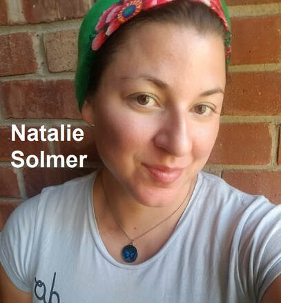
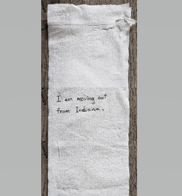
I actually have not met Natalie in person yet; however, I have been working with her on several occasions including RHINO *graphic* Review 2020. In addition, my graphic poems "Spaceflight Sonata P" (the Indianapolis Review, Spring 2019) & "Spaceflight Sonata P.2" (forthcoming) were accepted by her online journal. "Spaceflight Sonata P" was an unusual piece because it was written on a toilet paper roll. The main concept was human history may as well be written on toilet paper—frequently flushed away—before we learn from our decisions, despite how horrifying some were. For more details, please visit her journal and my essay; "Then Why Did I Use a Toilet Paper?" This piece was challenging to publish in both print and online journals because it was toilet paper - - super long, narrow, crumbed written letters without colors - - but she accepted it. Then, I strongly wanted to know more about her acceptance style & how she juggles poetic risks. Natalie Solmer Founder and Editor of The Indianapolis Review There is no easy explanation for how I choose the pieces of art that we publish in The Indianapolis Review. I could give you the obvious answer that reads like literary journal guidelines--’we want what is vivid, urgent, original’--but I won’t. We at The Indianapolis Review do want all those things, but how do I quantify and define those factors? Instead, I will tell you more about the origins of the journal, my own narrative, and what principles have shaped my 'eye.' I began The Indianapolis Review because some mystical force wouldn't let me sleep until I committed to fulfilling the vision I was seeing of the journal. I was already suffering from a lack of no sleep and no free time, so starting a journal seemed insane; however, I knew not to dodge The Muse. The vision I had of the journal came complete with a painting in my head. The very first thing I did besides procuring our domain name was begin creating our cover art: the Indy skyline being swallowed up by fish and a giant moon. I also knew I wanted to publish 5 artists per issue, which is somewhat unusual for a poetry journal. The art submissions have turned out to be the most thrilling thing for me, and connected me back to my own love of visual art. Though I have a Master's in Poetry from Butler University and lots of experience running poetry workshops, I do not have formal training in visual art. Therefore, while I feel quite confident in my critique of poetry, I have felt that the way I curate art for our issues is more intuitive and strange. I say I don't have training in art, but I have training as a florist. I worked as a one for over 13 years and created floral designs, as well as visually impactful sales displays, every day. I got into that profession due to my training in horticulture and an absolute need to "do something creative." It has only occurred to me now that I am a full-time professor how much I desire the presence and creation of visual art alongside my need for poetry and words. I've also realized that working as a floral department manager in a grocery for over 13 years taught me a lot about art. Here are some of those things which I have learned and which act as guiding principles in my curation process: 1-There needs to be an emphasis or focal point. In floral design this is usually achieved by including a large flower amid small and mid-sized flowers, or by creating emphasis on one group of flowers. Apparently, we creatures like to have somewhere to rest our eyes, focus, and contemplate. I find I am drawn to visual art or visual poetry that has a focal point, whether it is an image or text. These things could be a figure, face, object or larger abstract shape amid smaller shapes, for example. 2-There should be a sense of proportion and scale. In designing a vased arrangement, you aim for the arrangement to be 1.5 times taller than the vase, or at least as tall as the vase. Also, the arrangement should fit into its environment or place it will be used. Thus, sometimes a pavé style arrangement, where the flowers barely stick up out of a low container, is more appropriate in regard to its environment. Is the artist aware of the proportions of the objects in the art or the text included in the art? What is the proportion and scale communicating to the viewer about the art? 3-Be aware of the rhythm in your designs. Rhythm is created by repetition and the arrangement of the repetition. It is found in the precise placement of the roses in a vased dozen: how they radiate outward from a central rose and are spaced equidistant apart. Rhythm is also found in the placement of figures in a painting: how far apart they are from each other, how they are positioned towards each other and in relation to the rest of the scene on the canvas. What is the rhythm of the visual piece, and is it helping to communicate the artist’s purpose? 4-What is your purpose? Every time I created a design, it was for an occasion, even if that occasion was only known by the customer. A design carried a mood, and an underlying message based on its container and floral make up. I made the usual bestseller arrangements for anniversaries, birthdays, get well soons and new babies: rose bud vases, half and full dozens, mixed garden vases, and containers filled with flower foam. But I also created the unexpected: monochromatic arrangements of all yellow or a dozen purple roses with purple filler flowers. The yellow arrangement might be a bit manic, insisting joy or perhaps good health, friendship. The purple roses created fantasy, romance, the unexpected. If no purpose or message can be discerned from a piece of visual art, not even the creation or transmission of a certain mood or feeling, then it is not vital. 5-Know what you are communicating with color. As I alluded to in the previous point, colors often symbolize and communicate specific thoughts and emotions. A well known example of color symbolism in the floral business is that red roses stand for love, and yellow roses mean friendship. I never felt that these designations were set in stone, but colors have been scientifically proven to influence mood and emotion. What colors are used in a piece and why? Whether a piece of visual art is black and white or a composition made of contrasting jewel-tones, color says something. If the color composition is neither harmonious, nor contrasting, doesn’t make sense with the purpose of the piece, doesn’t seem to be well thought out, it’s a huge factor in my experience of the design. 6-Do your work with an open mind. I never wanted to be a florist in a grocery store--it sounds a lot less prestigious than designing in some fancy little floral shop, right? For awhile, I tried to leave the grocery and work in one of those shops. I would go interview in those places, and often they treated me very snobbishly after reading my resumé. After a few tries, I gave up. I realized that my situation was actually pretty great. As a floral department manager in the grocery, I had huge freedom in what I designed, and I had stability, which I knew didn’t exist that often in mom and pop floral shops. I’ve certainly heard disparaging remarks about my working in the grocery from acquaintances, customers, and family alike. I learned many things working as a grocery florist, but one of the most important things I learned was to be open minded and not judge anyone by their job or material wealth. Sometimes I see a submission of artwork to The Indianapolis Review that treats its subject matter with patronizing judgement. I certainly see this in poetry submissions as well. Often these pieces are trying to achieve the opposite--maybe bring awareness or solidarity to some social justice issue. However, if you are coming into your creation process with a mindset that you are superior, this will show through, even if it’s all subconscious on your part. Another aspect of this is when people judge certain styles or forms of art to be not as important or as serious as other art due to their popularity among artists that might not be formally trained, etc. 7-Now, go break all of my rules. Go break everyone’s rules. My favorite thing about visual art and about poetry is that there are technically ‘no rules’ to either of these forms of expression. The freedom I feel when approaching a blank page to write or paint on (or both) is exhilarating, as much as it is overwhelming. I think it helps tremendously to study what artists and writers believe about the practice and theory of making art, but ultimately you want to achieve that abstract, elusive goal: be an original: create in a voice that is all your own. Well, that’s all I got for now. I hope that at least one part of this was helpful in some way to at least one person. If you’ll excuse me, I am going to return to: mothering, making my art, attempting to write poetry, and grading lots of papers! Natalie Solmer is a mother, professor, and founder and editor of The Indianapolis Review. Before teaching, she was a horticulturist and florist for many years.
|
Archives
July 2024
|
フジハブ
Welcome to FUJI HUB: Waystation to Poetry, Art, & Translation. This is not your final destination. There are many links to other websites here, so please explore them!
Welcome to FUJI HUB: Waystation to Poetry, Art, & Translation. This is not your final destination. There are many links to other websites here, so please explore them!
What are you looking for?
FUJI HUB Directory
Popular Sites:
Gallery of Graphic Poems
Working On Gallery
(Monthly New Article by Writers & Artists)
About Naoko Fujimoto
Contact
Naoko Fujimoto Copyright © 2024
FUJI HUB Directory
Popular Sites:
Gallery of Graphic Poems
Working On Gallery
(Monthly New Article by Writers & Artists)
About Naoko Fujimoto
Contact
Naoko Fujimoto Copyright © 2024
