The Gallery of Graphic Poems showcases each graphic poem by Naoko Fujimoto. She is explaining the details of her work.
For graphic poetry lectures and questions, please click here to contact the team.
For graphic poetry lectures and questions, please click here to contact the team.
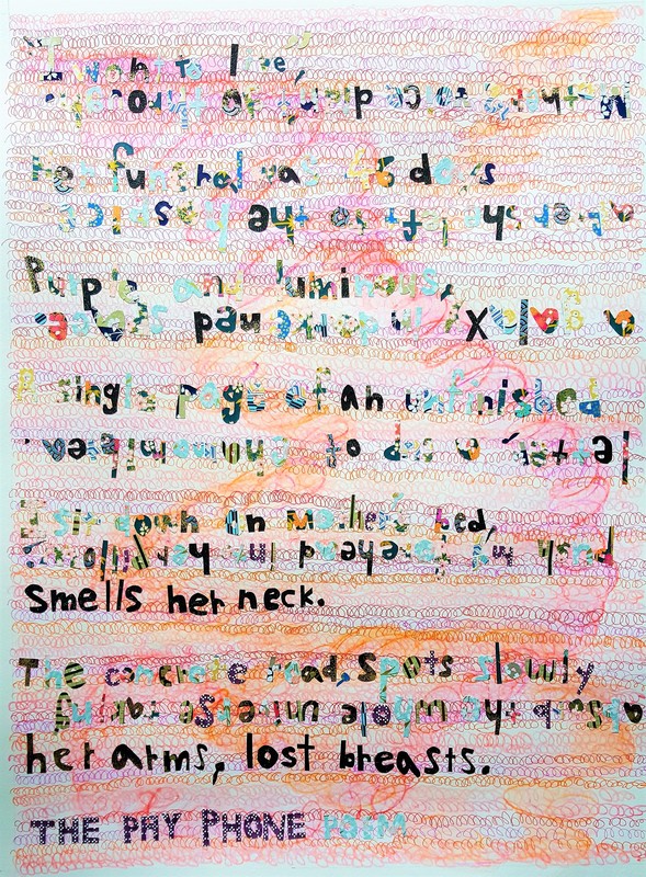
“The Pay Phone” is Very Difficult to Read
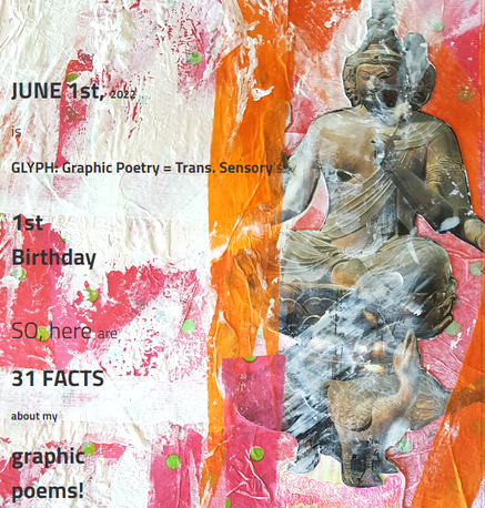
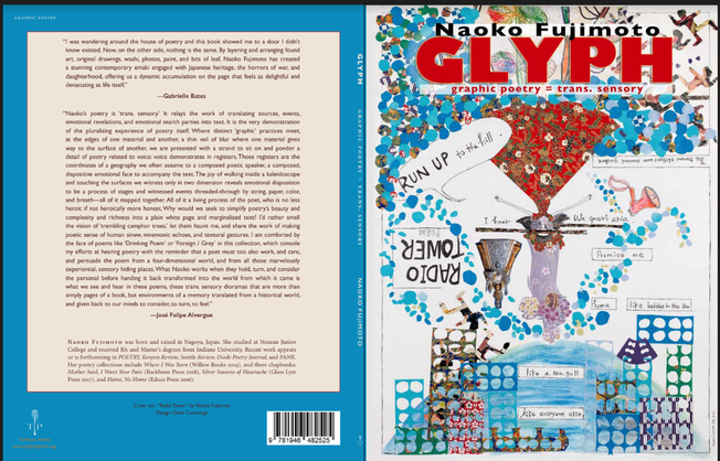
“The Pay Phone” is a graphic poem from my project, which is called Graphic Poetry = Trans. Sensory. My entire collection will be published by Tupelo Press in the near future under the title “Glyph: Graphic Poetry = Trans. Sensory”. I am currently finishing some of my works.
“Trans.” has two meanings, which are Translate and Transport. I translate my poems into words and images to create a contemporary picture scroll. The picture scroll in Japanese is Emaki (eh-MA-kee), and the art has been a popular and well-known style since the 6th century. Emaki is a collaboration of words and art and is akin to a current graphic novel / poetry / comic.
With the visual experience, I also want my readers to transport their senses from the flat paper and bridge the gap between words and images that will connect with their physical counterparts. Like a historical Emaki, there are side stories hidden behind some of the main graphic narratives— be they comedic or serious— for audiences to interpret. All of the details (choice of words, origami paper, or styles) have a specific meaning to contribute to the whole.
The original poem, “The Pay Phone”, was written after an interview with the daughter of a breast cancer patient when I was composing my poetry chapbook, “Home, No Home”. In the chapbook, I interviewed and researched survivors of health risks, natural disasters, and broken moments to identify the meaning of “home”.
As readers can see, “The Pay Phone – Graphic Poem” is very difficult to read. Words and sentences are intentionally upside-down and drowning into the similar background color. The cut-out letters are almost like a life-threatening letter. All my graphic poems are filled with personal moments. The cut-outs are origami-paper that was donated from a family of cancer survivors in Japan.
One patient called her daughter every evening from a hospice’s pay phone and said, “I want to live. Talk to you tomorrow.” I could not ignore the image of a patient standing by a pay phone every day to share how much she wanted to live and spend the future with her loved ones. However, the patient’s voice did not go through easily after her many treatments, mirroring her family and friends’ fatigue over time.
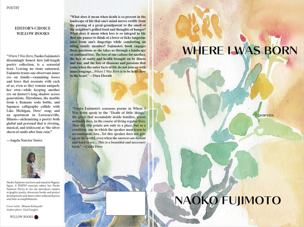
*****This original written poem is in my full-length collection, "Where I Was Born" (Willow Books).
“Mugwort’s Leaves”
Thirty-six Views of Mount Fuji is a series of landscape ukiyo-e (prints) by Hokusai. No.35 is titled “Sunsyuejiri” (駿州江㞍) which captured a strong wind blowing away papers and hats in the countryside. The structure is very minimalistic with Mt. Fuji, reeds, and some traversals; however, Hokusai described the strong wind so well with his perfect arc of tracing papers and hats against the magnificent Mt. Fuji.
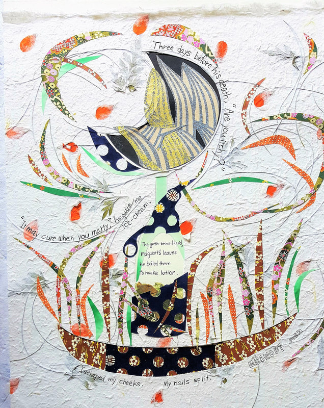
I wanted to use his arc techniques in my graphic poem, “Mugwort’s Leaves”, when I found the base washi-paper in Takayama. The paper was already pressed with dried reeds, flowers, and Japanese mugwort (yomogi). The reeds showed beautiful natural movements on the paper. With the paper, I added origami slits to support more arc movements around the bottle; therefore, it is like a wind blowing around the bottle like a magic potion.
This poem was inspired by my grandfather who used to make a lotion with mugwort’s young leaves. The words flowed from the top part into the bottle. The liquid was brown (like the color of the bottom part of the graphic poem) and had a certain unpleasant smell; however, my grandfather’s generation believed that it would cure my chronic dry skin. They believe in a more naturalistic approach than current medical treatment. Another example, in the poem, he said, “It may cure (you) when you marry”.
In the bottle, the organic liquid is contained, and it leads to the last line, “I scraped my cheeks. My nails split.” This naturalistic approach fails, so does Grandfather’s effort to his granddaughter who scratches her skin. I scraped off some of the base washi-paper to show a fleshy red color (flower petals) to represent scars on her skin. This piece is a one of my heartbroken collection.
You may see this art at Drunk in a Midnight Choir.
Observe & Listen
Graphic Poetry Audio Project is an online exhibition, which is a collaboration with Naoko Fujimoto’s graphic poems and recordings by modern leading writers, poets, and artists.
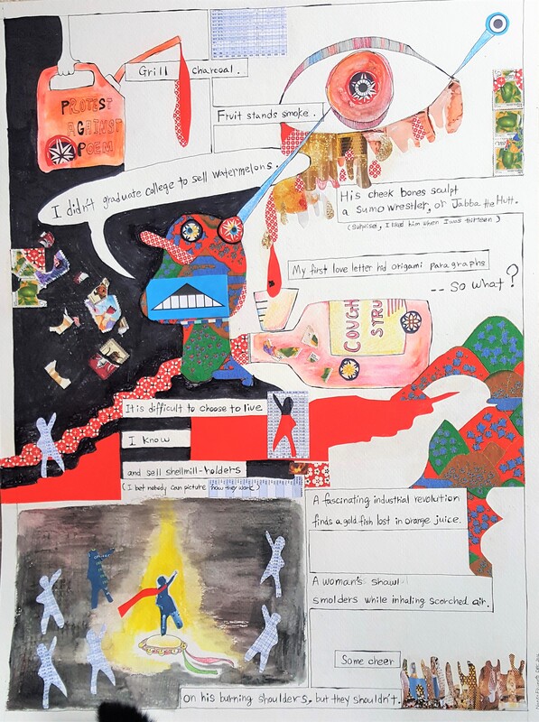
"Protest Against"
Graphic poetry is the melding of word and image. This video shows how I select words from the original text.
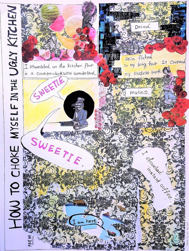
"How to Choke Myself in the Ugly Kitchen"
Emaki style is traditionally horizontal because a viewer easily can scroll through it from right to left and many viewers can observe it at the same time. It is also more convenient to display horizontally than vertically. Now, the display style has been changed. For example, the majority of my viewers have smart phones, which are rectangles. They often scroll down when they read or see pictures. Therefore, I choose to display my graphic poems vertically. (Thought, I have not removed the horizontal option yet.)
In addition, a traditional emaki shows graphic details of life (clothes, food, children’s plays, domestic animals…). The viewers are not only reading the emaki but also entertaining their eyes with the details. I adapt that background style into my graphic poems as well.
“How to Choke Myself in the Ugly Kitchen” is a one-page vertical piece. Viewers can read either from the top right or left (the narrative is not affected). If viewers listen to my original poem from Glass: A Journal of Poetry, they would realize that a large portion of words is replaced by images. One of my favorite graphic details is the yellow-green wall paper, which also represents a wet paper-towel. I crumpled it with colored water and displayed it like a wall in an old house.
The narrative woman is a traditional housewife who takes care of her husband, sometimes sacrificing herself, but she may not be financially or emotionally independent from him. The sheep in a torn post card said, “I am here”, as if the narrative woman is like a powerless animal. But the bright blue peeks in the graphic poem represent an ideal life being somewhere in the world.
Hashida Sugako (1925 – present), an established female TV drama script writer talked in an interview about how she wanted to be a perfect wife with her full-time job. Around the 1970’s, some husbands had more dominant power in their houses than their wives. In the current era, I still see unfair relationships between husbands and wives, so I wanted to write about it. This poem was inspired by the interview and my former female boss.
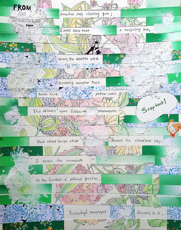
"From an Apartment"
This is a one-page illustrated narrative (like an Emaki style). A girl in a pink-purple dress with a lemon umbrella ran; perhaps, skipped over flowers. This is a graphic poem, so the first line started from the top left to the bottom right. The girl is the narrator, “I smell stale beer, a recycling box...”, when she walked on a street, she described her surroundings (as in the first scene of “Mrs. Dalloway” by Virginia Woolf). The green stripes represent sunbeams streaming through the leaves of trees, and white sands add the dirtiness of a downtown street.
When you listen to the audio from Glass: Poetry Journal, you will find a significant difference between my original written poem and graphic poem. In the original, “Mother said, Step back.” In the graphic poem, a mother-hen spoke, “Step back!” I represented it with an image instead of words because the mother-hen is visually loud, which means that the audience can easily connect with a mother-hen’s stereotypical image (protective, anxious, etc.). This poem was a coming of age poem for the girl who became independent from her mother and kept walking toward her local subway station, even though it said, “Step back”.
This poem was inspired by a black street lamp by Kurumamichi Station, in Nagoya. The lamp was unfortunately taken down due to the city’s street development; however, it was really tall and almost poked into the sky, especially in the cloudy morning.
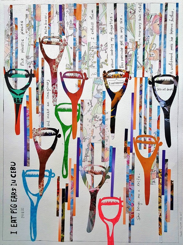
“I Eat Pig Ears in Cebu”
Gerhard Richter (1932 – current) is a German artist, and he studies new meanings and relationships between photographs and paintings. He paints a portrait with oil paintings as if he uses an Instagram smudge filter. He has various technics such as overpainted photographs (he paints oil over a snapshot photo). When I saw his art, I felt the similar esthetic of interpretations between traditional poetry and graphic poetry. And I wanted to adapt his technique into “I Eat Pig Ears in Cebu”.
“I Eat Pig Ears in Cebu” is a based on my experience in Cebu, the Philippines when I volunteer worked for an elementary school where some of Leprosy descendent attended. As if Richter used a squeegee to scrape the paint to create blurring particular parts of his work, I used peeler objects to scrape a social problem, which the young girl who grown up in the village still had a strong stereotype discrimination against Leprosy. Because of this discrimination, the village has been isolated from better education and quality of life.
These colorful strips represent “an imaginary rainbow” that the girl made with random plastic pieces/trash in the poem, and she may know that it may be very difficult to get out from her community. The childhood-memory-like, stick-figure drawing camouflages; perhaps, blurs this harsh reality.
These strips are majorly made of four papers, (Angela Narciso Torres’ book cover, her original idea of a cover art by her son, my handmade birthday card to Angela, and origami papers). I used these papers because Angela is originally from the Philippines and we often talk about Filipino history and culture. Her book, “Blood Orange”, is full of ordinary Filipino family life. I made a large piece of the stick-figure drawing and dedicated half of it to the graphic poem, and the other half to a birthday card for her. I had one of my best birthdays when I stayed in the village. The Filipino people were so kind to me, so I tied this memory to the graphic poem and the birthday card to Angela.
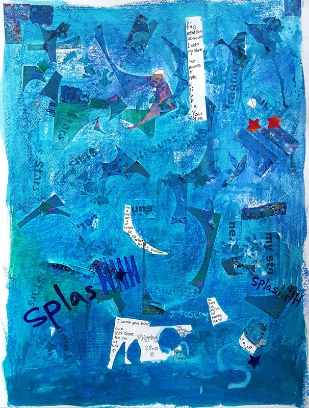
"July 2017, Skipping Stone"
"July 2017, Skipping Stone" is a graphic poem adapting E.E. Cummings' writing style (you may see the art at Jet Fuel Review), and "Before Sunset".
For example, some lines from "July 2017, Skipping Stone":
"You give me
a new one o
ur hands lie to
gether
like a bi
(ボチャン / ボチャン)
valve
(splaSHHH/ splaSHHH)"
"July 2017, Skipping Stone" showed an awkward girl who was horrible at skipping stones; perhaps, this was an analogy for a naive girl who did not know how to fall in love. She still did not know love is a trial and error endeavor, just like skipping stones -- she needed to be patient to learn about it. E.E. Cummings' writing style also worked for showing her clunky emotion.
And then her emotion carried on to the next art, "ぼちゃん".
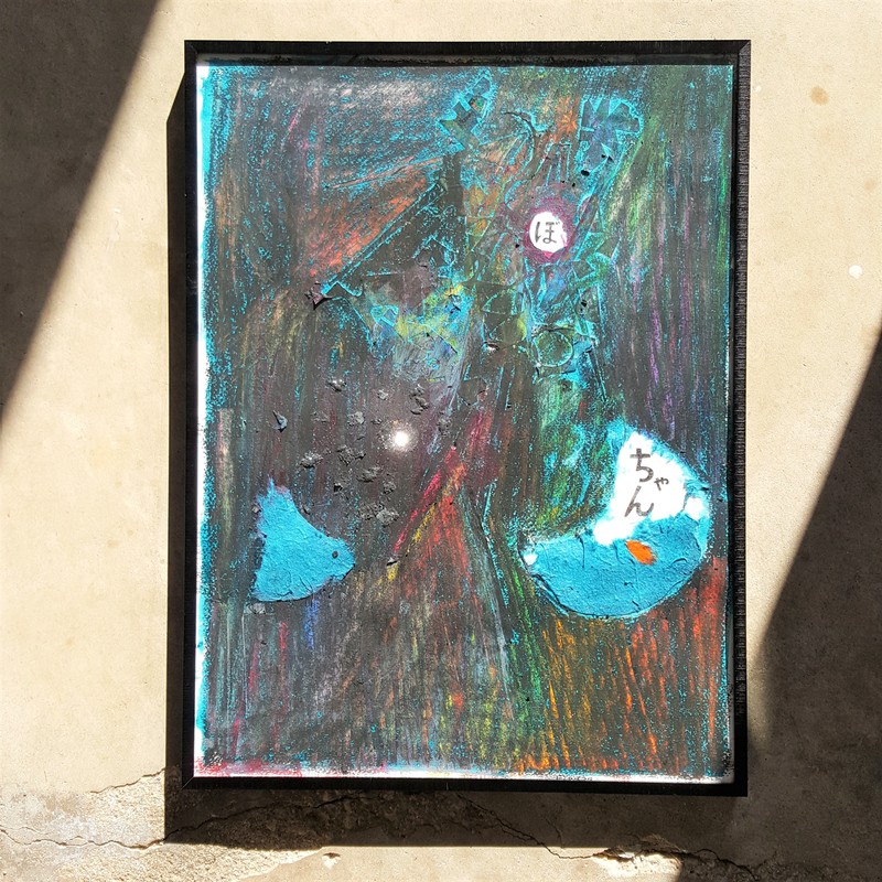
"ぼちゃん"
I created this graphic poem for my exhibition, "Star Fragment" at Kafein (February - March, 2018). "ぼちゃん" (BoChan) is a splashing sound in Japanese. This art was exhibited between my experimental art-writing "July 2017, Skipping Stone", and my large graphic poem "Before Sunset".
"ぼちゃん" was an important connecting piece. Because the art showed the narrator's emotion through time from "July 2017, Skipping Stone", In "July 2017, Skipping Stone", the splash sound was expressed as "ボチャン" in Katakana, Japanese. When you compare the shapes of words -- even though it says the exact sound, "Splash" -- they look different.
"ボチャン" had a hard look.
"ぼちゃん" had a soft appearance.
What I wanted to show in "ぼちゃん" was the main narrator, the girl, coming out of her hardened shell -- the conflicts between her existing knowledge of relationships and emotions about love -- and understanding herself with a flexible mind. There was still her awkwardness -- inconsistent shapes in the upper right quadrant -- and even though "ぼちゃん" showed a soft image, it was "Splash" after all.
So, in the art, she was still learning about love, but she was no longer just being innocent. She might feel confused or angry about her relationship; however, she also enjoyed being in it -- peaking colors between the grain, and significant forms of bright white or silver -- these objects would glitter from observing from different angles. I love this piece. Even though I used a lot of black oil pastels, it still shows brightness, which connects my goal of writing poems (sometimes I may fail though).
I am looking for someone who will take care this art well. The size is 18 x 24 inches with a steel frame. This has a list price, yet it may be negotiable, so please contact me if needed. You may see more pictures of this art at my Instagram. Domestic and international shipment fees are included.
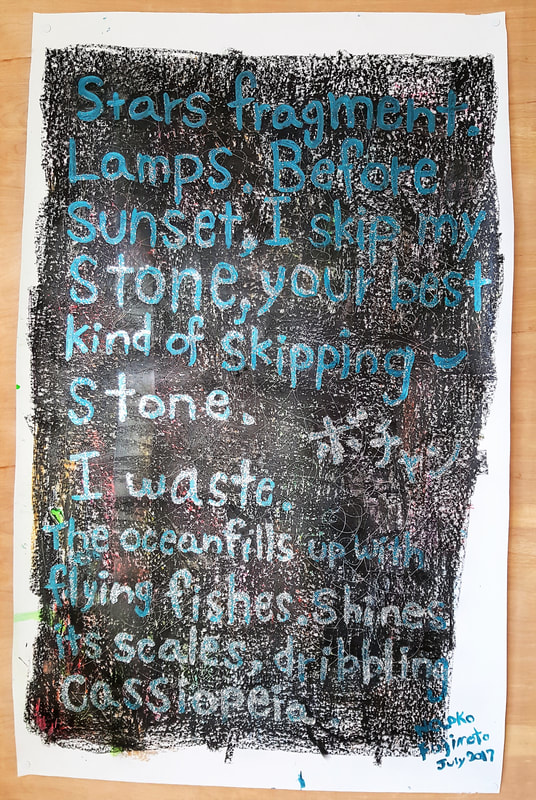
"Before Sunset"
I talked about my graphic poems, "July 2017, Skipping Stone" and "ぼちゃん" in my blog post on March 14, 2018 as well. They were a series of three exhibited next each other in order -- "July 2017, Skipping Stone", "ぼちゃん" and "Before Sunset".
"Before Sunset" is one of my lifetime working pieces because the original poem was published in Puerto del Sol, my very first publication. This poem is flexible, changing shapes and adapting to different line breaks, sounds, and words.
In "July 2017, Skipping Stone" and "ぼちゃん", I talked about how the narrator's emotion changed from a closed to an open mind, reflected in the letter characters morphing from hard to soft. "Before Sunset" was a sparkling piece. The colors and reflections of letters differed from the multiple angles -- sometimes you may not be able to read the poem if it is too dark, sometimes you are able to read only parts of it.
This graphic poem showed the emotion of love by the main character (as many already know that love had many faces: bright, sparking, colorful, dark), and how the relationship changed over times like the seasons.
I enjoy creating graphic poems because I can experiment expressing human emotions with more visual elements. I understand that some poems are suitable for being written/printed on paper. However, poems like "Before Sunset" have a variety of creative expressions, and I love exploring these opportunities.
NOT EATING BACON AND EGGS ON SUNDAY
“Not eating Bacon and Eggs on Sunday” was inspired by Picasso’s cubism after I visited "Picasso and Chicago" at the Art Institute of Chicago in 2013. Later, I also learned that Picasso has an art for breakfast. It is excitement to write a simple family dining experience and adapt cubism into poetry. I see one event (a family breakfast table) from many angels like that Picasso composed his art and I have fun with slashes for line-breaks & sounds effects. I read this poem at the Chicago Poetry Center.
NOT EATING BACON AND EGGS ON SUNDAY
After Cubism
The bottle / rolls in the vending machine. Mother / braces her hand against the cabinet / and
picks the leaves. Glistening juice / sizzles in the pan. Mother flaps / the pink towel. Father /
cooks sunny side up. I / do not eat his breakfast / but eat four Japanese tangerines. I want / his
change to buy a bottle of soda. I step / on a chair and hear water running from an icy / metal
spigot. The yolk / melts on the edge of the fork. Mother / washes her face. I hold / three coins in
my hand. The water / comes from the stem and I see / its vascular bundle. My hands smell / like
orange and coins. The broken / kapok-tree is on the carpet. Father / keeps flipping the bacon and
eggs. There are piled / books and a wallet on the tall cabinet. Sister eats / only bacon and
scribbles on a plate with egg yolk. / The stem is bent / and broken in half. When I reach / the
coins, the books fall into the kapok. The white / vascular bundles are between my nails.
I was wandering around the house of poetry and this book showed me to a door I didn’t know existed. —Gabrielle Bates
Naoko’s poetry is ‘trans. sensory.’ It relays the work of translating sources, events, emotional revelations, and emotional search parties into text. — José Felipe Alvergue
You may enjoy reading following articles:
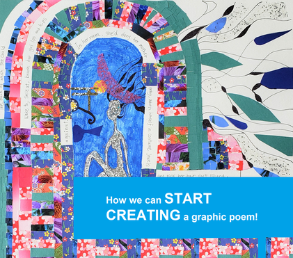
How we can start creating a graphic poem!
How do I choose materials and color schemes?
One simple way to improve observing habits after graphic poetry exercise
Is it difficult to have divergent thinking?
Can a graphic poem have a line break?
Why didn’t I write down whole poem in a graphic poem?
How Graphic Poetry Helps Us Progress the Story Telling Technique and the Creative Process of Its Own Editing
