|
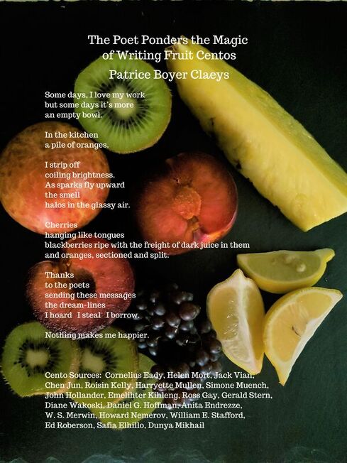
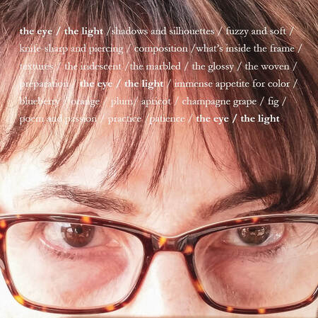
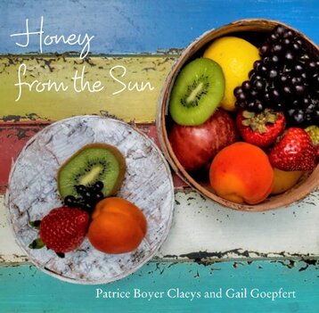
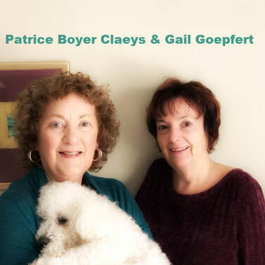
In early 2020, I heard comments from poets and writers - - "My lectures were canceled", "No conferences" - - "I cannot write", "No motivation" - - "Because of the pandemic, we do not have to write", "Welcome to slow days...", or "Zoomed-out!" I personally complained that my residency at the Writer's Room at the Betsy was canceled with other trips and events that I was looking forward to for months. We all knew that the pandemic became more serious and heartbroken through time. I started hearing of friends' extended families in the east coast passed away, including my publishers' family members. Though, one thing really cheering me up was exchanging photos between close poets. Occasionally, I received texts, (my phone never rang), and Gail Goepfert was one of them. I took pictures of tulips, grilled cheese sandwiches, and some silly, ordinary things. I was delighted to see that Goepfert and her friend, Patrice Boyer Claeys, created their collaboration photo - poetry book. It was colorful and cheerful, but more importantly it was a friendship collaboration. Their pure creative process cleansed me. "Wanna play tag?" "Sure!" Like these children's conversations - - it sounded so light, but also complicated to have these friends once we were all grown up; especially, both were in the same poetry profession. For me, I always had doubts, "Is this work necessary?" "Do they laugh at me for whatever reason?" before I shared my ideas with my fellow poets. While it is physically impossible to make honey from the sun, poets and artists can use that inspiration to fuel creative endeavors. Goepfert and Claeys used 2020 as an opportunity to create something together. The Making of Honey from the Sun by Patrice Boyer Claeys & Gail Goepfert Patrice Speaks: In the spring of 2020, Gail and I had just wrapped up our first chapbook collaboration about the pandemic. True to my relaxed fashion, I declared myself free to take a breather from the exertions of poetry. Gail, ever the encourager/task-master, had other ideas. She suggested I turn my attention to food, a subject I am passionate about. With a laugh, I told her to “get out of my hair,” but as we went our separate ways, her nagging voice rang in my ear. I am an avid writer of centos, with thousands of lines collected from many poets. Scanning my notebooks, I found a quote by D. H. Lawrence that intrigued me, “Every fruit has its secret.” What could these secrets possibly be? I was certain the cento form, with its fresh associative surprises, would help me discover them. Almost like using a Ouija board, making centos moves me into unexpected areas of thought and imagination. I began creating short centos about individual fruits—blueberries, alpine strawberries, grapefruit, kiwi, peaches. Writing had never been such fun! The poems were coming together almost without effort, and—amid a pandemic—the results gave me unadulterated joy. After sharing early poems with Gail, she said she would like to collaborate by trying her hand at graphic poems, but an early attempt with peaches left her uninspired and unconvinced of this collaborative plan. At a backyard gathering of our writing group, Plumb Line Poets, one of the members said, “If you photograph the fruit, you could make a perfect book for the coffee table, a kitchen store, or gift shop.” Gail Speaks: When the idea surfaced of collaboration on a book where my part was photography, I was all in. I like new projects, things to keep my inventive mind from becoming creaky with disuse. And I have made books with travel photographs before; that aspect was not that daunting, but Patrice and I were both novices to “food photography.” Our journey with fruit is probably best experienced in the video of The Making of Honey from the Sun. What I knew as an avid amateur photographer was that light and background and layout and framing all mattered. The plan was to figure out what would be aesthetically pleasing and characterize Patrice’s poems, which we read aloud before each setup; the reading served as inspiration and motivation for the shot. We purchased bags and bags of fruit and used every surface we could find—front porch slate, cutting boards, tablecloths taped with duct tape to smooth wrinkles, copper-topped table, credenza, a burled wood side table, kitchen countertop, deck railing and so much more. We plated or bowled with whatever we had in our homes--dessert plates that were my mother’s, Patrice’s china and mine, a random log from the fireplace, the bottom of her grown daughters’ Barbie barrel, a cheery tablecloth from Goodwill my sister had given me, and all manner of linens we gave a test run to see what delighted our eyes. Patrice’s kitchen skills energized the arrangements with a hedgehog of mangoes, spiraled orange peels, draped grapes, and strawberries tucked neatly into a wreath of juniper cuttings. Because it was summer and I loved the idea of integrating natural elements, we plucked petals, chopped branches off trees, and picked native grasses. We were both always thinking about props. There were many reshoots and shuffling of props and fruit for a new pose. I wanted the light and the presentation to be as good as it could be. I am sure Patrice lost patience with my “eye.” We had many laughs as she used an umbrella, a beach towel, and her own shirt to block the light and give us what we needed. It was important that we both gave the thumbs up to all twenty-three photos and the front and back covers. Some days we spent six to eight hours to pull together three or four shots. It was both more exhausting and exhilarating than we expected. Ultimately, it was one of the most fun photo challenges I’ve attempted. Gail and Patrice Speak: The poems offer an unusual twist to how we view everyday fruits, but we realize the coupling of the poems with the colorful, quirky photographs doubled the pleasure and caught people’s attention. The photos give people a door into the poems. We found that the combination of visuals with words has a broad appeal to both poets and people who do not have poetic leanings. Just as some wines pair well with certain foods, our book was a happy pairing of words and images, poet and photographer. Gail Goepfert, an associate editor at RHINO Poetry, is a Midwest poet, teacher, and photographer. Her first chapbook, A Mind on Pain, appeared in 2015, first book, Tapping Roots, from Aldrich Press in 2018. and Get Up Said the World was released in May 2020 from Červená Barva Press. Forthcoming books are Self-Portrait with Thorns from Glass Lyre Press and a collaboration with Patrice Boyer Claeys, This Hard Business of Living from Seven Kitchens. Recent publications include One Art, Rogue Agent, The Examined Life Journal, The Night Heron Barks, and The Inflectionist Review.
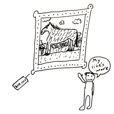
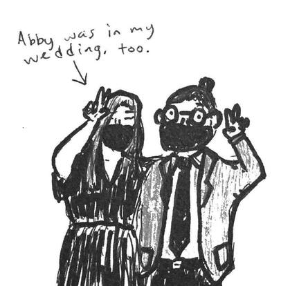
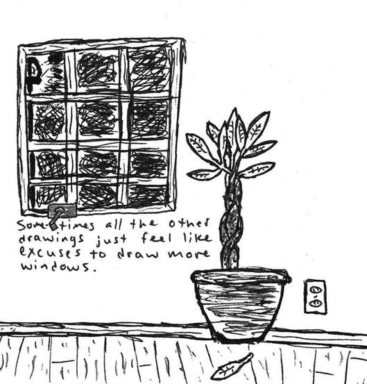
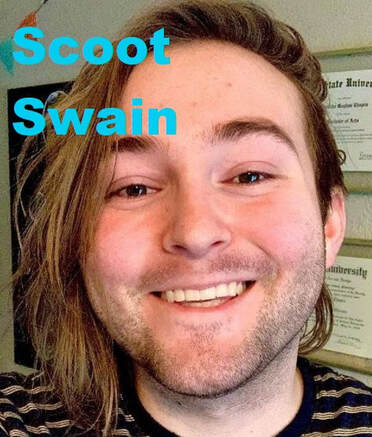
Patrice Boyer Claeys graduated from the University of Pennsylvania and the University of Manchester, U.K., and completed a Certificate in Poetry from University of Chicago. Her first collection, Lovely Daughter of the Shattering, was published by Kelsay Books in 2019, followed by The Machinery of Grace (2020). She collaborated with Gail Goepfert on a photography/poetry book, Honey from the Sun (2020), and on a poetry chapbook, This Hard Business of Living, due from Seven Kitchens Press in 2021. Recent work appears in The Night Heron Barks, SWWIM, *82 Review, little somethings press, Zone 3, Inflectionist Review and Relief: A Journal of Art and Faith. People asked me how an artist adapts the true meaning of an original poem and what the original poet thinks about the adaptation; mainly because of the current #RHINOArt2Art Submission Guideline. I have my own thoughts, but I wanted to explore this question with Gretchen Primack and Scoot Swain. Primack's poems were adapted into video poems, visual poems, and a graphic book review by various artists. She talked about the adapted works in the past article. I saw Swain's works at The Indianapolis Review (Issue 14: Fall 2020: The Visual Poetry Issue) for the first time. The Editor In Chief, Natalie Solmer, beautifully curated the issue, and there are so many current leading visual poets such as Sarah Sloat, Meg Reynolds, and David Dodd Lee. Solmer also discussed what she is looking for in her submissions in this article. It is the happiest feeling to share works with my respected, fellow visual poets. Swain added illustrations to Abby Johnson's poems, which were "16 Questions that Might Lead to Love" in the issue. My favorite thing about their illustrations are how relaxed the line-strokes are. The comic poem was clearly a good result of teamwork - - the illustrations and words flowed, and the two elements were fluently welded together - - that was my first impression of their poetry comic. Then, when I read the following article, I was like, "I knew it!" Swain and Johnson were indeed good colleagues. There was clear proof in the illustration. By Scoot Swain Abby Johnson and I worked together on 16 Questions that Might Lead to Love. She brought the poem into one of our classes in Paige Lewis’s workshop and I just fell apart after reading it. No huge surprise there--Abby is without question my favorite poet. After that class, I reached out to her and asked if she minded if I illustrated it, and we went from there, communicating through email. It took me about a month total to get all of the drawings’ last drafts together, but the entire process couldn’t have gone any smoother. I went line by line, writing each one in sharpie on a piece of Bristol paper and leaving myself plenty of room to draw. That was the most relaxing part of the process--a great opportunity to just sit and listen to music and take in the poem at a much slower pace. For anyone who wants to try their hand at a similar project, I recommend buying some notecards for first drafts so you don’t waste as much Bristol paper as I did (I’m not very good with scissors). Once all that was done I got drawing, which you probably guessed took the longest. The biggest no-no in poetry comics is drawing the exact same images already evoked by the piece’s language. You can’t illustrate “The Red Wheelbarrow'' by just slapping a red wheelbarrow on the page. Doing so takes away from both the words and drawings, makes the comic feel flat and predictable by taking away any tension between the two forces. Instead, I like to focus on the unseen--what absences can a line imply? What was here that we’re just barely too late to see? Something’s missing. What? The idea of absence makes 16 Questions into the piece it is--empty rooms, unopened doors, abandoned swingsets. When adapting poems into poetry comics, I’ve found that every image comes from the poem, even if it wasn’t in the piece to begin with. Or maybe it’s just that I love drawing people who look incredibly forlorn. Maybe a little bit of both. I should say that my favorite part of making the comic was working with Abby. She’s one of the best friends I’ve ever had, and if she were to ask me, I’d illustrate every poem she showed me. I’m surprised every conversation I have with her doesn’t just start with me shouting “COLLAB BRO?” I recommend throwing on some headphones and just listening to her read the poem on its own. It’s such a thoughtful and interesting piece, and the fact that I got to give it some of the life it gave me and make it into something new was one of my greatest joys of 2020. I also recommend reading all of Abby’s other work, which you can find at Ghost City Press, Requited Journal, and the Indianapolis Review. If I had to boil down my experience from drawing 16 Questions and working with Abby, it’s that you should take every opportunity you get to make art with your friends. Working with Abby made me feel far less lonely in a year defined by isolation and uncertainty. If you get the chance and find the inspiration, I recommend making something new with your loved ones. You’ll be proud of what you make, I’m positive. Scoot Swain is an Indianapolis-based poet and illustrator, currently pursuing an MFA in poetry from Butler University. A poetry editor for Turnpike Magazine, their work has appeared in The Indianapolis Review and The Broken Plate. They love comics, Dungeons and Dragons, and bugs. Find more of their art and words on Twitter and Instagram, @scootswain
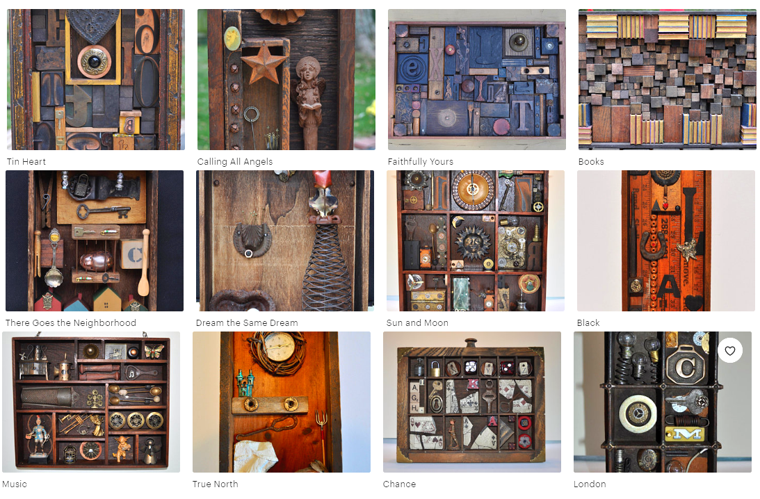
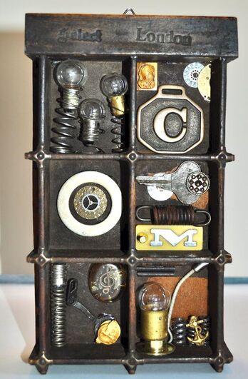
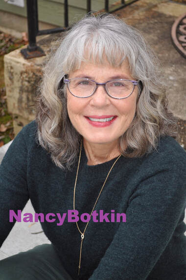
I have been thinking "What is Poetry?". There are so many creative diversities in the poetry field. Visual/graphic poetry is one of them. I think that there are more unique aspects, not only between written & visual elements, but also reading performances & exhibitions. For example, Joseph Cornell's boxes, Anselm Kiefer' concreates, and Renee Gladman's prose drawings have stronger visual aspects in their own poetic structures. Moreover, Douglas Kearney supports his poems with an energetic performance. I agree with RHINO editor, Daniel Suarez, when he said that "Poetry is an oral tradition", so performance is definitely a big part of poetic study. Today's guest, Nancy Botkin, was my first creative writing professor in my second semester as an exchange student. For every class, I had a new writing assignment from poetry, prose, fiction, and play, which was challenging, but really exciting because I could express myself while fellow students provided feedback. I was not a dead, quiet Japanese student in the class. She used "The Poet's Companion - A Guide to the Pleasures of Writing Poetry" as a textbook and focused on the chapter of image (she also talked about it more in the following craft essay). I remembered my first realization of "image" - - I was watching a movie, "Finding Neverland", with Thai students. Many dreamy scenes were shown in the movie. That's it! That meant image - - creative writing assignments became more stimulating once I learned how images affected my emotions. Now, she is becoming a poetic pack rat, collecting curious crumbs, gluing them in rectangles, and selling the collections. That is an amazing career after teaching poetry for twenty nine years. The Past Has a Future By Nancy Botkin There is a particular kind of person who loves the thrill of the hunt, loves to rummage through the old and discarded, and, for the sake of argument, we’ll call her an artist. A twisted piece of metal, a broken doll, a rusty wire, an odd-shaped piece of wood, and she says, “Is this salvageable? What will rise from these ashes?” Artists, I’ve learned, love what’s damaged and then go about remaking, reordering, or outright fixing, or by situating an object (or a word) in another context, they allow it to lean toward perfection. Making art is loving ruin and then honoring the wreckage. There’s nothing better than an old wood box that smells old. I close my eyes and begin to see the possibilities. Should it be stained, painted, or just wiped clean? And what will go inside this empty space? A poem, too, is at first a blank space. Clear a space, we say, when we want to begin something, open up our schedule, or before we set another plate at the table. I run my hand over white paper or turn a box on its side as if to anoint it with a special power. I have a plan for this, I say, but the plan remains open in order to protect mystery and accident. I close my eyes and begin to see the possibilities. For those of us who are lyric poets, the past is fertile territory. The proverbial she has a past, that we hear in fiction or film (often said in hushed tones), conjures up both romance and fear. Things, too, call up the past. Poets fire up the time machine and journey back to the house, the father, the woods, or that summer. “Remember those?” I hear people whisper at estate sales. “My grandfather had a pipe just like that” or “My mother used that same mixer!” Accustomed as we are to the products and conveniences of our time, the items of the past leave us in awe, breathless. Artists pluck them off the shelf, toss them into the present’s shopping cart, and roll them forward; the past always has a future. So, art makes the impermanent, permanent, or it freezes time—not exactly original ideas. Joseph Cornell, the originator of assemblage art, nourished his extravagant inner life by juxtaposing images (and vice versa) in his collages and box creations. Cornell loved ephemera and ordinary things, squirreling away postcards, lace, photostats, glasses, toys, and shells in marked boxes in his cramped basement. In a biography of Cornell, Deborah Solomon says “his objects offered a promise of immortality by virtue of their simple staying power” (48). We think of permanence after reading a well-known poem or when we view any notable work of art. What lasts is image, and perhaps a poet’s most useful tool is the image whereby the ordinary is imbued with significance. Nouns, I used to say to my creative writing students. Things. (“No ideas but in things,” Williams instructed.) Comb through your work and replace abstractions with the concrete, I would say over and over like a mantra. There’s a scene in the movie, Ordinary People, where Mary Tyler Moore squats down to retrieve a broken plate, and after surveying the damage, she says, “I can fix this.” Her world is crumbling around her, and she’s failing as a wife and mother, but she’s hoping the plate can be made whole. Perhaps my impulse toward art is a similar one. By shutting out a chaotic world where the “fix” will never be possible, I turn to art to assuage anxiety and to make myself whole. I sit in the chair or stand at the art table putting this here, moving that there, and taking that out. Rethink. Reorder. Remix. I look at my own basement and its clutter, a thousand objects stored away. I hold in my hand a glass bead or a metal key. I turn a word or a phrase over and over in my mind and I am rooted. Words and things move through me and extend beyond myself. Art is life’s elegant bypass; it weaves and circles around and back, returning me safely to the heart of it. NOTE Solomon, Deborah. Utopia Parkway: The Life and Work of Joseph Cornell. London: Jonathan Cape, 1997. Nancy Botkin retired from Indiana University South Bend in 2019 where she taught first-year writing and creative writing for 29 years. Her latest full-length collection of poems, The Next Infinity, is available from Broadstone Books. Her assemblages can be viewed and purchased on Etsy (BoxesByNancy). I feel that there are two types of walls in the visual poetry field.
The walls do not apply to all editors and publishers. Some of them are really openminded and explore new formats of poetry. Some of them publish diverse groups. And yet, I may not know the world-wide visual poetry scene. I use graphic poetry in my title, but the terminologies of visual and graphic do not have serious differences. I want to welcome poets who have strong beliefs and theories about their visual works at the Working On Gallery. For my first time reaching out to international poets, I contacted Sarah Sloat, because she publishes her works in America, Europe, and many other countries. Her newest book, Hotel Almighty, was published by an American publisher, Sarabande Books. Her poems were after erasing words from the famous American psychological horror novel Misery by Stephen King. Her visual elements made a depth to the collection. Check out her book. Sloat introduced me to a Canadian artist, Amanda Earl, who is also an editor at two publishing companies. Therefore, it was perfect to ask her questions that my audiences and I had. Questions:
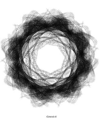
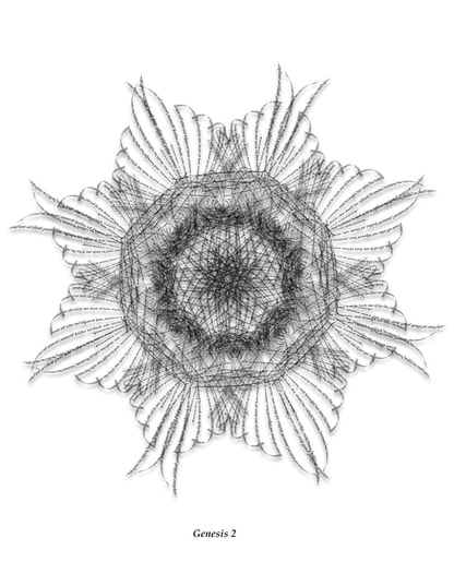
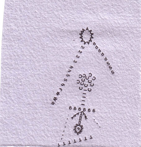
"Difficult to read" means that we are often easily confused as to where the starting/opening line is in the visual poem, as well as the meanings of the symbols used. Or some simply give up "reading" it. Because they may be upset if poems & visual poems are not easy to approach or readable, and some editors do not accept these visual poems (which may have more art than written elements). Earl and I exchanged emails regarding her visual poetry; one visual poem was reproduced from the Last Vispo Anthology on the Paris Review Blog, and the other is the Vispo Bible, a life's work begun in 2015 to translate the Bible into visual poetry. Amanda Earl: I think visual poetry is an exploration and engagement with the possibilities of language, by both those who wish to celebrate it and those who wish to corrupt it for their own purposes. I find it odd when editors have a narrow-minded view of what poetry is and what reading a poem could be. There are many different ways to read and many aspects of a poem to take note of. Even a more traditionally formatted poem. Such editors have a tendency to pay close attention to surface meaning and nothing more. They pay no attention to spacing, line breaks, repeated patterns of sound and imagery. All of these aspects of a more traditionally formatted poem can be found in some visual poems as well. I don't agree that my visual poems are difficult to read. I think there are many ways to read, but they aren't read in the same way as a traditionally formatted poem is read. I highly recommend Gary Barwin's series languageye in Jacket 2 in which he explores the idea of what it is to read a visual poem. For the Vispo Bible, all of the work is taken directly from the Bible. So, for example, the visual poem, Genesis 1 uses the text from the first chapter of the Book of Genesis from the Old Testament. The visual poems of the Vispo Bible deliberately twist, distort, repeat, layer and shape these religious texts because the texts themselves have been twisted and distorted and used as reasons for hatred, misogyny, homophobia, judgement, and violence by literalists. For me visual poetry is a response to literalism and how language can be used by those in power for propaganda, manipulation of people and lies. I see my visual poems, the Vispo Bible. Naoko Fujimoto: Earl also shared her presentation about the Vispo Bible at University of Ottawa in 2018. The presentation included why she used text from the Bible, how she processed creating her visual pieces, and her inspiration from Satu Kaikkoen (Finland). She also mentioned visual poets and educators such as Dan Waber (USA), Judith Copithorne (Canada), Hiromi Suzuki (Japan), and many others. Fujimoto: When I observed "SUN", the letter "A" seems to be the constituent parts of the sun. The sun's rays are then represented with 2,3,d... Flowers (dandelions?) are composed with many letters. I love how you composed it. This is a visually triggering piece. Did you use a type-writer, stamp, or another mechanism to make this? How long did it take to finish? Why are numbers and letters used together? Why did you choose the number, 2? This is so interesting to dissect all the details. If you do not mind, would you like to talk a bit more about "Sun"? Something to walk through some of your thought processes and creative choices? Earl:
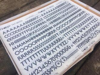
The rub on letter series you mention was work I did back in the mid aughts, experimenting with rub on letters. Two pieces were published in The Last Vispo Anthology: Visual Poetry from 1988 to 2008, Fantagraphics, 2012. One piece, "Sun", was published on the Paris Review blog, the work of slowly working with individual letters causes me to pay close attention to elements of text and language. I made "Sun" using rub on or dry transfer letters. I had seen some Letraset work and I wanted to try it. There are some visual poets and artists who work with Letraset such as Kate Siklosi, Kelly Mark and Derek Beaulieu. All three are Canadians. Derek's Letraset work was the first Letraset visual poetry I'd seen back in maybe 2007 or 2008. I loved how tactile it was, i loved the shape. Here's an example of more recent work he's done. I wanted to do that too. The problem was, you can't easily find Letraset anymore. But I went into my local art store and found sheets of letters. They are printed on sheets, made out of the material that is used for old-fashioned transparencies for presentations. You can choose different type. I think these were Helvetica, but I don't remember. They are in alphabetical order and include numbers and punctuation marks. You put the sheet on a piece of paper, then you take a pencil or some implement and rub the letter onto the paper. If you don't press hard enough, you end up with only part of the character. If the sheets are old, you can end up with cracked and flaking bits of letters. I think that is when it is most interesting, frankly. The imperfection and flaws of analogue media is what makes them so interesting. Same with typewriter poetry.
I had samples of gorgeous paper from La Papeterie Saint Armand of Quebec. I gave it a go. I didn't have a sketch or any plan. I just made my first mark on the page. I probably chose the letter A. Since the sheet contained numbers, letters and punctuation marks, I used all of them. This process used to be used in all sorts of applications, but especially sign-making. The only thought process I had was really, "let's try this and see what happens." I made six pieces in 2008. For each one, I just made them, without thinking about anything but exploring and playing. I found the process laborious and time-consuming. So I ended up just making a few pieces. For "Sun," I didn't have any specific flower in mind. At some point, I had the pleasure of learning about Mary-Ellen Solt's "Flowers in Concrete", but that was much later. I can't remember exactly how long it took to make the rub on letter pieces, but I didn't feel like I had the time., skill and physical stamina to do it for more than I did. I then scanned them so that I could have digital copies. You have to come up with a file name when you save a file to your computer, so I came up with titles for the pieces. Aside from "Sun," there is "Man," "Creature," "Kite," "Slim" and "UFO." At that time, American renaissance man and visual poet, Dan Waber had an online PHP BB, vispoetscom, where anyone in the world could upload their visual poetry. It was really great. I was very tentative and somewhat intimidated, but I uploaded various pieces, including the rub on letter pieces. That site was a great way to learn about what visual poetry was and who was making it. The editors of the Last Vispo asked for two of them, "Man" and "Sun." It was pretty exciting to have work in an anthology of visual poetry with a whole pile of other great visual poets, but that work wasn't representative of what I typically did or what I'm doing now. I occasionally play with rub on letters in my visual poetry, but it's not my main practice. I was already working digitally using Microsoft Paint, focusing on individual letters, and later quotations, song titles and now whole chapters of the Bible. I use Photoshop and Illustrator to create the visual poems. I still work with manual techniques on occasion and would like to do that more. I enjoy both digital and analogue methods but I am not as skilled with manual techniques as I am with digital tech. I'm not very co-ordinated. In the 90s, I was taking guitar lessons and ceramics so I could learn to do other things with my hands than write and feed myself. My pottery has been described as "charmingly uneven." "When I'm working on a visual piece…I pay no attention to any kind of rule or perceived rule. I go my own way. There's something satisfying about playing in the margins...I'm always looking for a combination of senses & emotions to be evoked by whatever I'm creating or absorbing as a reader, viewer, listener, etc. When I work on visual poems, I'll often play music & let the various combinations of notes, instruments, melodies, etc. help me to create the piece. To me the beauty & excitement of visual poetry is that it isn't hemmed in by expectations of a specific form in the way that other linear forms of poetry are." - Amanda Earl In addition, learn more of her creative processes: Interview by Gary Barwin
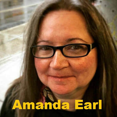
Fujimoto: My second question was "If you have a poetry reading event (book store or Zoom), how do you perform your visual pieces?" because since March 2020, all poetry reading events and exhibitions shifted to online, mainly ZOOM meeting & webinars. Earl: I don't perform my visual poetry. Other visual poets I know make visual poems that are actual sound scores and these can be performed. There are many different types of poetry and some poems are meant to be read aloud, while some is meant to be taken in with the eye. I also write other types of poetry which are written for the ear, and some that is written for both the ear and the eye. All of my work is written by a misfit for kindred misfits who don't fit in with conventional society and/or aren't interested in belonging to mainstream literary canons that perpetuate narratives of a dominant and oppressive white male patriarchal culture. I'm interested in pushing against that culture and creating, amplifying and supporting an alternative, more inclusive society and creative community. Amanda Earl is a pansexual, polyamorous feminist who lives in Canada. She's a vizpoet, poetesse, prose writer, editrix and publisher. Earl is the managing editor of Bywords.ca and the fallen angel of AngelHousePress. Her goals are love, whimsy, exploration and connection with kindreds. Where You Can Find the Vispo Bible.
Earl’s visual poetry has been exhibited in Canada, Brazil and Russia, and published in the last vispo: anthology: visual poetry 1988-2008 (Fantagraphics, 2012), Of the Body, (Puddles of Sky Press, 2012), Bone Sapling, a collaboration with Gary Barwin, (AngelHousePress, 2014), a field guide to fanciful bugs, (avantacular press, 2010), Montparnasse: this is visual poetry, (chapbook publisher, 2010) and in the magazines, untethered (2017) and dreamland (2016). Amanda's visual poetry also appears in online journals, Brave New Word, Angry Old Man, Ustanga, h&, Our Teeth otoliths, tip of the knife, ffooom, the new post literate, Logalia.com, DrunkenBoat, and the Bleed. Gary Barwin gave a lovely write up of Amanda's visual poetry on Jacket2, "What kind of [sic] sense is that?: Amanda Earl & the synaesthesia of reading" (June, 2013). For more vispo, please visit: EleanorIncognito.blogspot.ca Each piece of the Vispo Bible represents a chapter from the Book of Numbers, Old Testament. The text is taken from BibleGateway.com, King James Version. The Vispo Bible is a life’s work to translate every chapter, every book of the Bible into visual poetry. As of time of printing, Amanda has completed from the Old Testament: Genesis, Exodus, Leviticus Esther and Deuteronomy from the Old Testament and, from the New Testament: Jude, Revelation, John and Mark. The work began in June, 2015. Amanda is grateful to the Ontario Arts Council funding received for some of the work on the Vispo Bible in 2018. Additional individual pieces have appeared in h&; our teeth, illiterature, Brave New Word (Ukraine), Dreamland Magazine, untethered, Ustanga.it, Chaudiere Books NPM 2018, and To Call No 1 from Plaugolt Satzwechhsler in Germany, not your best visual poetry from knife fork book, Train concrete poetry journal and blog. |
Archives
July 2024
|
フジハブ
Welcome to FUJI HUB: Waystation to Poetry, Art, & Translation. This is not your final destination. There are many links to other websites here, so please explore them!
Welcome to FUJI HUB: Waystation to Poetry, Art, & Translation. This is not your final destination. There are many links to other websites here, so please explore them!
What are you looking for?
FUJI HUB Directory
Popular Sites:
Gallery of Graphic Poems
Working On Gallery
(Monthly New Article by Writers & Artists)
About Naoko Fujimoto
Contact
Naoko Fujimoto Copyright © 2024
FUJI HUB Directory
Popular Sites:
Gallery of Graphic Poems
Working On Gallery
(Monthly New Article by Writers & Artists)
About Naoko Fujimoto
Contact
Naoko Fujimoto Copyright © 2024
