|
I feel that there are two types of walls in the visual poetry field.
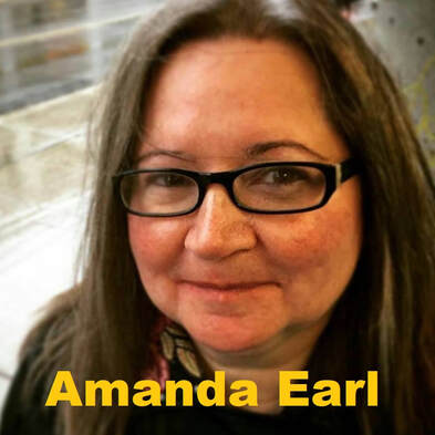
The walls do not apply to all editors and publishers. Some of them are really openminded and explore new formats of poetry. Some of them publish diverse groups. And yet, I may not know the world-wide visual poetry scene. I use graphic poetry in my title, but the terminologies of visual and graphic do not have serious differences. I want to welcome poets who have strong beliefs and theories about their visual works at the Working On Gallery. For my first time reaching out to international poets, I contacted Sarah Sloat, because she publishes her works in America, Europe, and many other countries. Her newest book, Hotel Almighty, was published by an American publisher, Sarabande Books. Her poems were after erasing words from the famous American psychological horror novel Misery by Stephen King. Her visual elements made a depth to the collection. Check out her book. Sloat introduced me to a Canadian artist, Amanda Earl, who is also an editor at two publishing companies. Therefore, it was perfect to ask her questions that my audiences and I had. Questions:
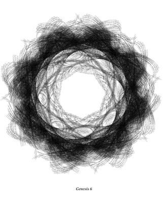
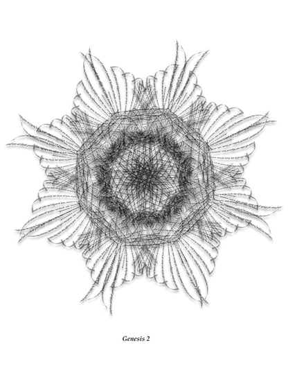
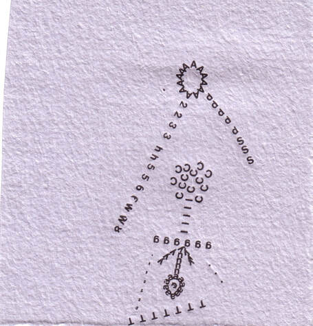
"Difficult to read" means that we are often easily confused as to where the starting/opening line is in the visual poem, as well as the meanings of the symbols used. Or some simply give up "reading" it. Because they may be upset if poems & visual poems are not easy to approach or readable, and some editors do not accept these visual poems (which may have more art than written elements). Earl and I exchanged emails regarding her visual poetry; one visual poem was reproduced from the Last Vispo Anthology on the Paris Review Blog, and the other is the Vispo Bible, a life's work begun in 2015 to translate the Bible into visual poetry. Amanda Earl: I think visual poetry is an exploration and engagement with the possibilities of language, by both those who wish to celebrate it and those who wish to corrupt it for their own purposes. I find it odd when editors have a narrow-minded view of what poetry is and what reading a poem could be. There are many different ways to read and many aspects of a poem to take note of. Even a more traditionally formatted poem. Such editors have a tendency to pay close attention to surface meaning and nothing more. They pay no attention to spacing, line breaks, repeated patterns of sound and imagery. All of these aspects of a more traditionally formatted poem can be found in some visual poems as well. I don't agree that my visual poems are difficult to read. I think there are many ways to read, but they aren't read in the same way as a traditionally formatted poem is read. I highly recommend Gary Barwin's series languageye in Jacket 2 in which he explores the idea of what it is to read a visual poem. For the Vispo Bible, all of the work is taken directly from the Bible. So, for example, the visual poem, Genesis 1 uses the text from the first chapter of the Book of Genesis from the Old Testament. The visual poems of the Vispo Bible deliberately twist, distort, repeat, layer and shape these religious texts because the texts themselves have been twisted and distorted and used as reasons for hatred, misogyny, homophobia, judgement, and violence by literalists. For me visual poetry is a response to literalism and how language can be used by those in power for propaganda, manipulation of people and lies. I see my visual poems, the Vispo Bible. Naoko Fujimoto: Earl also shared her presentation about the Vispo Bible at University of Ottawa in 2018. The presentation included why she used text from the Bible, how she processed creating her visual pieces, and her inspiration from Satu Kaikkoen (Finland). She also mentioned visual poets and educators such as Dan Waber (USA), Judith Copithorne (Canada), Hiromi Suzuki (Japan), and many others. Fujimoto: When I observed "SUN", the letter "A" seems to be the constituent parts of the sun. The sun's rays are then represented with 2,3,d... Flowers (dandelions?) are composed with many letters. I love how you composed it. This is a visually triggering piece. Did you use a type-writer, stamp, or another mechanism to make this? How long did it take to finish? Why are numbers and letters used together? Why did you choose the number, 2? This is so interesting to dissect all the details. If you do not mind, would you like to talk a bit more about "Sun"? Something to walk through some of your thought processes and creative choices? Earl:
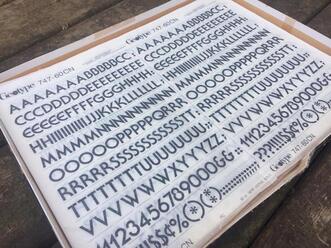
The rub on letter series you mention was work I did back in the mid aughts, experimenting with rub on letters. Two pieces were published in The Last Vispo Anthology: Visual Poetry from 1988 to 2008, Fantagraphics, 2012. One piece, "Sun", was published on the Paris Review blog, the work of slowly working with individual letters causes me to pay close attention to elements of text and language. I made "Sun" using rub on or dry transfer letters. I had seen some Letraset work and I wanted to try it. There are some visual poets and artists who work with Letraset such as Kate Siklosi, Kelly Mark and Derek Beaulieu. All three are Canadians. Derek's Letraset work was the first Letraset visual poetry I'd seen back in maybe 2007 or 2008. I loved how tactile it was, i loved the shape. Here's an example of more recent work he's done. I wanted to do that too. The problem was, you can't easily find Letraset anymore. But I went into my local art store and found sheets of letters. They are printed on sheets, made out of the material that is used for old-fashioned transparencies for presentations. You can choose different type. I think these were Helvetica, but I don't remember. They are in alphabetical order and include numbers and punctuation marks. You put the sheet on a piece of paper, then you take a pencil or some implement and rub the letter onto the paper. If you don't press hard enough, you end up with only part of the character. If the sheets are old, you can end up with cracked and flaking bits of letters. I think that is when it is most interesting, frankly. The imperfection and flaws of analogue media is what makes them so interesting. Same with typewriter poetry.
I had samples of gorgeous paper from La Papeterie Saint Armand of Quebec. I gave it a go. I didn't have a sketch or any plan. I just made my first mark on the page. I probably chose the letter A. Since the sheet contained numbers, letters and punctuation marks, I used all of them. This process used to be used in all sorts of applications, but especially sign-making. The only thought process I had was really, "let's try this and see what happens." I made six pieces in 2008. For each one, I just made them, without thinking about anything but exploring and playing. I found the process laborious and time-consuming. So I ended up just making a few pieces. For "Sun," I didn't have any specific flower in mind. At some point, I had the pleasure of learning about Mary-Ellen Solt's "Flowers in Concrete", but that was much later. I can't remember exactly how long it took to make the rub on letter pieces, but I didn't feel like I had the time., skill and physical stamina to do it for more than I did. I then scanned them so that I could have digital copies. You have to come up with a file name when you save a file to your computer, so I came up with titles for the pieces. Aside from "Sun," there is "Man," "Creature," "Kite," "Slim" and "UFO." At that time, American renaissance man and visual poet, Dan Waber had an online PHP BB, vispoetscom, where anyone in the world could upload their visual poetry. It was really great. I was very tentative and somewhat intimidated, but I uploaded various pieces, including the rub on letter pieces. That site was a great way to learn about what visual poetry was and who was making it. The editors of the Last Vispo asked for two of them, "Man" and "Sun." It was pretty exciting to have work in an anthology of visual poetry with a whole pile of other great visual poets, but that work wasn't representative of what I typically did or what I'm doing now. I occasionally play with rub on letters in my visual poetry, but it's not my main practice. I was already working digitally using Microsoft Paint, focusing on individual letters, and later quotations, song titles and now whole chapters of the Bible. I use Photoshop and Illustrator to create the visual poems. I still work with manual techniques on occasion and would like to do that more. I enjoy both digital and analogue methods but I am not as skilled with manual techniques as I am with digital tech. I'm not very co-ordinated. In the 90s, I was taking guitar lessons and ceramics so I could learn to do other things with my hands than write and feed myself. My pottery has been described as "charmingly uneven." "When I'm working on a visual piece…I pay no attention to any kind of rule or perceived rule. I go my own way. There's something satisfying about playing in the margins...I'm always looking for a combination of senses & emotions to be evoked by whatever I'm creating or absorbing as a reader, viewer, listener, etc. When I work on visual poems, I'll often play music & let the various combinations of notes, instruments, melodies, etc. help me to create the piece. To me the beauty & excitement of visual poetry is that it isn't hemmed in by expectations of a specific form in the way that other linear forms of poetry are." - Amanda Earl In addition, learn more of her creative processes: Interview by Gary Barwin
Fujimoto: My second question was "If you have a poetry reading event (book store or Zoom), how do you perform your visual pieces?" because since March 2020, all poetry reading events and exhibitions shifted to online, mainly ZOOM meeting & webinars. Earl: I don't perform my visual poetry. Other visual poets I know make visual poems that are actual sound scores and these can be performed. There are many different types of poetry and some poems are meant to be read aloud, while some is meant to be taken in with the eye. I also write other types of poetry which are written for the ear, and some that is written for both the ear and the eye. All of my work is written by a misfit for kindred misfits who don't fit in with conventional society and/or aren't interested in belonging to mainstream literary canons that perpetuate narratives of a dominant and oppressive white male patriarchal culture. I'm interested in pushing against that culture and creating, amplifying and supporting an alternative, more inclusive society and creative community. Amanda Earl is a pansexual, polyamorous feminist who lives in Canada. She's a vizpoet, poetesse, prose writer, editrix and publisher. Earl is the managing editor of Bywords.ca and the fallen angel of AngelHousePress. Her goals are love, whimsy, exploration and connection with kindreds. Where You Can Find the Vispo Bible.
Earl’s visual poetry has been exhibited in Canada, Brazil and Russia, and published in the last vispo: anthology: visual poetry 1988-2008 (Fantagraphics, 2012), Of the Body, (Puddles of Sky Press, 2012), Bone Sapling, a collaboration with Gary Barwin, (AngelHousePress, 2014), a field guide to fanciful bugs, (avantacular press, 2010), Montparnasse: this is visual poetry, (chapbook publisher, 2010) and in the magazines, untethered (2017) and dreamland (2016). Amanda's visual poetry also appears in online journals, Brave New Word, Angry Old Man, Ustanga, h&, Our Teeth otoliths, tip of the knife, ffooom, the new post literate, Logalia.com, DrunkenBoat, and the Bleed. Gary Barwin gave a lovely write up of Amanda's visual poetry on Jacket2, "What kind of [sic] sense is that?: Amanda Earl & the synaesthesia of reading" (June, 2013). For more vispo, please visit: EleanorIncognito.blogspot.ca Each piece of the Vispo Bible represents a chapter from the Book of Numbers, Old Testament. The text is taken from BibleGateway.com, King James Version. The Vispo Bible is a life’s work to translate every chapter, every book of the Bible into visual poetry. As of time of printing, Amanda has completed from the Old Testament: Genesis, Exodus, Leviticus Esther and Deuteronomy from the Old Testament and, from the New Testament: Jude, Revelation, John and Mark. The work began in June, 2015. Amanda is grateful to the Ontario Arts Council funding received for some of the work on the Vispo Bible in 2018. Additional individual pieces have appeared in h&; our teeth, illiterature, Brave New Word (Ukraine), Dreamland Magazine, untethered, Ustanga.it, Chaudiere Books NPM 2018, and To Call No 1 from Plaugolt Satzwechhsler in Germany, not your best visual poetry from knife fork book, Train concrete poetry journal and blog. Comments are closed.
|
Archives
July 2024
|
フジハブ
Welcome to FUJI HUB: Waystation to Poetry, Art, & Translation. This is not your final destination. There are many links to other websites here, so please explore them!
Welcome to FUJI HUB: Waystation to Poetry, Art, & Translation. This is not your final destination. There are many links to other websites here, so please explore them!
What are you looking for?
FUJI HUB Directory
Popular Sites:
Gallery of Graphic Poems
Working On Gallery
(Monthly New Article by Writers & Artists)
About Naoko Fujimoto
Contact
Naoko Fujimoto Copyright © 2024
FUJI HUB Directory
Popular Sites:
Gallery of Graphic Poems
Working On Gallery
(Monthly New Article by Writers & Artists)
About Naoko Fujimoto
Contact
Naoko Fujimoto Copyright © 2024
