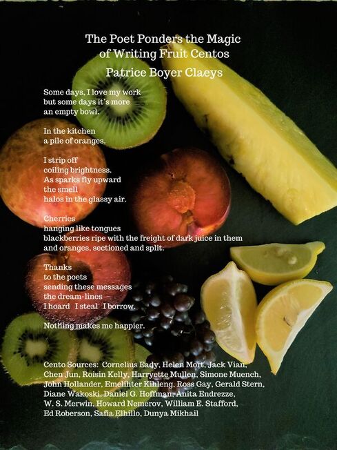
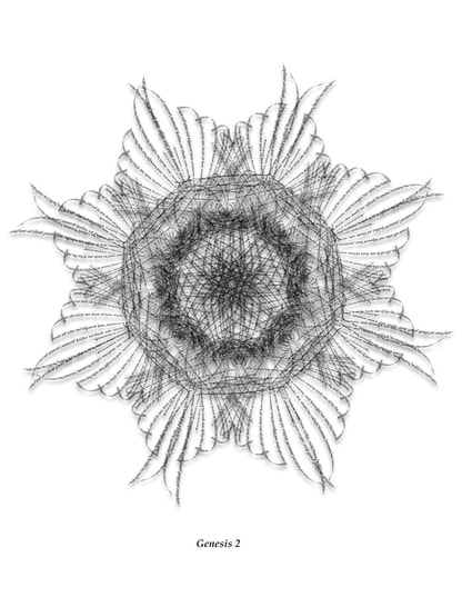
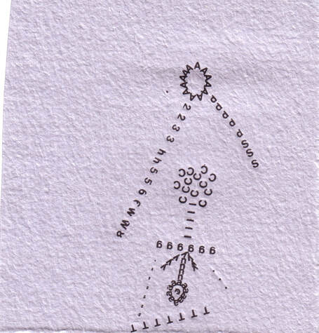
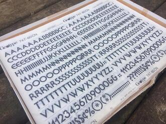
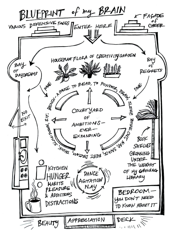
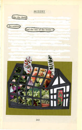
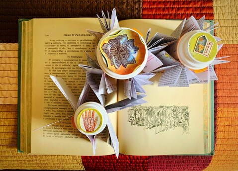
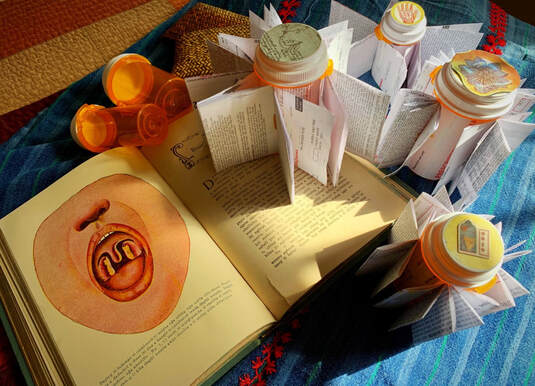
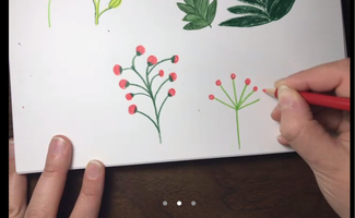
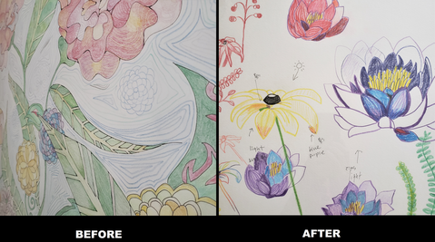
Recently, I received an email. "I do not have Origami Papers. Should I buy them?" My answer is that you can use any paper around you. Creating graphic poems can be a sustainable and reasonable project! Of course, if you have the budget to purchase authentic papers, you may. So, this is a good time to show how I chose material and created graphic art for a RHINO Poetry social media post. I also wrote about materials for my graphic poems. You may refer to this article. I became a Translation Initiative Editor at RHINO Poetry. One of my jobs is to spread the word that RHINO Poetry likes reading translation submissions though social media and emails. Instagram and Facebook are particularly good with colorful & cheerful notifications. You may see all paper material from the picture above; anniversary cards, birthday cards, and Godiva's Birthday Cake Truffles' bags. They were all from my birthday gift!
I used these papers because they were spring-like, pastel colors. It is bright & energetic. In addition, the cup cake has two meanings.
For this project, I did not buy any new materials. It was fun to think of how I could adapt these materials into my graphic advertisement. Much like challenging oneself to cook a meal with just the ingredients in their refrigerator at the time. #RHINOArt2Art's submission is open and we had the first editorial meeting. One thing I realize is poets are seemingly more open to visual explorations of their medium - - i.e. poetry formats: erasure, Golden Shovel, centos (see the previous craft essay) - - than before. Graphic / visual adaptations are not only fun for creators, but they also push their way of thinking about the poems they read and what potential lies in various creative approaches. We do not have a clear rule for visual adaptations like Golden Shovel and centos do. Visual adaptations have more varieties of final products like erasure techniques. But I believe that sharing my process notes may be useful to our community as a springboard to thinking visually, and making more exciting graphic adaptations. The rules for the Golden Shovel: (From Writer's Digest)
As you may or may not know, #RHINO Art2Art is an initiative to pair poems in RHINO Poetry's archive with graphic art, with a view to highlighting poets of color, and to draw more attention to our beautiful archive, thanks to our tireless interns. Between July and August 2020, I had a test-run for this project. I created three adaptations and recruited a handful of poets who were interested in creating various examples before the open submission. The following is my adaptation of Nate Marshall's "buying new shoes". buying new shoes When I read this poem for the first time, I saw many possibilities for images from Marshall's words, such as Nikes boxed, hundred plus, under his arm like a briefcase... This is a short poem, but it is full of striking imagery about a young male who wants expensive shoes. I also thought that the way the poems are arranged on the pages are of significant beauty. I could separate words and images to create a new visual adaptation; however, I did not want to disturb the line-breaks. The poem has a certain cadence. If you read it aloud, it is obvious. Therefore, I decided to keep all the words and play with the shape of its body, the iconic Nike box and shoe cut-out. The white dots represent the shoes that the speaker could not own. Meditating with Marshall's poem was a pleasant time for me. Though this poem is short, Marshall's work left a strong impression on me. It was his super poetic power. I always feel anxiety when sharing visual adaptations of a poet's work to them. But later, I heard from José Olivarez that he and Marshall had a long discussion about the line-breaks. You have no idea how much I was thrilled when I learned of that. #RHINOArt2Art
An Ongoing Celebration of RHINO’s Online Archives In early 2020, I heard comments from poets and writers - - "My lectures were canceled", "No conferences" - - "I cannot write", "No motivation" - - "Because of the pandemic, we do not have to write", "Welcome to slow days...", or "Zoomed-out!" I personally complained that my residency at the Writer's Room at the Betsy was canceled with other trips and events that I was looking forward to for months. We all knew that the pandemic became more serious and heartbroken through time. I started hearing of friends' extended families in the east coast passed away, including my publishers' family members. Though, one thing really cheering me up was exchanging photos between close poets. Occasionally, I received texts, (my phone never rang), and Gail Goepfert was one of them. I took pictures of tulips, grilled cheese sandwiches, and some silly, ordinary things. I was delighted to see that Goepfert and her friend, Patrice Boyer Claeys, created their collaboration photo - poetry book. It was colorful and cheerful, but more importantly it was a friendship collaboration. Their pure creative process cleansed me. "Wanna play tag?" "Sure!" Like these children's conversations - - it sounded so light, but also complicated to have these friends once we were all grown up; especially, both were in the same poetry profession. For me, I always had doubts, "Is this work necessary?" "Do they laugh at me for whatever reason?" before I shared my ideas with my fellow poets. While it is physically impossible to make honey from the sun, poets and artists can use that inspiration to fuel creative endeavors. Goepfert and Claeys used 2020 as an opportunity to create something together. The Making of Honey from the Sun by Patrice Boyer Claeys & Gail Goepfert Patrice Speaks: In the spring of 2020, Gail and I had just wrapped up our first chapbook collaboration about the pandemic. True to my relaxed fashion, I declared myself free to take a breather from the exertions of poetry. Gail, ever the encourager/task-master, had other ideas. She suggested I turn my attention to food, a subject I am passionate about. With a laugh, I told her to “get out of my hair,” but as we went our separate ways, her nagging voice rang in my ear. I am an avid writer of centos, with thousands of lines collected from many poets. Scanning my notebooks, I found a quote by D. H. Lawrence that intrigued me, “Every fruit has its secret.” What could these secrets possibly be? I was certain the cento form, with its fresh associative surprises, would help me discover them. Almost like using a Ouija board, making centos moves me into unexpected areas of thought and imagination. I began creating short centos about individual fruits—blueberries, alpine strawberries, grapefruit, kiwi, peaches. Writing had never been such fun! The poems were coming together almost without effort, and—amid a pandemic—the results gave me unadulterated joy. After sharing early poems with Gail, she said she would like to collaborate by trying her hand at graphic poems, but an early attempt with peaches left her uninspired and unconvinced of this collaborative plan. At a backyard gathering of our writing group, Plumb Line Poets, one of the members said, “If you photograph the fruit, you could make a perfect book for the coffee table, a kitchen store, or gift shop.” Gail Speaks: When the idea surfaced of collaboration on a book where my part was photography, I was all in. I like new projects, things to keep my inventive mind from becoming creaky with disuse. And I have made books with travel photographs before; that aspect was not that daunting, but Patrice and I were both novices to “food photography.” Our journey with fruit is probably best experienced in the video of The Making of Honey from the Sun. What I knew as an avid amateur photographer was that light and background and layout and framing all mattered. The plan was to figure out what would be aesthetically pleasing and characterize Patrice’s poems, which we read aloud before each setup; the reading served as inspiration and motivation for the shot. We purchased bags and bags of fruit and used every surface we could find—front porch slate, cutting boards, tablecloths taped with duct tape to smooth wrinkles, copper-topped table, credenza, a burled wood side table, kitchen countertop, deck railing and so much more. We plated or bowled with whatever we had in our homes--dessert plates that were my mother’s, Patrice’s china and mine, a random log from the fireplace, the bottom of her grown daughters’ Barbie barrel, a cheery tablecloth from Goodwill my sister had given me, and all manner of linens we gave a test run to see what delighted our eyes. Patrice’s kitchen skills energized the arrangements with a hedgehog of mangoes, spiraled orange peels, draped grapes, and strawberries tucked neatly into a wreath of juniper cuttings. Because it was summer and I loved the idea of integrating natural elements, we plucked petals, chopped branches off trees, and picked native grasses. We were both always thinking about props. There were many reshoots and shuffling of props and fruit for a new pose. I wanted the light and the presentation to be as good as it could be. I am sure Patrice lost patience with my “eye.” We had many laughs as she used an umbrella, a beach towel, and her own shirt to block the light and give us what we needed. It was important that we both gave the thumbs up to all twenty-three photos and the front and back covers. Some days we spent six to eight hours to pull together three or four shots. It was both more exhausting and exhilarating than we expected. Ultimately, it was one of the most fun photo challenges I’ve attempted. Gail and Patrice Speak: The poems offer an unusual twist to how we view everyday fruits, but we realize the coupling of the poems with the colorful, quirky photographs doubled the pleasure and caught people’s attention. The photos give people a door into the poems. We found that the combination of visuals with words has a broad appeal to both poets and people who do not have poetic leanings. Just as some wines pair well with certain foods, our book was a happy pairing of words and images, poet and photographer. Gail Goepfert, an associate editor at RHINO Poetry, is a Midwest poet, teacher, and photographer. Her first chapbook, A Mind on Pain, appeared in 2015, first book, Tapping Roots, from Aldrich Press in 2018. and Get Up Said the World was released in May 2020 from Červená Barva Press. Forthcoming books are Self-Portrait with Thorns from Glass Lyre Press and a collaboration with Patrice Boyer Claeys, This Hard Business of Living from Seven Kitchens. Recent publications include One Art, Rogue Agent, The Examined Life Journal, The Night Heron Barks, and The Inflectionist Review.
Patrice Boyer Claeys graduated from the University of Pennsylvania and the University of Manchester, U.K., and completed a Certificate in Poetry from University of Chicago. Her first collection, Lovely Daughter of the Shattering, was published by Kelsay Books in 2019, followed by The Machinery of Grace (2020). She collaborated with Gail Goepfert on a photography/poetry book, Honey from the Sun (2020), and on a poetry chapbook, This Hard Business of Living, due from Seven Kitchens Press in 2021. Recent work appears in The Night Heron Barks, SWWIM, *82 Review, little somethings press, Zone 3, Inflectionist Review and Relief: A Journal of Art and Faith. People asked me how an artist adapts the true meaning of an original poem and what the original poet thinks about the adaptation; mainly because of the current #RHINOArt2Art Submission Guideline. I have my own thoughts, but I wanted to explore this question with Gretchen Primack and Scoot Swain. Primack's poems were adapted into video poems, visual poems, and a graphic book review by various artists. She talked about the adapted works in the past article. I saw Swain's works at The Indianapolis Review (Issue 14: Fall 2020: The Visual Poetry Issue) for the first time. The Editor In Chief, Natalie Solmer, beautifully curated the issue, and there are so many current leading visual poets such as Sarah Sloat, Meg Reynolds, and David Dodd Lee. Solmer also discussed what she is looking for in her submissions in this article. It is the happiest feeling to share works with my respected, fellow visual poets. Swain added illustrations to Abby Johnson's poems, which were "16 Questions that Might Lead to Love" in the issue. My favorite thing about their illustrations are how relaxed the line-strokes are. The comic poem was clearly a good result of teamwork - - the illustrations and words flowed, and the two elements were fluently welded together - - that was my first impression of their poetry comic. Then, when I read the following article, I was like, "I knew it!" Swain and Johnson were indeed good colleagues. There was clear proof in the illustration. By Scoot Swain Abby Johnson and I worked together on 16 Questions that Might Lead to Love. She brought the poem into one of our classes in Paige Lewis’s workshop and I just fell apart after reading it. No huge surprise there--Abby is without question my favorite poet. After that class, I reached out to her and asked if she minded if I illustrated it, and we went from there, communicating through email. It took me about a month total to get all of the drawings’ last drafts together, but the entire process couldn’t have gone any smoother. I went line by line, writing each one in sharpie on a piece of Bristol paper and leaving myself plenty of room to draw. That was the most relaxing part of the process--a great opportunity to just sit and listen to music and take in the poem at a much slower pace. For anyone who wants to try their hand at a similar project, I recommend buying some notecards for first drafts so you don’t waste as much Bristol paper as I did (I’m not very good with scissors). Once all that was done I got drawing, which you probably guessed took the longest. The biggest no-no in poetry comics is drawing the exact same images already evoked by the piece’s language. You can’t illustrate “The Red Wheelbarrow'' by just slapping a red wheelbarrow on the page. Doing so takes away from both the words and drawings, makes the comic feel flat and predictable by taking away any tension between the two forces. Instead, I like to focus on the unseen--what absences can a line imply? What was here that we’re just barely too late to see? Something’s missing. What? The idea of absence makes 16 Questions into the piece it is--empty rooms, unopened doors, abandoned swingsets. When adapting poems into poetry comics, I’ve found that every image comes from the poem, even if it wasn’t in the piece to begin with. Or maybe it’s just that I love drawing people who look incredibly forlorn. Maybe a little bit of both. I should say that my favorite part of making the comic was working with Abby. She’s one of the best friends I’ve ever had, and if she were to ask me, I’d illustrate every poem she showed me. I’m surprised every conversation I have with her doesn’t just start with me shouting “COLLAB BRO?” I recommend throwing on some headphones and just listening to her read the poem on its own. It’s such a thoughtful and interesting piece, and the fact that I got to give it some of the life it gave me and make it into something new was one of my greatest joys of 2020. I also recommend reading all of Abby’s other work, which you can find at Ghost City Press, Requited Journal, and the Indianapolis Review. If I had to boil down my experience from drawing 16 Questions and working with Abby, it’s that you should take every opportunity you get to make art with your friends. Working with Abby made me feel far less lonely in a year defined by isolation and uncertainty. If you get the chance and find the inspiration, I recommend making something new with your loved ones. You’ll be proud of what you make, I’m positive. Scoot Swain is an Indianapolis-based poet and illustrator, currently pursuing an MFA in poetry from Butler University. A poetry editor for Turnpike Magazine, their work has appeared in The Indianapolis Review and The Broken Plate. They love comics, Dungeons and Dragons, and bugs. Find more of their art and words on Twitter and Instagram, @scootswain
I have been thinking "What is Poetry?". There are so many creative diversities in the poetry field. Visual/graphic poetry is one of them. I think that there are more unique aspects, not only between written & visual elements, but also reading performances & exhibitions. For example, Joseph Cornell's boxes, Anselm Kiefer' concreates, and Renee Gladman's prose drawings have stronger visual aspects in their own poetic structures. Moreover, Douglas Kearney supports his poems with an energetic performance. I agree with RHINO editor, Daniel Suarez, when he said that "Poetry is an oral tradition", so performance is definitely a big part of poetic study. Today's guest, Nancy Botkin, was my first creative writing professor in my second semester as an exchange student. For every class, I had a new writing assignment from poetry, prose, fiction, and play, which was challenging, but really exciting because I could express myself while fellow students provided feedback. I was not a dead, quiet Japanese student in the class. She used "The Poet's Companion - A Guide to the Pleasures of Writing Poetry" as a textbook and focused on the chapter of image (she also talked about it more in the following craft essay). I remembered my first realization of "image" - - I was watching a movie, "Finding Neverland", with Thai students. Many dreamy scenes were shown in the movie. That's it! That meant image - - creative writing assignments became more stimulating once I learned how images affected my emotions. Now, she is becoming a poetic pack rat, collecting curious crumbs, gluing them in rectangles, and selling the collections. That is an amazing career after teaching poetry for twenty nine years. The Past Has a Future By Nancy Botkin There is a particular kind of person who loves the thrill of the hunt, loves to rummage through the old and discarded, and, for the sake of argument, we’ll call her an artist. A twisted piece of metal, a broken doll, a rusty wire, an odd-shaped piece of wood, and she says, “Is this salvageable? What will rise from these ashes?” Artists, I’ve learned, love what’s damaged and then go about remaking, reordering, or outright fixing, or by situating an object (or a word) in another context, they allow it to lean toward perfection. Making art is loving ruin and then honoring the wreckage. There’s nothing better than an old wood box that smells old. I close my eyes and begin to see the possibilities. Should it be stained, painted, or just wiped clean? And what will go inside this empty space? A poem, too, is at first a blank space. Clear a space, we say, when we want to begin something, open up our schedule, or before we set another plate at the table. I run my hand over white paper or turn a box on its side as if to anoint it with a special power. I have a plan for this, I say, but the plan remains open in order to protect mystery and accident. I close my eyes and begin to see the possibilities. For those of us who are lyric poets, the past is fertile territory. The proverbial she has a past, that we hear in fiction or film (often said in hushed tones), conjures up both romance and fear. Things, too, call up the past. Poets fire up the time machine and journey back to the house, the father, the woods, or that summer. “Remember those?” I hear people whisper at estate sales. “My grandfather had a pipe just like that” or “My mother used that same mixer!” Accustomed as we are to the products and conveniences of our time, the items of the past leave us in awe, breathless. Artists pluck them off the shelf, toss them into the present’s shopping cart, and roll them forward; the past always has a future. So, art makes the impermanent, permanent, or it freezes time—not exactly original ideas. Joseph Cornell, the originator of assemblage art, nourished his extravagant inner life by juxtaposing images (and vice versa) in his collages and box creations. Cornell loved ephemera and ordinary things, squirreling away postcards, lace, photostats, glasses, toys, and shells in marked boxes in his cramped basement. In a biography of Cornell, Deborah Solomon says “his objects offered a promise of immortality by virtue of their simple staying power” (48). We think of permanence after reading a well-known poem or when we view any notable work of art. What lasts is image, and perhaps a poet’s most useful tool is the image whereby the ordinary is imbued with significance. Nouns, I used to say to my creative writing students. Things. (“No ideas but in things,” Williams instructed.) Comb through your work and replace abstractions with the concrete, I would say over and over like a mantra. There’s a scene in the movie, Ordinary People, where Mary Tyler Moore squats down to retrieve a broken plate, and after surveying the damage, she says, “I can fix this.” Her world is crumbling around her, and she’s failing as a wife and mother, but she’s hoping the plate can be made whole. Perhaps my impulse toward art is a similar one. By shutting out a chaotic world where the “fix” will never be possible, I turn to art to assuage anxiety and to make myself whole. I sit in the chair or stand at the art table putting this here, moving that there, and taking that out. Rethink. Reorder. Remix. I look at my own basement and its clutter, a thousand objects stored away. I hold in my hand a glass bead or a metal key. I turn a word or a phrase over and over in my mind and I am rooted. Words and things move through me and extend beyond myself. Art is life’s elegant bypass; it weaves and circles around and back, returning me safely to the heart of it. NOTE Solomon, Deborah. Utopia Parkway: The Life and Work of Joseph Cornell. London: Jonathan Cape, 1997. Nancy Botkin retired from Indiana University South Bend in 2019 where she taught first-year writing and creative writing for 29 years. Her latest full-length collection of poems, The Next Infinity, is available from Broadstone Books. Her assemblages can be viewed and purchased on Etsy (BoxesByNancy). I feel that there are two types of walls in the visual poetry field.
The walls do not apply to all editors and publishers. Some of them are really openminded and explore new formats of poetry. Some of them publish diverse groups. And yet, I may not know the world-wide visual poetry scene. I use graphic poetry in my title, but the terminologies of visual and graphic do not have serious differences. I want to welcome poets who have strong beliefs and theories about their visual works at the Working On Gallery. For my first time reaching out to international poets, I contacted Sarah Sloat, because she publishes her works in America, Europe, and many other countries. Her newest book, Hotel Almighty, was published by an American publisher, Sarabande Books. Her poems were after erasing words from the famous American psychological horror novel Misery by Stephen King. Her visual elements made a depth to the collection. Check out her book. Sloat introduced me to a Canadian artist, Amanda Earl, who is also an editor at two publishing companies. Therefore, it was perfect to ask her questions that my audiences and I had. Questions:
"Difficult to read" means that we are often easily confused as to where the starting/opening line is in the visual poem, as well as the meanings of the symbols used. Or some simply give up "reading" it. Because they may be upset if poems & visual poems are not easy to approach or readable, and some editors do not accept these visual poems (which may have more art than written elements). Earl and I exchanged emails regarding her visual poetry; one visual poem was reproduced from the Last Vispo Anthology on the Paris Review Blog, and the other is the Vispo Bible, a life's work begun in 2015 to translate the Bible into visual poetry. Amanda Earl: I think visual poetry is an exploration and engagement with the possibilities of language, by both those who wish to celebrate it and those who wish to corrupt it for their own purposes. I find it odd when editors have a narrow-minded view of what poetry is and what reading a poem could be. There are many different ways to read and many aspects of a poem to take note of. Even a more traditionally formatted poem. Such editors have a tendency to pay close attention to surface meaning and nothing more. They pay no attention to spacing, line breaks, repeated patterns of sound and imagery. All of these aspects of a more traditionally formatted poem can be found in some visual poems as well. I don't agree that my visual poems are difficult to read. I think there are many ways to read, but they aren't read in the same way as a traditionally formatted poem is read. I highly recommend Gary Barwin's series languageye in Jacket 2 in which he explores the idea of what it is to read a visual poem. For the Vispo Bible, all of the work is taken directly from the Bible. So, for example, the visual poem, Genesis 1 uses the text from the first chapter of the Book of Genesis from the Old Testament. The visual poems of the Vispo Bible deliberately twist, distort, repeat, layer and shape these religious texts because the texts themselves have been twisted and distorted and used as reasons for hatred, misogyny, homophobia, judgement, and violence by literalists. For me visual poetry is a response to literalism and how language can be used by those in power for propaganda, manipulation of people and lies. I see my visual poems, the Vispo Bible. Naoko Fujimoto: Earl also shared her presentation about the Vispo Bible at University of Ottawa in 2018. The presentation included why she used text from the Bible, how she processed creating her visual pieces, and her inspiration from Satu Kaikkoen (Finland). She also mentioned visual poets and educators such as Dan Waber (USA), Judith Copithorne (Canada), Hiromi Suzuki (Japan), and many others. Fujimoto: When I observed "SUN", the letter "A" seems to be the constituent parts of the sun. The sun's rays are then represented with 2,3,d... Flowers (dandelions?) are composed with many letters. I love how you composed it. This is a visually triggering piece. Did you use a type-writer, stamp, or another mechanism to make this? How long did it take to finish? Why are numbers and letters used together? Why did you choose the number, 2? This is so interesting to dissect all the details. If you do not mind, would you like to talk a bit more about "Sun"? Something to walk through some of your thought processes and creative choices? Earl:
The rub on letter series you mention was work I did back in the mid aughts, experimenting with rub on letters. Two pieces were published in The Last Vispo Anthology: Visual Poetry from 1988 to 2008, Fantagraphics, 2012. One piece, "Sun", was published on the Paris Review blog, the work of slowly working with individual letters causes me to pay close attention to elements of text and language. I made "Sun" using rub on or dry transfer letters. I had seen some Letraset work and I wanted to try it. There are some visual poets and artists who work with Letraset such as Kate Siklosi, Kelly Mark and Derek Beaulieu. All three are Canadians. Derek's Letraset work was the first Letraset visual poetry I'd seen back in maybe 2007 or 2008. I loved how tactile it was, i loved the shape. Here's an example of more recent work he's done. I wanted to do that too. The problem was, you can't easily find Letraset anymore. But I went into my local art store and found sheets of letters. They are printed on sheets, made out of the material that is used for old-fashioned transparencies for presentations. You can choose different type. I think these were Helvetica, but I don't remember. They are in alphabetical order and include numbers and punctuation marks. You put the sheet on a piece of paper, then you take a pencil or some implement and rub the letter onto the paper. If you don't press hard enough, you end up with only part of the character. If the sheets are old, you can end up with cracked and flaking bits of letters. I think that is when it is most interesting, frankly. The imperfection and flaws of analogue media is what makes them so interesting. Same with typewriter poetry.
I had samples of gorgeous paper from La Papeterie Saint Armand of Quebec. I gave it a go. I didn't have a sketch or any plan. I just made my first mark on the page. I probably chose the letter A. Since the sheet contained numbers, letters and punctuation marks, I used all of them. This process used to be used in all sorts of applications, but especially sign-making. The only thought process I had was really, "let's try this and see what happens." I made six pieces in 2008. For each one, I just made them, without thinking about anything but exploring and playing. I found the process laborious and time-consuming. So I ended up just making a few pieces. For "Sun," I didn't have any specific flower in mind. At some point, I had the pleasure of learning about Mary-Ellen Solt's "Flowers in Concrete", but that was much later. I can't remember exactly how long it took to make the rub on letter pieces, but I didn't feel like I had the time., skill and physical stamina to do it for more than I did. I then scanned them so that I could have digital copies. You have to come up with a file name when you save a file to your computer, so I came up with titles for the pieces. Aside from "Sun," there is "Man," "Creature," "Kite," "Slim" and "UFO." At that time, American renaissance man and visual poet, Dan Waber had an online PHP BB, vispoetscom, where anyone in the world could upload their visual poetry. It was really great. I was very tentative and somewhat intimidated, but I uploaded various pieces, including the rub on letter pieces. That site was a great way to learn about what visual poetry was and who was making it. The editors of the Last Vispo asked for two of them, "Man" and "Sun." It was pretty exciting to have work in an anthology of visual poetry with a whole pile of other great visual poets, but that work wasn't representative of what I typically did or what I'm doing now. I occasionally play with rub on letters in my visual poetry, but it's not my main practice. I was already working digitally using Microsoft Paint, focusing on individual letters, and later quotations, song titles and now whole chapters of the Bible. I use Photoshop and Illustrator to create the visual poems. I still work with manual techniques on occasion and would like to do that more. I enjoy both digital and analogue methods but I am not as skilled with manual techniques as I am with digital tech. I'm not very co-ordinated. In the 90s, I was taking guitar lessons and ceramics so I could learn to do other things with my hands than write and feed myself. My pottery has been described as "charmingly uneven." "When I'm working on a visual piece…I pay no attention to any kind of rule or perceived rule. I go my own way. There's something satisfying about playing in the margins...I'm always looking for a combination of senses & emotions to be evoked by whatever I'm creating or absorbing as a reader, viewer, listener, etc. When I work on visual poems, I'll often play music & let the various combinations of notes, instruments, melodies, etc. help me to create the piece. To me the beauty & excitement of visual poetry is that it isn't hemmed in by expectations of a specific form in the way that other linear forms of poetry are." - Amanda Earl In addition, learn more of her creative processes: Interview by Gary Barwin
Fujimoto: My second question was "If you have a poetry reading event (book store or Zoom), how do you perform your visual pieces?" because since March 2020, all poetry reading events and exhibitions shifted to online, mainly ZOOM meeting & webinars. Earl: I don't perform my visual poetry. Other visual poets I know make visual poems that are actual sound scores and these can be performed. There are many different types of poetry and some poems are meant to be read aloud, while some is meant to be taken in with the eye. I also write other types of poetry which are written for the ear, and some that is written for both the ear and the eye. All of my work is written by a misfit for kindred misfits who don't fit in with conventional society and/or aren't interested in belonging to mainstream literary canons that perpetuate narratives of a dominant and oppressive white male patriarchal culture. I'm interested in pushing against that culture and creating, amplifying and supporting an alternative, more inclusive society and creative community. Amanda Earl is a pansexual, polyamorous feminist who lives in Canada. She's a vizpoet, poetesse, prose writer, editrix and publisher. Earl is the managing editor of Bywords.ca and the fallen angel of AngelHousePress. Her goals are love, whimsy, exploration and connection with kindreds. Where You Can Find the Vispo Bible.
Earl’s visual poetry has been exhibited in Canada, Brazil and Russia, and published in the last vispo: anthology: visual poetry 1988-2008 (Fantagraphics, 2012), Of the Body, (Puddles of Sky Press, 2012), Bone Sapling, a collaboration with Gary Barwin, (AngelHousePress, 2014), a field guide to fanciful bugs, (avantacular press, 2010), Montparnasse: this is visual poetry, (chapbook publisher, 2010) and in the magazines, untethered (2017) and dreamland (2016). Amanda's visual poetry also appears in online journals, Brave New Word, Angry Old Man, Ustanga, h&, Our Teeth otoliths, tip of the knife, ffooom, the new post literate, Logalia.com, DrunkenBoat, and the Bleed. Gary Barwin gave a lovely write up of Amanda's visual poetry on Jacket2, "What kind of [sic] sense is that?: Amanda Earl & the synaesthesia of reading" (June, 2013). For more vispo, please visit: EleanorIncognito.blogspot.ca Each piece of the Vispo Bible represents a chapter from the Book of Numbers, Old Testament. The text is taken from BibleGateway.com, King James Version. The Vispo Bible is a life’s work to translate every chapter, every book of the Bible into visual poetry. As of time of printing, Amanda has completed from the Old Testament: Genesis, Exodus, Leviticus Esther and Deuteronomy from the Old Testament and, from the New Testament: Jude, Revelation, John and Mark. The work began in June, 2015. Amanda is grateful to the Ontario Arts Council funding received for some of the work on the Vispo Bible in 2018. Additional individual pieces have appeared in h&; our teeth, illiterature, Brave New Word (Ukraine), Dreamland Magazine, untethered, Ustanga.it, Chaudiere Books NPM 2018, and To Call No 1 from Plaugolt Satzwechhsler in Germany, not your best visual poetry from knife fork book, Train concrete poetry journal and blog. I changed my title of this online space from "Working On Something - Blog" to "Working On Gallery". Since September 2020, I have been collecting craft essays from poets who also work with visual elements. Some of them were editors who shared their processes of their visual submissions. Others were poets whose pieces were adapted by visual artists. I realize that this site is becoming a phenomenal gallery, where current leading poets speak their thoughts of their visual compositions along with their art. This is so unique because this is different from journal & magazine publishing. This is more personal and something fantastic is starting. For example, Octavio Quintanilla showed his current working collection, "The FRONTEXTO", along with his process poem. He said, "[E]ssay transformed itself in each revision. Just kept changing because, in the end, I didn't want to write a "traditional" sort of essay. So, I started taking notes as if I were creating a frontexto, and indeed, three frontextos came out of that process." I really loved how Quintanilla approached and used the space. And I am thankful to have a better vision of what I want Working On Gallery to be. In addition, Frances Cannon is one of the more active poets/artists working today. She constantly publishes varieties of visual writing works - graphic reviews, illustrations, books... So, I was curious as to how she manages her inspirations, workloads, and new projects. What is the blueprint of her brain? She created two new pieces for this gallery. Simply amazing. Meg Reynolds contacted me after the Indianapolis Review was released. We were both in their visual poetry issue. I did not know her, but was familiar with her black and white drawings - simple yet energetic - and I was so excited to actually know her in person. When we started talking about this craft essay, she in the last days of her pregnancy. She was like, "My due day is tomorrow!" and I said, "Why are you thinking of my request?!" I admire her creative professional mindset. It is not easy to concentrate on taking care of both yourself and your family, especially a newborn baby. It is her ongoing project - process essay about motherhood and Poetry/Essay & Drawing - and I am so honored that she shared her first weeks of the project. I am also excited to witness how she develops her pencil touches & styles though her motherhood days & years. Here is a peaceful, beautiful, and powerful composition by Reynolds. Motherhood in Poetry Comics By Meg Reynolds Throughout my pregnancy, my center of gravity warped, changing the way I moved. Now I carry my daughter’s growing body around our small apartment, our shared weight continually redistributing. She takes up space that expands to include her. I live in typical bewilderment - when did my infant grow out of her first onesie? In one of the endless late-night hours when she refuses to fall back to sleep? Or last week, which went so fast that I’m certain only contained three days? The warping of time is even more pronounced. Last time my life changed this significantly, I wrote a single panel of visual poetry each day for a year. The resulting collection allowed me to witness the arc of my life, how I changed through grief and art-making. Now I return to visual poetry because it is a medium well suited for times like this. It resists categorization and commits to unanswerable questions when I don’t have an answer to even simple questions like what time it is. What makes poetry comics? What am I doing? I’m not sure I know. Mothering often moves with a rigid linearity. To record this, I need the skeletal support of syntax. When I rise out of bed to feed her at night, it is a repetition of the same steps - warm the bottle, check the milk, nose the nipple into her mouth, doomscroll Instagram to stay awake. This is the consistency by which she lives and learns to live. I need words for this, but words in poetry, loosened and associative enough to accommodate how massive those moments feel, my daughter, hungry each night. Other times I am more flooded. The hour goes nonlinear, and I need images. There are faces she makes, a turning down of her mouth that seems built to describe every sadness I’ve ever felt. When I hold her, it is hard not to feel that I am gathering up all my old exiled or unloved selves and kissing their lonely faces. She is her own person with her own feelings, but she is sometimes also a prism for mine. That is what images are for, compressing time until it rings through the marks. The image witnesses what can’t be suspended over the scaffolding of beginning, middle, and end. Visual poetry makes a record of time moving in many directions because it too moves in many directions. It leads the pen and the eye both along the line of sentences and into the spiraling, layered time of the image. With the power of text and image, I work around and through motherhood. Each day I write at least one page in my journal and complete a 10 minute drawing. I draw from these pieces to make new poems and comics. As the boundaries between writing and drawing bend and change, so too do the boundaries between her and me, and I want to record it all. Meg Reynolds is a poet, artist, and teacher in Burlington, VT. Her work has appeared The Missing Slate, Mid-American Review, Fugue, Sixth Finch, The Offing, Hobart, and the anthology Monster Verse: Poems Human and Inhuman as well as The Book of Donuts and With You: Withdrawn Poems of the #Metoo Movement. Her comic poetry collection, A Comic Year, is forthcoming from Finishing Line Press in October 2021.
Often people & students asked me how the graphic poet adapts the true meanings of an original poem and what the original poet thinks about the adaptation. My answers were:
I wanted to explore this question. Especially with RHINO Poetry launching a new submission #RHINOArt2Art to celebrate the brilliant poets who have graced Rhino with their work over the years. We invite the artistically inclined among our readers to create art for poems in Rhino’s online archive. I wanted to ask for poets whose works were adapted into visual formats. Coincidently, I received an email from Gretchen Primack, whose poem was recently adapted by a British video artist in December, 2020. And I also had a graphic review of her most recent poetry collection. Primack's collection, Visiting Days, is about a men's maximum-security prison. In Albany Poets, Rebecca Schumejda reviewed her book: [Primack] speaks for those who do not have a voice, for those who are locked away and forgotten about or locked away and mistreated...Another idea that she discusses involves how inmates survive in often inhuman and degrading conditions, which is perfectly illustrated in “Hakeem (The Box),” where the use of repetition, internal rhyme and spacing recreate the absolute torture of being in isolation. So, I asked Primack, "What are your thoughts on your poems in a visual format?" By Gretchen Primack To be read, really read. Not to win awards, or have my books buried on lonely shelves, but to have poems absorbed. That’s my wish. And there is no form of absorption like someone turning someone else’s poems into a new piece of art. I got to find this out in the most delicious way not once but twice since Visiting Days, my third book of poems, came out in 2019. The book is “set” in an imaginary maximum-security men’s state prison like the ones where I’ve been teaching for many years, and each poem is in the voice of an imaginary person incarcerated or visiting there. Naoko Fujimoto created a visual review of the book. Then the artist Helen Barker created a video complement to one of its poems. I think the only visual reviews I’d seen before Naoko’s were the work of graphic novelists in the New York Times book review. They are compelling, but I found Naoko’s work about Visiting Days even more intimate, expressive, and far-reaching. Naoko’s review combined three elements: The poems, the commentary on them, and the art supplementing that commentary. Those elements shaken up together become magic—far more than the sum of its parts. Naoko integrated quotes from the poems into her collaged colors and shapes, enhancing them; she heightened her observations about the work with texture and shades. I encourage any lit-loving visual artist to give this a go. Helen Barker’s work is part of Agitate Art, a curated portfolio of activist art that she and Philip McCulloch Downs created in order to showcase consciousness-raising work, often around animal rights. In fact, Helen found my work through that avenue; another of my books, Kind, advocates for non-human animals as part of an ethical, intersectional and environmental consciousness. (Two of the poems in Visiting Days also deal with these ideas, in the context of incarceration.) Helen chose a poem about art—specifically, an incarcerated man detailing the joy and release he feels when drawing with colored pencils. The idea of someone finding freedom and self-affirmation in art even within the walls of a max prison was one Helen was eager to translate into visual form. She did so by animating the poem, with different-colored figures appearing on “paper” as my recorded voice recites the poem, the words scrolling next to the forming and disappearing images. It’s remarkable how apt the animations are, as if Helen reached inside not only my brain but the brain of the man I’d imagined, and created just what he and I saw. And I’m amazed at how much seeing the sketches form contributes to the experience of the poem. Once again, there are three elements: in this case, the animation, the written lines of the poem, and the voiceover. And once again, the sum is far greater than its parts. Absorption? Oh yes—Naoko and Helen absorbed the hell out of these poems. There’s a downside to it: they’ve spoiled me. If a piece of writing hasn’t been triple translated by an artist, has it been read? Gretchen Primack is the author of Visiting Days (Willow Books Editors Select Series 2019), set in a maximum-security men’s prison, as well as Kind (Post-Traumatic Press), which will be republished by Lantern Books in March 2021. She is also the author of Doris’ Red Spaces (Mayapple Press) and co-wrote, with Jenny Brown, the memoir The Lucky Ones: My Passionate Fight for Farm Animals (Penguin Avery). Her poems have appeared in The Paris Review, Prairie Schooner, FIELD, Cortland Review, Ploughshares, Poet Lore, and other journals. Primack has administrated and taught with college programs and poetry workshops in prison for many years, and she moonlights at The Golden Notebook in Woodstock, NY.
In 2019, I curated the first RHINO *Graphic* Review. The issue was unique because each reviewer explored a book of their choice and expressed their comments in both words and images. The result was phenomenal! The NewPages, many editors, and publishers commented on the issue; in addition, the second issue was launched in 2021 along with many visual projects at RHINO Poetry. Then wonderful things happened. Because of the awareness, I started receiving information about poets who work with visual / graphic elements. They are all fantastic and super interesting. Therefore, I approached them about writing craft essays in 2020, which was the start of my blog, "WORKING ON". I started hearing about Frances Cannon from many sources in late 2019. Her graphic reviews were published in the Green Mountains Review, with her newest review being featured the Iowa Review. These led me to her book, Walter Benjamin Reimagined A Graphic Translation of Poetry, Prose, Aphorisms, and Dreams from MIT Press. The editor at North American Review also personally emailed me to check out her work! Now, I am so thrilled to learn her poetic style and hope to work with her in future projects. It is so exciting to share Cannon's creative brain blueprint. Blueprint By Frances Cannon It is to my detriment as well as my benefit that I have an insatiable hunger to create. My cup of creativity runneth over and is creating a mess. I have too many projects, too many ideas, too many journals, notebooks, sketches, paintings, poems, scribbles, manuscripts-in-progress, too many irons in the fire; I hope that this isn’t misread as boasting, rather—my overactive production limits my capacity for task-completion, as well as career focus. I will elaborate: due to my interests in art, writing, and teaching, I spread my energy equally into these fields, rather than diving headlong into one and achieving ‘greatness,’ by my own definition. Perhaps it is the double capricorn in me (sun and rising), or the fact that both of my parents have PhD degrees and my grandparents were tenured and beloved professors, but for whatever reason, I’m an ambitious animal. My goals are becoming increasingly difficult in our current economy: to publish a whole shelf of books and secure a tenure-track full professorship at some prestigious university; good luck, and get in line! Instead, I am juggling three part-time teaching jobs, and haven’t had time to complete any major personal undertaking in a few years. Perhaps my scatterbrained approach makes me a less-than-ideal candidate for any straightforward position: I’m not an expert in American literature, nor an expert in copper engraving, nor in culinary arts—I dabble in each of these crafts, and many more half-developed skills. My mediums blur together. Whenever I sit down to write another book, I can’t help myself, I sneak in an illustration, then two, then three, until my prose manuscript becomes a graphic hybrid, and then I don’t know how to categorize it, and neither do the publishers. There is a similar pattern in my teaching habits—in all of the teaching jobs that I currently hold as well as all of the previous teaching jobs—I start off in one clear discipline, and over time, I drift into an in-between zone of genres—a ‘medium medium’ so to speak, as in, a mode in the middle. For example: when I taught in the English department at the University of Iowa, I began by teaching introductory writing and literature courses, then queer literature, then graphic literature, and I began adding comics and drawing workshops on the weekend, until I drifted all the way out of the English department. In other words, I moved on. Similarly, while pursuing my master’s degree in Iowa, I pitched a graphic novel thesis project, and met much resistance and confusion. The powers that be didn’t know how I would fit my unwieldy hybrid genre manuscript through the narrow slot of accepted forms. My round peg didn’t fit into the square hole of academic expectations. I doubled my thesis committee to include a bookmaker and artist, but in the end, my primary advisor, a nonfiction writer, suggested that I leave the drawings out and submit the prose alone. I didn’t want to abandon my drawings, so I split my thesis in half and wrote two books at once: my prose thesis, as well as a graphic novel. In an ironic twist of fate, the graphic novel got published, and the prose manuscript sits in a file on my desktop, untouched. All of this is to say, my hunger to create, and my interdisciplinary, hybrid inclinations often produce more obstacles than successes. I am lost in a labyrinth of my own design. On the bright side: I am never bored; I am always bursting with ideas; and I have published a small stack of books, as well as many articles, essays, and art. And, I have three jobs, which is tiresome, but better than the alternative: unemployment. I am grateful, and I would never want to dampen or reign in my over productive imagination, to set aside one of my three vocations (art, writing, or teaching) in order to ‘focus’ on one. So, I try to keep up with all three: a triathlon of creative disciplines. Here is a dizzying map of my brain, enter at your own risk. FRANCES CANNON is a writer, professor, and artist currently living in Vermont, where she teaches at the Vermont College of Fine Arts, Champlain College, and the Vermont Commons School. She has an MFA in creative writing from Iowa and a BA from the University of Vermont. She is the author and illustrator of several books: Walter Benjamin: Reimagined, MIT Press, The Highs and Lows of Shapeshift Ma and Big-Little Frank, Gold Wake Press, Tropicalia, Vagabond Press, Predator/Play, Ethel Press, and Uranian Fruit, Honeybee Press.
Website: frankyfrancescannon.com Twitter @FrancesArtist Instagram @Frankyfrancescannon In 2020, I reviewed five wonderful poetry books and edited the second graphic issue at RHINO Poetry!
Factory Girl by Takako Arai The Trilogy by Bruno K. Öijer Phone Bells Keep Ringing for Me by Choi Seungja Dark Braid by Dara Yen Elerath Hotel Almighty by Sarah J. Sloat Graphic Issue - RHINO Reviews Visual Poem by Octavio Quintanilla - - "The FRONTEXTO, however, was born on January 1, 2018, when I embarked on a creative journey to combine text and image and explore visual poetry (frontexto is a blend of frontera and texto, border/text). Since that day, I have been sharing a frontexto every day on my social media platforms." - - San Antonio Public Library When I saw Octavio Quintanilla's visual poems, I was stunned by how he freely melded Spanish, English, and his cultures in his visual presentation. There were no boundaries in his work. He wrote short personal essays in English and expressed his visual essences with Spanish words - - he endlessly explores and shows his poetic world. His visual poems reminded me how to be myself. I am a Japanese woman, but I tried to write or draw like someone else for a long time - - I wanted to write poems like Louise Glück, paint like Paul Cézanne, or make visual pieces like Anselm Kiefe. In this way, I tried to push away my Japanese identity; perhaps, I wanted to be a perfect English speaker or writer. I totally forgot how much my culture is apart of me. Don't hide. I am thankful that Quintanilla brought me back. I will be reading his piece (the following) in my Twitter for my daily challenge. Visual Poem by Octavio Quintanilla - - "These Frontextos are part of “Los días oscuros” (Dark Days), a Frontexto series I started when San Antonio, TX went into quarantine due to Corona-19. This series chronicles, overall, these days of illness, social unrest, and yes, also our days of hope and light." - - St. Philip's College By Octavio Quintanilla This following essay transformed itself in each revision. Just kept changing because, in the end, I didn't want to write a "traditional" sort of essay. So, I started taking notes as if I were creating a frontexto, and indeed, three frontextos came out of that process. Octavio Quintanilla is the author of the poetry collection, If I Go Missing (Slough Press, 2014) and served as the 2018-2020 Poet Laureate of San Antonio, TX.
His poetry, fiction, translations, and photography have appeared, or are forthcoming, in journals such as Salamander, RHINO, Alaska Quarterly Review, Pilgrimage, Green Mountains Review, Southwestern American Literature, The Texas Observer, Existere: A Journal of Art & Literature, and elsewhere. His Frontextos (visual poems) have been published in Poetry Northwest, Gold Wake Live, Newfound, Chachalaca Review, Chair Poetry Evenings, Red Wedge, The Museum of Americana, About Place Journal, The American Journal of Poetry, The Windward Review, Tapestry, Twisted Vine Literary Arts Journal, & The Langdon Review of the Arts in Texas. Octavio’s visual work has been exhibited at the Southwest School of Art, Presa House Gallery, Equinox Gallery, the Weslaco Museum, Aanna Reyes Gallery in San Antonio, TX, Our Lady of the Lake University, AllState Almaguer art space in Mission, El Centro Cultural Hispano de San Marcos, The Walker’s Gallery in San Marcos, TX, and in the Emma S. Barrientos Mexican American Cultural Center / Black Box Theater in Austin, TX. He holds a Ph.D. from the University of North Texas and is the regional editor for Texas Books in Review and poetry editor for The Journal of Latina Critical Feminism & for Voices de la Luna: A Quarterly Literature & Arts Magazine. Octavio teaches Literature and Creative Writing in the M.A./M.F.A. program at Our Lady of the Lake University in San Antonio, Texas. Instagram @writeroctavioquintanilla Twitter @OctQuintanilla A while ago, Noh Anothai taught us how to write Thai Nirat Poems at the RHINO Poetry Forum. In his description of Thai Nirat Poems, the nirat is a sort of traditional Thai verse travel memoir (with origins as a courtly love poem): an account of journeys taken away from, and addressed to, absent lovers, that employs several conventions. One of his translation examples: “Cross & Part” reminded me of Semimaru’s waka. #10 Waka of Ogura Hyakunin Isshu (Anthology of 100 poems by 100 poets). Semimaru also known as Semimaro was a Japanese poet and musician of the early Heian period (around the 8th century). #10. (Translated by Naoko Fujimoto) Here, we meet we sprawl East to Kyoto to home once we pass this gate. Here. これやこの 行も帰るも 別れては 知るも知らぬも 逢坂の関 This waka is also playing with the name of the place. 逢坂の関 (Osaka no Seki) is a checkpoint for travelers to go down to Osaka or go up to Kyoto. Travelers must cross this gate. 逢坂の関 also phonetically means Au-saka no Seki, which is a meeting spot. Here is my Thai Nirat poem. Noh told us that Nirat poems can be gracefully corny. Support Working on GalleryYour $25 donation will be a tremendous support for Working on Gallery's future guests and running costs. If you become a patron, your name will appear in the next Working on Gallery's article. In addition, you will receive my first poetry book, "Where I Was Born", for U.S. shipments. Or, you will receive a thank-you letter for international shipments. Working on Gallery has been used by universities, advanced-level art lectures, and writing workshops. Your donation will help this gallery be more successful. Thank you so much - Naoko Fujimoto Sarah Sloat's newest book, Hotel Almighty (Sarabande Books, 2020), is a collection of poems after erasing words from the famous American psychological horror novel Misery by Stephen King, along with her visual interpretations. She explains her erasure poetry techniques in the following essay, as well as in an insightful interview by Kelcey Parker Ervick. Erasure poetry was introduced to me when I was in college. Professors and students in my poetry community were really into erasing words until I graduated. My professor, David Dodd Lee, was erasing John Ashbery’s poems for his book And Others, Vaguer Presences: A Book of Ashbery Erasure Poems (2016, BlazeVox). At the moment, I could not find joy in excavating new meanings from someone else's work. I felt it was more of a game than composing new poems, and I somehow felt bad for erasing words from the original text. However, my thoughts on it had changed since 2009. I learned of many erasure approaches, but had decided the most crucial decision lies in choosing the right material to work with. I met Alison Thumel who used The Life-Changing Magic of Tidying Up, Marie Kondo’s 2014 self-help best-seller. When I read her works, I truly understood the sparkling nature of erasure poetry. Sarah's book choice for Hotel Almighty was really intriguing. Her erasure poems carry the spirit of Misery through her personal lens showcased with collages. This is the technical and dramatic pinnacle of erasure poetry. By Sarah Sloat Hotel Almighty began four years ago as part of a month-long found poetry challenge. Every poet who put her hand up was assigned a Stephen King book as a source text, and mine was Misery. It wasn’t part of my usual reading terrain. There are many ways to approach found poetry. You can use words from all over the book, you can shuffle words from a single page, you can pick out all the questions in the book and compose a list poem, or pluck every sentence beginning with something such as “the snow” and go for anaphora. Or you can do blackout poetry, retaining the order of the words in the source text on a page or across a series of pages. I wanted to keep things simple, so I took this approach, limiting myself to one page per poem. This gave me freedom to start anew every day. Blackout poetry sometimes involves literally blacking out unwanted words with a sharpie. But the poet can also white them out, or blue them out with a colored pencil. Taking an eraser to the page also works to a certain extent depending on the ink and paper, but never fully obliterates the unwanted text. For a rough idea of how I approached the poems in Hotel Almighty, I’d like to discuss one piece from the book, [Like the damp…], which uses page 243 of Misery (Hodder & Stoughton). Each time I went looking for a poem, I resisted reading the text and instead looked at it as a kind of inventory. I gathered a basket of nouns and verbs and any interesting phrases. It was important to disengage from the story, which I did read prior to starting the project. On page 243, the phrase “like the damp” perches in the top line, impossible to overlook. As any poet can tell you, the simile is a mighty tool and a great temptation. “Like the damp” was a promising start, though I tried other possibilities. As with all the poems, I kept ideas in a notebook rather than marking up the page since I often changed course or abandoned a false start. I consider myself lucky with Misery. Stephen King likes solid nouns and verbs. His prose is lively, it’s peppered with good choices. Moving down the page, could one ask for a better word than “mistress?” It’s a powerful word that quickly arranged itself as the subject of the poem. At one point another version of this poem was at least twice as long. But in the end I kept it punchy, limiting the text to a single sentence: like the damp / the mistress / had the run of the house With every piece, only when I settled on a text did I consider the visuals. I wanted each poem to work on its own and obscured the superfluous text before choosing visual elements. For this poem, I used correction fluid. Parallel to working on page 243, I was doing collages with flowers, mostly stuffing structures with plants and blossoms. Because I couldn’t be bothered to keep finding new houses to pack with greenery, I drew my own primitive houses. I had two versions of this collage, the one used in the poem and another full of red roses, which seemed a bit monotonous. It’s a primitive rather slapdash drawing, like a child might do. Correction fluid, too, for all its charm is not the tidiest way to make an erasure. When I look at it now I think, wow, could have been a little neater than that! But it grew on me, as Misery did. Like the damp, like a mistress. Sarah J. Sloat splits her time between Frankfurt and Barcelona, where she works as a news editor. Her book of visual poetry, Hotel Almighty, was recently published by Sarabande Books. You can keep up with her at sarahjsloat.com and on Twitter at @SJSloat.
I was invited to an introduction to creative writing lecture at the University of St. Francis in Joliet, IL by Beth McDermott. She also talked about her creative writing and visual poetry materials in this interview. Due to Covid-19, I joined her zoom lecture with half of her students from their homes and the other half from the classroom. Despite the long distance, her students explored the concepts of graphic poems. We did a three-minute graphic poetry exercise with pens & pencils (black & white art). Their first drafts were stunning! After the exercise, we also had a short presentation of their graphic poems. The most fun and important part of creating graphic poems is deciding how to chose words and images from the original poem. Fundamentally, there are three choices:
I used Louise Glück's "All Hallows" for this exercise because:
Exercise:
All Hallows Each student selected different parts of Louise Glück's poem. Examples of the students' favorite lines are:
With these lines, they worked on creating their versions of graphic poems. They added visual elements - - some students drew styles similar to contemporary comics - - some explored Glück's meaning of "harvest" - - some connected and adapted their favorite movies or additional images into her poem. The amount of creativity they managed to conjure within three minutes was stunning! In addition, there was a good question about adapting the original into a graphic poem. One student asked how the graphic poet adapts the true meanings of the original poem. My answers were (so far):
After I curated RHINO Poetry *graphic* Review, Luisa sent me one photo. Tiny pages were attached to a prescription bottle, which looked like it had flapping wings. The charming photo made me smile. Then, it slowly became grim - - in my imagination - - I could not stop thinking that the Poet Laureate of the Commonwealth of Virginia was gluing pages on prescription bottles (in the kitchen?) after she was done with her medication. What did the pandemic do to her? Maybe, she & I were the same, craving & searching for creativity with ordinal materials. It was an amazing moment to realize that I personally got to know American Poet Laureates who shared their creative processes with me. In the past & forthcoming, Rodney Gomez wrote an essay about the process of his visual poetry book and Octavio Quintanilla will write an essay about his translation + visual poetry. I would like to cherish this fantastic highlight of 2020. It was a known fact that this year was tough on everybody in the world. But during this difficult time, poets found ways to push their minds and their craft forward, which was real encouraging. Luisa found creativity with ordinal objects and moved her hands to make something; perhaps, searching her zen-moments. I was fortunate to learn about her process. Pandora, Pandemya Luisa A. Igloria There are scenes in movies and TV series, in which a character goes to the bathroom-- to wash their face or brush their teeth, put on makeup, look for a razor, a cotton pad, a nail clipper. They pull back the hinged door of the wall-mounted bathroom cabinet, and there behind the mirror beside the object they were looking for, sit one or two amber-tinted plastic bottles. These are of course the ubiquitous amber prescription vials we all get from the drugstore, holding everything from headache medication to psychotropics to diuretics and Beta-blockers. Each has a printed label with your personalized dosing instructions, your physician’s name, and how many refills remain after you’ve completed that round of therapy. Each comes with at least 2 printed pages detailing drug facts, conditions and symptoms covered, possible side effects; plus little diagrams showing the shape of the pill or tablet: round, oval, triangular (there’s a migraine pill with that shape); scored. The thing I don’t quite get is how few of these bottles I’ve seen in narratives on film, despite the verisimilitude of everything else (in the same way perhaps that kitchens look far too neat to be lived in). My husband and I have about a dozen prescriptions between ourselves that we need to take daily. No way they would fit on those narrow white bathroom cabinet shelves. Besides, with the bathroom’s moist and humid environment (daily hot shower, anyone?) it really doesn’t seem the best place to store medication. Most of his sit in a small rectangular basket, and I have mine in a plastic tray I’ve recycled from some grocery item. We’ve also become those people who put their daily doses in dispenser boxes, each with a lid marked with the first letter of the day of the week. Every now and then someone repurposes one or two—safety pin container, spare button container, pill kit for travel (when we still could). Up until very recently, I’d tear or lift the labels off empties before putting them into recycling. I can’t even imagine how many of these we’ve used. We’re both past 55 (see how I did that coy little move so you don’t know where on the spectrum between 55 and 60 we are?), so we must have gone through hundreds. Out of curiosity, I did a bit of internet research and read that the global market in pharmaceutical packaging (including plastic and glass vials with tamper-resistant stoppers and caps) made at least $908 billion in 2017, with the North American market getting the largest slice of the pie. That is a lot of drugs. And a lot of vials. Sometime in late summer, in the middle of this pandemic, I started making and stab-binding handmade books using mostly recycled materials: stamped envelopes from letters that came in the mail, plastic bubble mailers, pancake mix boxes, a small stash of “Lucky Fish” fortune tellers that dropped out of the pages of a book as I was tidying up (I think they were giveaways from a poet’s book launch at an AWP conference years ago). I was preparing for a workshop I’m teaching for The Muse Writers Center in Norfolk starting 29 November— I’d given it a whimsical title: “The Poem is a Book is a Plane Ticket is a Chess Piece is a Lost Earring is the Clapper in a Little Bell is a Room Where You Can Breathe.” This is a themed workshop, but we’re also going to be adding a second layer of exploration to our writing in the form of visual elements. Perhaps the poets will embody their poems as postcards, cutouts, erasures, illustrated letters, accordion books, mini poetry zines, repurposed books, matchbox poems, and more. A sudden inspiration came out of nowhere: if a book is any number of pages (of different expression or make—paper, parchment, vellum, wood, stone, metal, etc.) meant to be written on, read, preserved, and placed inside some kind of cover, how could I turn a plastic pill container into a “book?” Perhaps it helped that I was also writing “sintomas|resetas,” a poem series revolving around the ideas of symptoms and prescriptions but expanding the “normative” meanings of both. In any case, soon I was gathering whatever prescription information sheets were still lying about the house; I either tore off or blacked out the parts with identifying information, then cut them into long strips whose width was more or less equivalent to the height of the prescription vial I would use to make my “book.” After a short process of trial and error fitting, I decided to stab-bind little books using the prescription sheets as pages. Then I glued them so front and back pages of each one overlapped all around the periphery of each bottle. I decoupaged the white lids of the vials to cover the tell-tale W logo of the drugstore chain, and also to continue in the process of transforming the object into something more than what it was to begin with. I’m mostly pleased with the results at this stage, though I think I will continue to manipulate each “book” some more—maybe I will paint images on the existing prescription pages using ink or watercolor or metallic marker. Maybe I will hot-glue a group of these “books” on a tray that will allow me to display them on a surface as well as hang them on the wall. Finally, I intend to deploy parts of my “sintomas|resetas” poems into each receptacle/book; perhaps I’ll include other objects (for instance, I have some Mexican milagros or folk charms a friend sent me a while ago) so that each “book” will literally hold both words and images/objects. Especially considering all the stresses we’re experiencing during this period of global concern over the pandemic, the economy, and the violence in our political environment, I don’t know that I’ll be “done” anytime soon with this project. As I work on these pieces, I keep thinking of the Greek myth of Pandora, and how she was created because the gods, forever jealous and territorial, couldn’t get over how Prometheus had stolen divine fire to give to humans. Pandora was supposedly the first mortal woman created by the gods; she was to be sort of their Enola Gay, as her purpose was to go into the world with a box of “gifts” which turned out not to be her dowry, but all the plagues and evils and diseases we now experience because these escaped when she lifted the lid out of curiosity. Hesiod describes Pandora in line 585 of the Theogony in pretty much misogynist terms: “For from her is the race of women and female kind: of her is the deadly race and tribe of women who live amongst mortal men to their great trouble, no helpmeets in hateful poverty, but only in wealth.” Pandora shut the lid in the nick of time though, so that one thing remained in the box—Hope. What about Pandemya (Tagalog/Filipino for “pandemic”)? She’s still loose in the world. Of course she will not be contained by politicians who willfully underestimate her, dismiss her as a trifle, something that we “just have to learn to live with” like the flu. In July 2020, Gov. Ralph Northam appointed Luisa A. Igloria as the Poet Laureate of the Commonwealth of Virginia (2020-22). Luisa is one of 2 Co-Winners of the 2019 Crab Orchard Poetry Prize for Maps for Migrants and Ghosts (Southern Illinois University Press, fall 2020). In 2015, she was the inaugural winner of the Resurgence Prize (UK), the world's first major award for ecopoetry, selected by former UK Poet Laureate Sir Andrew Motion, Alice Oswald, and Jo Shapcott. Former US Poet Laureate Natasha Trethewey selected her chapbook What is Left of Wings, I Ask as the 2018 recipient of the Center for the Book Arts Letterpress Poetry Chapbook Prize. Other works include The Buddha Wonders if She is Having a Mid-Life Crisis (Phoenicia Publishing, Montreal, 2018), Ode to the Heart Smaller than a Pencil Eraser (2014 May Swenson Prize, Utah State University Press), and 12 other books.
Her poems are widely published or appearing in national and international anthologies, and print and online literary journals including Orion, Shenandoah, Indiana Review, Crab Orchard Review, Diode, Missouri Review, Rattle, Poetry East, Your Impossible Voice, Poetry, Shanghai Literary Review, Cha, Hotel Amerika, Spoon River Poetry Review, and others. With over 30 years of experience teaching literature and creative writing, Luisa also leads workshops at The Muse Writers Center in Norfolk (and serves on the Muse Board). She is a Louis I. Jaffe Professor and University Professor of English and Creative Writing— teaching in the MFA Creative Writing Program at Old Dominion University, which she directed from 2009-2015. For over nine years to date, she has been writing (at least) a poem a day. (Profile photo credits: Chuck Thomas, University Photographer, ODU) Dearest Friends, (who also listened to my recent 8.55 minutes audio publication at the Indianapolis Review.) I am so honored to live this moment & share poems with you. I hope you have a wonderful last week of October. Love,
Naoko Fujimoto During the COVID-19 isolation, my schedule had been canceled and changed, so I meditated with drawing flowers. But soon I got bored, as if I had the same miso-soup every meal. It did not matter how I changed the ingredients. Miso-soup tasted like miso-soup. My flower paintings were my flowers…nothing excited me. Around that time, I was introduced to Sophie Lucido Johnson from RHINO Poetry Editor, Nick Tryling. Both jointed RHINO *graphic* Reviews Vol.2 in September, 2020. Sophie reviewed Unslakable (Paper Nautilus) by Rage Hezekiah. Sophie's art style was simple yet warm, and I love how she played with colors. Her style reminded me of my favorite children book's illustrations -- Matilda by Roald Dahl -- and many other illustrations by Quentin Blake. When I was preparing for the graphic issue, I also learned that she painted many objects such as flowers, mushrooms, animals, and cookies in her blog with her lovely articles. Some topics were like "How to Make A Little Book" & "How to Make Your Life Swole With A Page-A-Day Diary", which were all fun to read. So, I asked her to teach me how to draw flowers and she kindly had me for her art lessons. The Art Institute of Chicago currently holds Claude Monet's exhibition. He was the master of painting light. (I learned and heard that a million times.) It was so different until I forced myself to think about - - borrowing Sophie's word - - the white illusion of natural light. Here are pictures Before and After. I am more aware of where the light hits. And soft colored pencils (thanks, Angela Narciso Torres!) are perfect to collaborate with these effects. I took in so many details watching and observing Sophie's technique though the zoom lens. I am currently working on an English writing textbook for young Japanese children, so I will be upgrading my CAT drawing skills (maybe my cartoon RHINO too). Yes, Cats will be the navigators for how to write essays in English. Today's Instructor:
Sophie Lucido Johnson's work has appeared in the New Yorker, The New York Times, The Guardian, The Believer, and elsewhere. Her first book was called "Many Love." "This is not a poem. Please do not submit to us again". This comment came with a rejection letter before my graphic poetry, "Protest Against", was accepted by North American Review. I truly understood the concept of submission; however, this comment had stayed in the back of my mind. Since then, I started thinking of how I categorized my works and how they could be accepted as poems...though is categorization even necessary? This thinking influenced all my graphic projects afterward. Even though stories and poems with visual elements were not new ideas, some writers & poets made a clear division between written words and painted images. When I observed contemporary pieces that expressed both images and words with writers, they criticized the written parts of it. I was one of them. I had my own poetic vector and judged these pieces by my developing poetic knowledge. However, I am not saying that criticizing is a bad habit. It is necessary; especially in editing. All editors would like to cherish their selected pieces and create their publications for the best. In addition, the piece might not follow their current theme, even though it may be an interesting piece. During the last two weeks, I collected essays about visual submissions by editors at the Indianapolis Review and the North American Review for this blog. They were actively accepting their visual/graphic poetry submissions. Both editors had similar submission goals. Almost like I found my own craft tribes. The freedom I feel when approaching a blank page to write or paint on (or both) is exhilarating, as much as it is overwhelming. I think it helps tremendously to study what artists and writers believe about the practice and theory of making art, but ultimately you want to achieve that abstract, elusive goal: be an original: create in a voice that is all your own. -- Natalie Solmer, Founder and Editor of The Indianapolis Review I’ve begun using the word “excellent” or “best” less and less, preferring words like “necessary” or even “involving.” -- J. D. Schraffenberger, Editor of the North American Review The two editors also mentioned how important it is to be openminded. It might be easy to say it, but harder to do it!
When I was processing the first issue of RHINO Poetry *graphic* Review in 2019, it took me a decent time to gather proficient contributors who understood the concept of writing a book review with visual elements, which means that some parts of their reviews might be expressed as graphics without words. I was seriously nervous when the first issue came out thinking some people might say, "They are not book reviews. Please don't do it again." Because of the first fantastic five contributors, the issue received phenomenal praises domestically and internationally. Therefore, the spirit could carry on to the second issue. The following year, new contributors were introduced to the review editor, Angela Narciso Torres, and me. The nine contributors created graphic reviews including two animations. I am already excited to organize the third issue in 2021, and am looking forward to meeting the new contributors who explore possibilities with words and images. Through my own graphic poetry submissions and RHINO *graphic* Reviews, I have been meeting talented writers and poets who craft their writing with visual elements. It was good to be reminded that I was not alone. When our RHINO Poetry editor, John McCarthy, my partner, and I had breakfast together, we talked about atheism; perhaps, poetry as a kind of religion. John mentioned the poetry collection, The Necessary Poetics of Atheism (Twelve Winters Press). Their conversation was really interesting; however, I had to leave for my early lecture for the North American Review Writing Conference. Even though I had strawberry waffles for breakfast, I could not resist a welcoming pastry at a reading room in the center of Seerley Hall at the University of Northern Iowa. There were a few people in the beautiful, gigantic room, but one person was playing the piano. It was a perfect morning with a chocolate croissant, hot coffee, and impromptu music. The pianist was Jeremy, the author of The Necessary Poetics of Atheism! Later that year, my graphic poem, "Protest Against", was accepted by the North American Review. In Final Thursday Press, the editors described my piece as, "The poem is a dance of boxed handwritten texts, my first love letter hid origami paragraphs, against Picasso-esque figures and face that populate the page. Red spills across the middle of the poem, and I love the way it takes the reader in, first visually and then through text." "Protest Against" was not an easy piece to be welcomed because words, sentences, & images each had a message (protest against this current society). However, they seemed like random ideas together. I was really happy that the editors accepted my original concept and interpreted it as their own thoughts. It is important to respect our traditional publishing style, yet I really think that we need no boundaries for our poetic forwardness. I respect the way that the North American Review is approaching their work. The North American Review Gets Graphic J. D. Schraffenberger After many decades as a glossy magazine with black and white interior pages, in 2019 the North American Review rebranded itself, a process through which we not only thought deeply about what our mission and goals are, but also what our visual and material identity was going to be going forward. As guiding principles, we asked how our magazine could be more open, how it might invite and support eclectic and diverse writers and artists, and how this work can be socially and personally restorative. The staff decided that in order to be open to the widest range of diverse work, including visual art, we would need to begin printing in full color, which has allowed us to present innovative graphic poetry like Naoko Fujimoto’s “Protest Against,” as well as a recent graphic review in our Summer/Fall 2020 issue by Frances Cannon of Ocean Vuong’s memoir On Earth We’re Briefly Gorgeous, and in the Spring 2021 issue, we’re featuring Gary Kelley’s graphic narrative about the blues musician Robert Johnson. Our commitment to publishing striking visual work is an ongoing process of discovering what is possible in our pages. For instance, “Protest Against” presented us a perfect opportunity to showcase a poem whose lyrical text was powerful in a traditional reading but whose aesthetic identity was more decidedly visual. We wanted it to serve as a declaration to our readers of how far into the visual we’re willing to go as editors. We are always open to visual art submissions in all forms, styles, media, and genres, including graphic poetry, graphic book review, and graphic narratives. As to what the NAR is looking for in future submissions, well, I’ll say the same thing I would if we were talking about submissions of poetry, fiction, or nonfiction: we want something bold, original, strange and beautiful on its own terms. I’ve begun using the word “excellent” or “best” less and less, preferring words like “necessary” or even “involving.” As an editor and a reader, I want to encounter something that demands an answer from me, that brings me into the details of its world, invites me to take part in the moments of its life. J.D. Schraffenberger is editor of the North American Review and an associate professor of English at the University of Northern Iowa. He’s the author of two books of poems, Saint Joe’s Passion (Etruscan Press) and The Waxen Poor (Twelve Winters Press), and his other work has appeared in Best Creative Nonfiction, Brevity, Hayden’s Ferry Review, Mid-American Review, Notre Dame Review, Poetry East, Prairie Schooner, and elsewhere. He lives in Cedar Falls, Iowa, with his wife, the novelist Adrianne Finlay, and two young daughters.
I actually have not met Natalie in person yet; however, I have been working with her on several occasions including RHINO *graphic* Review 2020. In addition, my graphic poems "Spaceflight Sonata P" (the Indianapolis Review, Spring 2019) & "Spaceflight Sonata P.2" (forthcoming) were accepted by her online journal. "Spaceflight Sonata P" was an unusual piece because it was written on a toilet paper roll. The main concept was human history may as well be written on toilet paper—frequently flushed away—before we learn from our decisions, despite how horrifying some were. For more details, please visit her journal and my essay; "Then Why Did I Use a Toilet Paper?" This piece was challenging to publish in both print and online journals because it was toilet paper - - super long, narrow, crumbed written letters without colors - - but she accepted it. Then, I strongly wanted to know more about her acceptance style & how she juggles poetic risks. Natalie Solmer Founder and Editor of The Indianapolis Review There is no easy explanation for how I choose the pieces of art that we publish in The Indianapolis Review. I could give you the obvious answer that reads like literary journal guidelines--’we want what is vivid, urgent, original’--but I won’t. We at The Indianapolis Review do want all those things, but how do I quantify and define those factors? Instead, I will tell you more about the origins of the journal, my own narrative, and what principles have shaped my 'eye.' I began The Indianapolis Review because some mystical force wouldn't let me sleep until I committed to fulfilling the vision I was seeing of the journal. I was already suffering from a lack of no sleep and no free time, so starting a journal seemed insane; however, I knew not to dodge The Muse. The vision I had of the journal came complete with a painting in my head. The very first thing I did besides procuring our domain name was begin creating our cover art: the Indy skyline being swallowed up by fish and a giant moon. I also knew I wanted to publish 5 artists per issue, which is somewhat unusual for a poetry journal. The art submissions have turned out to be the most thrilling thing for me, and connected me back to my own love of visual art. Though I have a Master's in Poetry from Butler University and lots of experience running poetry workshops, I do not have formal training in visual art. Therefore, while I feel quite confident in my critique of poetry, I have felt that the way I curate art for our issues is more intuitive and strange. I say I don't have training in art, but I have training as a florist. I worked as a one for over 13 years and created floral designs, as well as visually impactful sales displays, every day. I got into that profession due to my training in horticulture and an absolute need to "do something creative." It has only occurred to me now that I am a full-time professor how much I desire the presence and creation of visual art alongside my need for poetry and words. I've also realized that working as a floral department manager in a grocery for over 13 years taught me a lot about art. Here are some of those things which I have learned and which act as guiding principles in my curation process: 1-There needs to be an emphasis or focal point. In floral design this is usually achieved by including a large flower amid small and mid-sized flowers, or by creating emphasis on one group of flowers. Apparently, we creatures like to have somewhere to rest our eyes, focus, and contemplate. I find I am drawn to visual art or visual poetry that has a focal point, whether it is an image or text. These things could be a figure, face, object or larger abstract shape amid smaller shapes, for example. 2-There should be a sense of proportion and scale. In designing a vased arrangement, you aim for the arrangement to be 1.5 times taller than the vase, or at least as tall as the vase. Also, the arrangement should fit into its environment or place it will be used. Thus, sometimes a pavé style arrangement, where the flowers barely stick up out of a low container, is more appropriate in regard to its environment. Is the artist aware of the proportions of the objects in the art or the text included in the art? What is the proportion and scale communicating to the viewer about the art? 3-Be aware of the rhythm in your designs. Rhythm is created by repetition and the arrangement of the repetition. It is found in the precise placement of the roses in a vased dozen: how they radiate outward from a central rose and are spaced equidistant apart. Rhythm is also found in the placement of figures in a painting: how far apart they are from each other, how they are positioned towards each other and in relation to the rest of the scene on the canvas. What is the rhythm of the visual piece, and is it helping to communicate the artist’s purpose? 4-What is your purpose? Every time I created a design, it was for an occasion, even if that occasion was only known by the customer. A design carried a mood, and an underlying message based on its container and floral make up. I made the usual bestseller arrangements for anniversaries, birthdays, get well soons and new babies: rose bud vases, half and full dozens, mixed garden vases, and containers filled with flower foam. But I also created the unexpected: monochromatic arrangements of all yellow or a dozen purple roses with purple filler flowers. The yellow arrangement might be a bit manic, insisting joy or perhaps good health, friendship. The purple roses created fantasy, romance, the unexpected. If no purpose or message can be discerned from a piece of visual art, not even the creation or transmission of a certain mood or feeling, then it is not vital. 5-Know what you are communicating with color. As I alluded to in the previous point, colors often symbolize and communicate specific thoughts and emotions. A well known example of color symbolism in the floral business is that red roses stand for love, and yellow roses mean friendship. I never felt that these designations were set in stone, but colors have been scientifically proven to influence mood and emotion. What colors are used in a piece and why? Whether a piece of visual art is black and white or a composition made of contrasting jewel-tones, color says something. If the color composition is neither harmonious, nor contrasting, doesn’t make sense with the purpose of the piece, doesn’t seem to be well thought out, it’s a huge factor in my experience of the design. 6-Do your work with an open mind. I never wanted to be a florist in a grocery store--it sounds a lot less prestigious than designing in some fancy little floral shop, right? For awhile, I tried to leave the grocery and work in one of those shops. I would go interview in those places, and often they treated me very snobbishly after reading my resumé. After a few tries, I gave up. I realized that my situation was actually pretty great. As a floral department manager in the grocery, I had huge freedom in what I designed, and I had stability, which I knew didn’t exist that often in mom and pop floral shops. I’ve certainly heard disparaging remarks about my working in the grocery from acquaintances, customers, and family alike. I learned many things working as a grocery florist, but one of the most important things I learned was to be open minded and not judge anyone by their job or material wealth. Sometimes I see a submission of artwork to The Indianapolis Review that treats its subject matter with patronizing judgement. I certainly see this in poetry submissions as well. Often these pieces are trying to achieve the opposite--maybe bring awareness or solidarity to some social justice issue. However, if you are coming into your creation process with a mindset that you are superior, this will show through, even if it’s all subconscious on your part. Another aspect of this is when people judge certain styles or forms of art to be not as important or as serious as other art due to their popularity among artists that might not be formally trained, etc. 7-Now, go break all of my rules. Go break everyone’s rules. My favorite thing about visual art and about poetry is that there are technically ‘no rules’ to either of these forms of expression. The freedom I feel when approaching a blank page to write or paint on (or both) is exhilarating, as much as it is overwhelming. I think it helps tremendously to study what artists and writers believe about the practice and theory of making art, but ultimately you want to achieve that abstract, elusive goal: be an original: create in a voice that is all your own. Well, that’s all I got for now. I hope that at least one part of this was helpful in some way to at least one person. If you’ll excuse me, I am going to return to: mothering, making my art, attempting to write poetry, and grading lots of papers! Natalie Solmer is a mother, professor, and founder and editor of The Indianapolis Review. Before teaching, she was a horticulturist and florist for many years.
I met Dara at Massachusetts Museum of Contemporary Art. We were both visiting artists supported by Tupelo Press and staying at the museum residency area. It was one fantastic summer time - - exchanging creative thoughts and knowledge with other visiting writers and artists - - we also had a chance to visit Tupelo Press. Their office was located at an old factory building along with print makers, pottery studios, and many other creative spaces. Now, Tupelo Press' office is closer to the main building of MASS MoCA. During the stay, her poem was accepted by AGNI Magazine and we celebrated together. (She actually ate all my cooking, including super leftover spaghetti.) At that moment, she was working on her debut poetry collection, which won the 20th John Ciardi Prize for Poetry through BkMk Press at the University of Missouri-Kansas City. Her book, DARK BRAID, will be available soon. On Creating an Animated Book Review By Dara Yen Elerath When Cynthia Cruz came to read at my MFA program--the Institute of American Indian Arts—I approached her to express how much I admired her writing. I’m shy and usually reluctant to speak to esteemed authors, but Cruz’s poems affected me and I felt compelled to voice my enthusiasm. Since then I have continued to admire the sinuous music of her language and her capacity to render experiences without moralizing, explaining or judging the characters in her poems. Instead of providing a framework for us to interpret her experiences, Cruz gives us a window onto them—dark and harrowing though they may be. At the beginning of her collection, The Glimmering Room, she cites the Gospel of Thomas: “If you bring forth what is within you, what is within you will save you. If you do not bring forth what is within you, what is within you will destroy you.” In accordance with this, Cruz’s poems give voice to an inner world so dense and unexpected that it takes on the heady quality of a fever dream. The Glimmering Room addresses themes that might be too painful to encounter were they not wrapped in the narcotic beauty of her strange, raw and glamorously edgy imagery. It is this imagery I began with when considering how to create an animated review for her book. Many lines in her poems conjured visions of America in the 1990s. Specific items stood out to me: Paxil, Care Bears, My Little Ponies. These evocations of the 90s reminded me, also, of zines—small-circulation, self-published fan magazines common to the era. A do-it-yourself ethic was characteristic of these zines, which were often comprised of hand-made art and collaged images. While my own aesthetic is softer and does not reflect the punk sensibility of most zines, I still held them in mind as I began to lay out the graphic. The main figure in my design was inspired by the many girls, often depicted in treatment facilities, that populate Cruz’s book. The youthful trappings these girls bear—stuffed animals, glitter nail polish and skater-boy haircuts—make the incongruity of their already adult problems all the more poignant. In several poems they wear paper crowns, which serve as a particularly apt metaphor for the notions of false power that underlie the narrative threads in this collection. With regard to the animation, I wanted it to be minimal, but impactful. The review is composed of fragile, ephemeral-seeming elements—paper, tape, handwriting, line-drawings—that I hope reflect the psychic delicacy of Cruz’s characters; I decided that the viscerality of blood might provide a needed contrast to this. Since broken childhood is a defining theme of this collection I chose to animate the blood spilling from the girl’s chest like a gunshot wound. While the technical aspects of crafting this review are beyond the purview of this brief essay, I would like to mention that I used two professional design programs, Photoshop and After Effects, to composite and animate the review. The images I created were assembled in Photoshop then imported into After Effects where I generated the animations using tools in the program. I took a frame-by-frame animation approach with the blood, rendering out several states of the blood spilling downward and letting the program interpolate the states in-between these. I loved working on this graphic review, particularly for the time it gave me to spend contemplating the language and atmosphere of Cruz’s book. I appreciate the dialog between text and image, as well as between reader and writer, that these ekphrastic responses encourage. The idea of graphic book reviews is still new, but I’m grateful for Naoko’s work in generating the initial idea and in urging others to create them. My hope is that interest in these reviews-as-works-of-art will flourish and grow for years to come. Dara Yen Elerath is a poet and graphic artist. Her debut collection, Dark Braid, won the John Ciardi Prize for Poetry and is forthcoming in 2020 with BkMk Press. Virtual Girls Night with Dara at "ポエムスナックシャック" (Poem Snack-Shack)
We were editing this article together - - she had a virtual glass of milk & I had a glass of water. I played the piano per her request. Have a drink with us. I met Kristen Renee Miller at a meeting of Third Coast Translators Collective. There Chicago-based translators gathered and exchanged their works through their discussions. I was invited to a corroboration workshop with the TCTC and RHINO Poetry. After the translation workshop, she showed me her art and I was stunned. All her works were original and yet relatable to current our society - - like the animated review from RHINO Poetry Review (Graphic Issue Vol.2). She used her creative technique to show her review message, "...A...B...C...of...How...we...were...wrong...wrong...wrong..." with erasure of poetry from the book, Wilder. Along with publishing her debut translation collection, SPAWN (Book*hug, 2020) by Ilnu Nation poet Marie-Andrée Gill, she writes poems, creates visual & animated art, & works as a managing editor at Sarabande Books. She is one of the most amazing and respected poets I have met. Reading Claire Wahmanholm’s Wilder in the Apocalypse By Kristen Renee Miller I first read Claire Wahmanholm’s book of apocalypse poems, Wilder, unforgettably, on March 11th, 2020, the same day the World Health Organization declared COVID-19 a global pandemic. I was somewhere in the airspace between San Antonio and Louisville at the time—flying home from the conference for the Association of Writers and Writing Programs (AWP), which controversially kept its annual event on the books despite an increasingly grim outlook, a public outcry, and vast dropouts from members, exhibitors, and attendees. For those of us who did attend, the conference maintained a furtive, conspiratorial feel in the hollowed-out convention center. Even at the height of conference hustle, it was impossible to shake the feeling of sneaking around someplace after hours, someplace abandoned, a modern ruin. The initial giddiness from superficial perks (room upgrades! no coffee lines! no wait for anything!) had long since dissolved into a heady sense of unease. In the previous days and weeks, we’d been conditioned to doubt the evidence of our own senses concerning the virus (are we in danger? are we imagining things?), an ambivalence for which AWP was a tidy play-within-the-play. Did exchanges in book fair aisles feel hushed because of some shared sense of transgression, or only because we weren’t shouting over fifteen-thousand other people? Was the lighting in the exhibitor hall dimmer this year, or were we imagining it? At night we gathered at hotel bars and toasted the event ironically, hubristically, as co-conspirators: Uncanny Valley AWP. Last-Chance Saloon AWP. Zombie Apocalypse AWP. Enter Wilder, which I borrowed on the plane from my seatmate and colleague Joanna and inhaled in a single leg of the flight. Wilder finds humankind mid-apocalypse in an imagined near future. In dreamy, gorgeous abecedarians, fabulist prose poems, and erasures of Carl Sagan’s Cosmos, Wahmanholm describes a frighteningly plausible apocalypse. Yes, there is the environmental blight, the wildfires, the extinctions; yes, there is the ruin left by wars; there, the plagues ravaging those left. What leaves the strongest impression is the complete bewilderment of those who remain to witness it all, the chorus, the book’s collective “we.” “Which of our wrong things had been wrong enough?” asks the collective voice in Wilder—the same question we conference goers and non-goers were asking ourselves and each other (mostly on Twitter) in early March: Which of our individual choices are responsible for this? Which of our collective choices? And what of the visible and invisible move-makers completely outside our control? Embedded in every exchange was the same shared sense of doom, the inevitability of The Worst. Already we had become Wilder’s chorus. My animated review, which can be viewed in RHINO Reviews issue 3.3, is my attempt to encapsulate in just a few lines Wilder’s dreamy dread and Wahmanholm’s inventiveness and exquisite craft. Starting with Wahmanholm’s abecedarian “Beginning” as a source text, I created a seven-part erasure poem* that unravels and rewrites itself as it careens (a little too fast) toward an inevitable “vanishing.” My previous visual poems have been individual images or image series, meant to allow the eye to linger, to wander. In this animated piece, however, I wanted to hurry the eye ahead at a pace a little faster than is comfortable to recreate my experience reading Wilder in the apocalypse: that slippery sense of the bottom dropping out, that hypervigilance that makes you afraid to blink. *** *For those interested in the technical stuff, I made the animation using the Markup editor on my iPhone. I recorded the video with the iOS Screen Recorder and edited it with the mobile app Vixer. I’m sure there are far more professional tools for this sort of project, but I liked the slight imperfections of my method and the tactility of swiping the lines out one-by-one with my finger. Kristen Renee Miller’s work appears in POETRY, The Kenyon Review, Guernica, The Offing, and Best New Poets 2018. She is the translator of SPAWN (2020), by Ilnu Nation poet Marie-Andrée Gill. A recipient of fellowships and awards from The Kennedy Center, the Foundation for Contemporary Arts, and the American Literary Translators Association, she lives in Louisville, Kentucky, where she is the managing editor for Sarabande.
Gomez's visual poetry book will be out soon this October from Pleiades Press. This press accepts visual poetry collections. Their submission guidelines are on their website. It is really fantastic to see that they publish all interpretations of visual poetry. When I read Gomez's book, I immediately thought that he beautifully dissects his poems—each phrase deforms into image & word—like a cell dividing into multiples and creating new life. These fragments become a solid block, like a new identity throughout his book. It was really amazing to observe his works. Then, I become curious about how he creates his visual poems. His work is digitally processed (unlike my graphic poems), but there are still earthly vibes in his poems. When I obsess over something or someone, I cannot resist learning from them. Gomez kindly replied to my question, "How do you process your visual poetry collection?" Rodney Gomez: Geographic Tongue began as a series of black & white word-only poems. Most of my visual poems start out that way. But sometimes you work a poem and put it aside wanting to return to it with fresh eyes. What happened is that a lot of these pieces mutated in hibernation. They demanded images, colors, lines, and shapes. It became quickly apparent that I was wasting my time attempting to pigeonhole them into monochrome. The more I gave up traditional text the easier it became to discover the true body of each piece. Some poems no longer needed a transition—they emerged fully formed as their true, colorful, dynamic selves. Now almost every poem I write has a visual twin. It has become easy to identify what form the poem needs and deserves. At the same time I was writing Geographic Tongue I was also writing the poems in another collection, Arsenal with Praise Song, which arrives in January 2021 from Orison Books. That book confronts very violent imagery, mutilation, death, and similar themes, but there are no visuals in it. Perhaps Geographic Tongue is respite to that work. Not that it lacks involvement with some tough themes. But there is something gentle and conciliatory in color and shape. Everything the reader sees in Geographic Tongue is a result of discovery. Visual poetry is a new thing for me and so the collection shows efforts of newness. There are few collages here, few poetry comics. Nothing was painted or drawn with my hands. Everything was constructed in virtual space, and with a mouse, although I dislike using ‘virtual’ because the digital space is just as real as the space we take breath in. My guiding principle was aleatory: to give the poem whatever body it needed. The result is a mix of different textures and tones. Rodney Gomez is the author of Citizens of the Mausoleum (Sundress, 2018), Ceremony of Sand (YesYes, 2019) and Arsenal with Praise Song (Orison, 2020). His work appears in Poetry, Poetry Northwest, The Gettysburg Review, Blackbird, North American Review, Pleaides, Denver Quarterly, Verse Daily, and other journals. He is a member of the Macondo Writers’ Workshop. In 2020 he will serve as the Poet Laureate of the city of McAllen, Texas. Picture credits from The Indianapolis Review
The following essay was inspired by Hyejung Kook's zuihitsu 随筆 sentence. The original exercise was about 10 minutes, and in the RHINO Poetry Forum, all poets shared their lines from 5-second paragraphs of the 10-minute exercise. You may try this exercise even though I am a trained professional, you can still try this at home. "A Cat Sits On a Mat"
This is the first sentence ever I wrote in English. Probably, I wrote it more than one hundred times. My first English teacher was introduced by my sister’s kindergarten friend from East Asia (I do not remember where his family came from) and his mother taught us English twice a week in our cookie-cutter apartment in Japan. A cat sits on a mat. It was British English--I noticed it later when I started my exchange student life in Indiana--so my sister and I learned British English pronunciation, but shortly after, our new English teacher came from Australia. My pronunciation is somewhere between Japanese—British—Australian—American Mid-west, but I realized my spelling of the color, “grey”, is in British English. In her class, we first practiced the pronunciation of ABC as /ə/ /b/ /k/. We drew, “a cat sits on a mat” in our notebooks. Usually my sister took longer than I did. Soon, I started decorating the cat and mat. My first cat had a bow tie with a new cat wearing a silk hat. There was a flower vase on the mat. It is clearly no longer, “a cat sits on a mat”. I drew food—chopsticks, bowls, and tea cups. I added furniture around the cat (and more cats). Eventually I designed a whole house for the original cat that sat on the first mat. Some colorful cats lied on the floor. A blue cat sits on a mat. Adding the word "blue" was the most exciting moment I still remember. My brain recognized connecting words with meanings. Despite not memorizing how to spell, I could say many colors and objects in English before she went back to her own country. A cat sits on a mat. In our first class, my nephew and nieces were repeating the same sentence with their crooked handwriting, but my nephew was quiet. He did not want to say the sentence nor draw it. "I don't understand your gibberish", he despaired, crying. His eyes wide open and raw like a small animal gnawing. He left our dining table and went to the corner, holding his paper. A cat sits on a mat. A cat sits on a chair. A cat sits on a table. "Is it bad manners?" my nieces laughed in Japanese, so I laughed too. After the class, they kept drawing and adding things around the original cat like I did nearly thirty years ago. My nephew came back and slammed his paper on the table, showing a gigantic purple cat sitting on the tiniest green mat. Then, they started chasing each other. |
Archives
April 2024
|