Poetry Line-Breaks
One significant element about poetry is line-breaks.
Good line-breaks make words pop.
Keep the image in the reader's mind.
In "Create a First Graphic Poem", I used Louise Glück's poem.
This poem has not only visually triggering lines, but also strong line-breaks.
Here are my two favorite parts.
Good line-breaks make words pop.
Keep the image in the reader's mind.
In "Create a First Graphic Poem", I used Louise Glück's poem.
This poem has not only visually triggering lines, but also strong line-breaks.
Here are my two favorite parts.
All Hallows
by Louise Glück
(From Poetry Foundation)
Even now this landscape is assembling.
The hills darken. The oxen
sleep in their blue yoke,
the fields having been
picked clean, the sheaves
bound evenly and piled at the roadside
among cinquefoil, as the toothed moon rises:
This is the barrenness
of harvest or pestilence.
And the wife leaning out the window
with her hand extended, as in payment,
and the seeds
distinct, gold, calling
Come here
Come here, little one
And the soul creeps out of the tree.
Red:
I like how Glück navigates verbs using line-breaks. The verb movement becomes emphasis. In addition, "L" and "P" pronunciations are musicality effective.
Green:
The mysterious endings beautifully stand out due to the line-breaks. In the conversation, a woman calls, "Come here". It has a rhythm with the sound of the hard "C" juxtaposed with the soft "here". And the one-line stanza has a powerful concluding image, "a soul creeps out".
Graphic Poem Can Have a Line-Break
When people ask me, "How do I process line-breaks when I create graphic poetry", I show them this graphic poem.
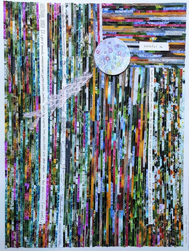
This graphic poem, Natane Rain Is (#21 GLYPH), is tricky because the majority of people start reading from the top right.
"careful to" jumps out in colorful strips.
Even though, the top left has the title, "Natane Rain Is", why do they read this poem from the top right?
BECAUSE I designed it that way!
(evil laugh)
This is a poem about a hopeless relationship.
The one-sided love often feels frustrated, annoyed, confused... I want my readers to experience these feelings through my graphic poem. Therefore:
When my readers feel negative elements after reading this poem, I have succeeded!
"careful to" jumps out in colorful strips.
Even though, the top left has the title, "Natane Rain Is", why do they read this poem from the top right?
BECAUSE I designed it that way!
(evil laugh)
This is a poem about a hopeless relationship.
The one-sided love often feels frustrated, annoyed, confused... I want my readers to experience these feelings through my graphic poem. Therefore:
- Readers may need to read multiple times to find the narrative.
- It is easy to get lost in the colorful strips.
- They may feel frustrated, which mirrors the poem's emotional theme of a broken heart.
When my readers feel negative elements after reading this poem, I have succeeded!
Line-Break Hyperawareness
I think that graphic poems utilize an advanced form of line-breaks—one that guides the reader’s eyes through poetic lines with static materials.
I consider this line-break hyperawareness.
"careful to" stands out as a natural starting point for reading "Natane Rain Is" if readers have this hyperawareness. This is intentionally distractive as it plays with human eye-movements.
Like most Western/European styles of comics, narratives move from the top left to the bottom right. So our eyes are trained for a long time to read that way.
One of my creative choices made with each graphic poem is to follow the traditional story telling pattern (top left - bottom right), or do something else. Either way, the composition of the graphic poem is designed to guide the readers through the narrative.
BECAUSE!
The line-break hyperawareness emphasizes Trans. Sensory.

